HOME | DD
 KeyshaKitty — Practice and doodling junk
Published: 2008-03-04 09:21:31 +0000 UTC; Views: 3472; Favourites: 67; Downloads: 43
Redirect to original
Description
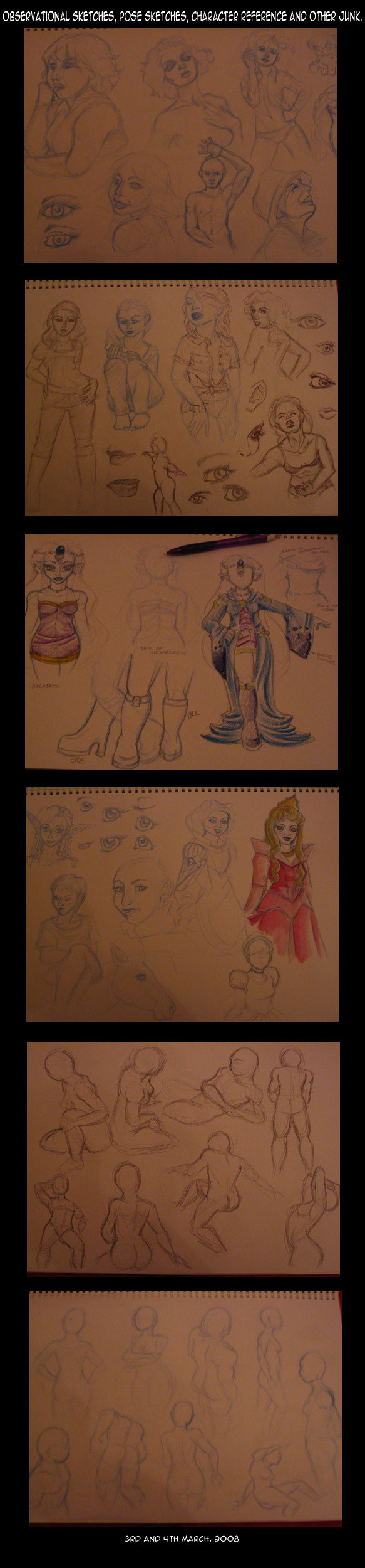
A bunch of doodles and observational sketches and pose reference and...yeah, you get the idea. X3 Done over the past couple of days to get some practice in.Sorry about the bad lighting and angles of the paper. A3 sketchbook is annoying to scan, so I just snapped photos. They may not show up very well on some moniters.
The Magji reference in there is for my friend who wants to make a Magji costume for an up-coming convention, and wanted a reference of her outfit to work with - plus something for the judges to see too, so I just slapped it in here.
Lots of work still to go. :/ My own cosplays are getting in the way of more progress.
EDIT: Hey guys? Comments are on so that people can offer crit as they see fit. Typing in stupid things like 'butts' is the kind of thing that makes me hate having the comments on, but I don't want to hinder myself by taking them off. Please stop being immature, thanks.
Related content


Comments: 37

I admire you're pose-work,it's really lovely
I really like the eyes on the second photo too - as well as lips (I have a hard time with lips and noses)
And I really like the 5th photo, pose work there is wonderful ^^
Backviews can be hard sometimes huh?
And as other have said Your realism is great too, as well as the horse head.
 (Smile)")
👍: 0 ⏩: 0

the more i watch other artists, with their sketch dumps and what not, the more i learn ^~^ i actually look up to artists like you, so i guess... thanks for the lesson ^~^
👍: 0 ⏩: 0

I Love your eyes! the costumes look great and the bodies are really nice and curvy!! GREAT JOB!!!!
👍: 0 ⏩: 0

Woah, you are *amazing* with poses and angles! My only suggestion is for the first pose on the left in the second shot: the base of the thumb on her left hand seems a shade too close to the other digits, it looks like it should be more to the side of her hand.
Other than that, you make me seethe with uncontrollable jealousy at your skill. I love looking at artists' poses and practices, and yours are extremely well done.
👍: 0 ⏩: 0


")


wow! its really nice to see things like this from you! you're doing well to improve. :]
just some advice, i do agree with what a couple of people have said. your torsos seem to be a little short. makes the figure seem a bit pudgy or squished together. especially in women, if you want to make them seem thin, you might want to accsentuate the waist line. then the hips and bust will look more like.. how to explain this.. more profound?
i hope that helps a little. :3
👍: 0 ⏩: 1

Wow, Kai and realism o_o? This is a first that I've seen. I'm not an art major or anything, but I must say you've definitely improved with realism- especially the eyes. I really didn't see some drawings as pudgy or anything, but I assumed it was depicting a certain age, maybe older in years *shrugs*
What I wanted to comment on mostly was your poses and that the wide variety you are doing is good- you're not sticking to one side, so to speak, but you're everywhere, even different points of view (arial, side, looking from bottom, etc). What I admire is how you can express such emotion in just a simple pose XD
Yeah, I can see where the hips may a tad too high (2nd pic, girl on left) where the torso feels it's a tad too off, if you know what I mean 
👍: 0 ⏩: 1

Thanks for actually pointing out which picture/person you wanted to give some anatomy help on, as that makes things easier for me too. :3 And I see what you mean by the hips as well.
I take my sketchbooks with me when I can, but most days right now, when I'm out, it's a quick walk/travel somewhere and back - I'm not actually sitting or staying anywhere long enough to doodle. X3 I need to start going to cafes again more.
👍: 0 ⏩: 0

Natch~! It looks better than what I fill my gallery with!BD
👍: 0 ⏩: 0

You're getting better with proportions, but your torsos tend to fall a bit too short, and that makes the figuer look more like it's all hip and no body, if you know what I'm saying....?
Overall, you're getting better with realism
👍: 0 ⏩: 1

Observational sketches FTW! Taking a figure drawing class was the best thing that happened to my art, and it's totally fun after you get into it. And sitting down and drawing random people at coffee shops is absolutely hilarious. People watching is quite fun. ^o^
👍: 0 ⏩: 0

So far, so good Kai.
Keep up the good work.
👍: 0 ⏩: 0

The first two pages remind me a of realistic cartoony style, if that makes any sense. I'm assuming you were aiming for more realistic, so I just wanted to point it out
I'm thinking the proportions themselves is what makes me think this, though I have yet to exactly pin-point what about them exactly. Hope it helps!
👍: 0 ⏩: 1
Not really aiming for realistic. People always seem to think that's what I've been aiming for. :/ I'm just praticing and trying other things.
👍: 0 ⏩: 2
Ahh, alright. I just had the impression you were trying for a more realistic approach, not necessarily straight realism.
👍: 0 ⏩: 0


ALL HAIL KEYSHA-CHAN!!!!!!

👍: 0 ⏩: 0


Wow, it's really weird to see you draw in this style! So different! It's really nice though, you're good at this!
A few tips maybe: you tend to make the hair not fit the head sometimes. making the back or the top of the head just a little bit too small, which makes the hair look a bit off.
Sometimes at 3/4 shots you draw the corner of the mouth too far to the centre of the face. Try drawing them more to towards the cheeks, and a bit more to the top. If your characters smile, the corners of the mouth still point downwards a bit - makes me think they're not really smiling at all!
These are just a few tips. (: In general, I love these works and I really admire you for trying to improve this hard instead of drawing the same things all the time!
Also, a few things I'd love to see from you: thinner characters, most of them are a little pudgy here, especially the arms and the legs; more men! (manflesh! yumm- er. never mind.)
Oh, and the last two pages are pure love. Amazing!
👍: 0 ⏩: 2
Can you be more specific about which pictures look pudgier in the arms and legs?
👍: 0 ⏩: 1
Sorry for the late reply...
On the first page, the top left girl looks pudgy in her face and her arms. The bottom left and right figure are a bit pudgy in their face too.
The second page, the left girl, I think her hips and legs are just a bit too big, and a bit too pugdy again. Same goes for the small figure at the bottom; her upper legs and bum are a bit too fat.
Not much to say about the third and fourth page... it's more in your old style, right?
A general remark about the fifth and six page: when you draw a girl from behind, you give her big hips and a big bottom. Now I have to admit some girls have big bottoms (*coughmecough*) but not all of them. Try drawing pudgy AND thin characters.
Funny that. I need to work on drawing less thin and more pudgy characters.
Also, isn't it annoying to draw on A3 paper? I wouldn't be able to stand dragging that thing around all the time. I always use A4...
👍: 0 ⏩: 1
XD Funny you say those - all the ones you pointed out on the first two pages were taken from mags with '
👍: 0 ⏩: 0

yeah.it is different, but nice though! good job! ^^
👍: 0 ⏩: 0

did you take drawing classes? cuz u are really good
👍: 0 ⏩: 0

All very nice sketches. You can only stand to get better with practice, right?
👍: 0 ⏩: 0

The last two pages of figures are great! You're really getting a lot of work in here! I can't wait to see more!
👍: 0 ⏩: 0


sweet! thanks Kai
*ish working away on that in the background*
👍: 0 ⏩: 1
:3 If there's some way of getting a better copy of it, let me know - like if you're up for getting a colour copy of it done at warehouse stationary. It's something you could give to the judges as well. :3
👍: 0 ⏩: 1
we could use my household copier in all likeliehood ^_^
👍: 0 ⏩: 1
A3 sized sketchbook, though. :/
👍: 0 ⏩: 1
ah, well, warehouse stationary is good then. Might get it reduced, since otherwise, knowing me, I'll damage my copy
*heads to bed*
👍: 0 ⏩: 0