HOME | DD
 Kimorox — The Great Rebels =new plot=

#comic #comicpage #dog #feathers #green #manga #plot #religion #religious #sphinx #worldbuilding
Published: 2017-04-29 02:21:09 +0000 UTC; Views: 312; Favourites: 1; Downloads: 0
Redirect to original
Description
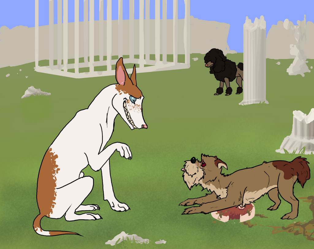
The new plot of my comic once called ''The Great Defenders'': kimorox.deviantart.com/art/The… I am still debating if I want to use the same cover or create a whole new one.In case you wonder, this comic is not for critisising religion. While I indeed despise religion, the main thought behind this comic is, back then when in ancients times when religious beliefs where the same as they are in my comic, I am wondering if they weren't people who, rather than losing fate in God, just ended up hating God. THIS is what this comic is about.
Anyway, I hope wou will like this.
Also I'm too lazy to correct the grammar now so if theres mistakeds then just deal with them.
Related content


Comments: 5

That's pretty much not well readable because of the font color :/ I read the page still (maybe it's just me not liking magenta on black) but I think you could just use white letters instead or you could try red. I'm pretty confused about what it is going to be about but it's the first page I see, so I don't know.
👍: 0 ⏩: 1

Well this is not the first page: its just the plot. But I will consider what you said about the font colour. I might also edit the plot to make it more understandable.
👍: 0 ⏩: 1

Oh and btw: do you also think I should change the colour of the font for this??:
👍: 0 ⏩: 1
Yes, I would definitely suggest you change the text color, maybe white works, but not always. I also have trouble to find the right color so I usually stick to black and white but if you want it to be colored, you could use a dark red for example  (Smile)")
 (Wink)")
👍: 0 ⏩: 0