HOME | DD
 Kirbopher15 — R O C K M A N
Published: 2009-05-11 01:25:43 +0000 UTC; Views: 7753; Favourites: 193; Downloads: 70
Redirect to original
Description
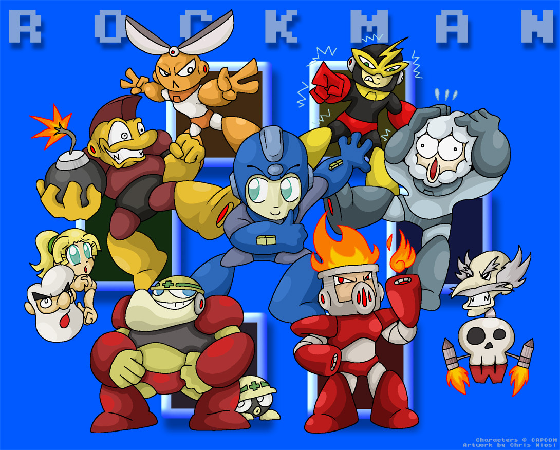
Little fanart I sketched back during my last day of class. I was told just today about a Nintendo fanart contest of some kind, was reminded of the sketch right away and decided to finish it. I digitally inked it this time sound since I'm finding it to be a better process. Had to fool with the positioning of the characters a little bit, dunno if it came out as well as it could have. Background was kinda simple but seemed to work with Megaman 1's really basic looking style from back in the day. Definitely gotta few mistakes on the designs, since I didn't have reference in class obviously, but ah well. Wish me luck!Related content


Comments: 50

Hello, I would like tot ake the 50th comment to say THIS IS SO AWESOME!
👍: 0 ⏩: 0


Cutman and Elecman's legs' makes Megaman look like he's got cat ears.
👍: 0 ⏩: 0


This with no reference?
It's still impressive man.
👍: 0 ⏩: 0


everytime i see the MM1 robot masters i think of the protomen lmao. nice job
👍: 0 ⏩: 0


With cutman and elecman's feet put together it looks like megaman has furry ears lol
just had to point that out. XD
👍: 0 ⏩: 0

By the end of the day, all but one of you will be dead. Feel free to choose amongst yourselves.
👍: 0 ⏩: 0


1. Iceman isn't that grey. He's more of a bluish hue.
2. What's with the Mettaur? He's so pale yellow
👍: 0 ⏩: 0

Bombman's expression is the best. Although, you seemed to have drawn him a little too built, 'cuz if I recall correctly, Bombman seems a bit obese in the game.
Good nonetheless.
👍: 0 ⏩: 0

It's great! plz make a pic of Rockman II it was the best one in the Rockman/Megaman series!
👍: 0 ⏩: 0


wow looks great
my favorite of these is Cutman!")
👍: 0 ⏩: 0

XD every time i see cut man i think "Kung-fu cutman" awsome stuff, and is it just me or dose willy remind me of evan splooge (i mighta miss spelled that) from parody rangers. any way. keep the good work up
👍: 0 ⏩: 0


I need to enroll in a class boring and uneventful enough to draw during, because it seems the only time I'm inspired to draw is when I'm not supposed to.
👍: 0 ⏩: 0

AH YES I WAS EXPECTING FOR THIS
i always wanted to see original rockman or megaman x fanart in your style.
as expected, the robot masters in superdeformed style are a great view. Im favouriting this, i always enjoy a fine rockman art.
P.d : why does Dr. Wily reminds me of an old sperm? O.o
👍: 0 ⏩: 0


When you say "digital inking," do you mean, like, drawing it out over your sketch with a computer? (And with a mouse or tablet, for that matter?)
Because that's ridiculously difficult for me, and therefore I suspect I'm doing it wrong.
Also, lurve it. Gutsman makes me happy.
👍: 0 ⏩: 1

That's totally going to be the new final boss for a Mega Man 10 on the side there. Just a gigantic head, and it's most deadly attack is the eyebrow wiggle.
👍: 0 ⏩: 0


Another Mega Man fan I see. That's always a good thing.
Some of the Robot Masters are in the wrong place, but other than that, it's a nice picture.
👍: 0 ⏩: 1

Probably, I was without reference so I just kinda bullshat my way through the positioning. I put the physical-powered guys to the left and the three elemental ones to the right.
👍: 0 ⏩: 0


Any chance you'll be making similar pictures with the other games?

👍: 0 ⏩: 1
I thought about doing one for MM2 but I'm not sure, may not be for a while.
👍: 0 ⏩: 0

As soon as I saw this, the stage selection music popped in my head. By that, I mean when you made the choice, and it shows who you're going after.
👍: 0 ⏩: 0

I just got one thing to say about Bombman.
EEHEEHEEHAHAHAHAHAHAHAHAHAHAHAHAHA!
👍: 0 ⏩: 0


I'm obviously loving Bombman's face.
Then again most of the Robot master's are pretty good.
I haven't played Megaman 1 in a while, but I remember the music like a bad smell. Great Job.
👍: 0 ⏩: 0


Cutman came out the best. He's such a beast in this picture. And digital inking proved to me to be a more workable medium... Mainly because scanning and cleanup went away. XD
👍: 0 ⏩: 1
KUNG-FU CUTMANG~
I really -should- experiment more with real life inking stuff too, I feel like it makes a better grounding, but augh digital inking's so much easier fff
👍: 0 ⏩: 1
Oh it's fucking GREAT because you'll totally learn to be more careful. XD
Also physical mediums are better for concept art. More happy accidents means more concept variety.
👍: 0 ⏩: 0


awesome, but isn't Iceman Blue with a Coat?...
Meh, nice draw..!!!
👍: 0 ⏩: 0


I love iceman's expression he gives! Awesome job Kirb!
👍: 0 ⏩: 0


