HOME | DD
 Kirbopher15 — Terrain of Magical Expertise

Published: 2010-04-01 03:05:46 +0000 UTC; Views: 26817; Favourites: 368; Downloads: 216
Redirect to original
Description
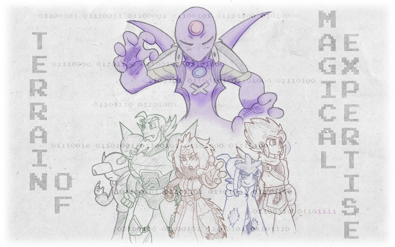
A poster I sketched out mainly on a piece of 18x24 paper. The world map in the background and Webmaster hovering over it were both two additional 11x14 pieces. The rest of the effects and BG art was done in Photoshop.The designs of Alpha and his friends are updated versions of the ones pictured in the last piece they were featured in . Alpha's color scheme lessened up a bit and he sports a new tail to go with his wings, Kirb's gotta burlap-sack for a new hat and more Cerulean color scheme, Flamey's got a tail to go with her wings and a haircut I've finally settled on, Gamecrazed I've slimmed down a bit and given a D-Pad stomach ornament and Nylocke has been given a new outfit that combines the look of his 1st Season armor/cape with the 3rd Season color scheme. Ruri, Zetto and Webmaster are nearly the same but were given a few updates.
S'not perfect, but it was a fun little project to do, took about 3 days to finish. I did the original sketch on a smaller piece of paper in class on a whim and decided to transfer it to a bigger piece of paper last Monday. Any critique would be great!
Related content


Comments: 172

Looks pretty solid. Looking forward to more stuff.
A few things I'd fix if you want to tighten it up.
1. The chick with the cat ears has them at a bad angle, one looks like it's sprouting from the front of her head, the other behind it.
2. The open hands on the floating character to the right side looks like you just drew them once, and then just copy flipped them. Even if you did fudge it a bit, I'd recommend just copying the line layer instead, and redrawing the shading, so it looks more natural.
3. What exactly is the light source, because the shading is all kinds of crazy?
4. The main front character's arm on the right side looks like it's scrunched severely. Why not redraw it spread out a little bit, or at least where's not just a cuff and hand popping out from behind ?
5. Composite wise, why not mix up the character poses? On the left, you have two heads doing nothing, and a small character standing still, and then a big splash for the mid front character, then on the right, you have 3 characters posing more dynamically, a fourth floating, and then a background element shoving up meaning that your ratio is skewered towards 3:1:5. Considering you have the floating character already opaque, why not shove him more into the middle, as it looks like you're trying to show his omnipotence.
6. There's several portions that seem to vanish instead of continuing past overlaps. The biggest one is the road/trunk portion of the city tree thing that flows below the characters, yet suddenly stops behind the character with the controller thing on his chest. It's sudden and abrupt, and looks like it should have more continuing past him.
👍: 0 ⏩: 0

Ah, TTA. I should watch that again. lol
Oh, and you did a good job with the voice work on Galactic Battles!
👍: 0 ⏩: 0

oh ya i remember TOME i personally liked it
👍: 0 ⏩: 0

I just loved your TTA series~ I was so sad that you discontinued it, but still awesome work!
")
👍: 0 ⏩: 0

Why must you remind us we'll never see this again? XD
Fan bitching aside, it's an interesting change in artstyle. Personally, I like the older style better. The colorful cartoon style was atractive and eye-catching. Kirb looks out of place, Alpha's older wings and tail seemed to match the character himself better, and Nailocks face strikes me as too "Green Goblin" for some reason.
Not a bad piece overall, I just enjoyed your other stuff fine.
👍: 0 ⏩: 0

I'm loving this new style of yours. It's come a long way. It'd be interesting to see how other tta characters would look now. The aura looking like kagemamoru and webmasters new design are my favourite parts of this.
👍: 0 ⏩: 0


This looks definitely very epic, but It seems like Kirb's gigantic head is a little iffy. That sword looks really good though.
I also like the redesign of Webmaster(?). He looks more alien and mysterious.
👍: 0 ⏩: 0

Wow Kirbopher I must say that I'm impressed! The picture looks great! Zetto looks very evil in it which surprised me. He usually looks crazy, but not evil. Kirbopher15 looks the most drastically changed and the burlap sack was a great inclusion. Less Linkish. Alpha looks great as always. Flamegirl looks one of the best there. The pose, the hair, everything. Not much to say about GC. He's GC. Nailock looks great as well, really showing his spontaneous awesome side we love so much. And Webmaster looks very different. I like what you did with him so he's more original. Ruri came out perfect there as well. It seems to me that everyone has a darker color tone than usual. It's still a great piece of art and I'm glad you still remember your old TTA series!
👍: 0 ⏩: 0

Good! Good! you can make a manga of it!
👍: 0 ⏩: 0

Sorry, I'm not much of an artist so I don't think that I can critique you
But I do really like the piece ^^ And I'm liking the cat girl XD

👍: 0 ⏩: 0

I'm thinking that Zetto's nose was drawn a little too big. I think it makes him look slightly more goofy than cool. Other than that, it looks good.
👍: 0 ⏩: 0

Awesome. Loved these characters, glad to see them again lol.
👍: 0 ⏩: 0

It's been a while since I have seen TTA, I miss it.
👍: 0 ⏩: 0

Well I have to say Kirbopher this came out quite well but the only things I don't like is Webmaster's and Nylocke's faces. Nylocke's face reminds me of a toonish goblin's face from back in the day, and Webmaster's face is more like a Alien which is mainly because of his eyes. I'm sorry if I had offended you in anyway with my comment. Other then those two things. I like this.
👍: 0 ⏩: 1

I was looking at webmaster thinking he went Super Saiyan 3 or something.
👍: 0 ⏩: 1
I give it to you it kinda does look like that but its just the eyes just don't seem to fit right to me.
👍: 0 ⏩: 0

good job man I hate these new avitars..but I must indure it
👍: 0 ⏩: 0


TTA Forever! I wonder if Alphas final battle with Darkeyesofanubis will cost his life?
👍: 0 ⏩: 0

WHOA WHOA WAIT i just noticed...
TOME = Terrain Of Magical Expertise
do i get a prize or somethin' o3o
👍: 0 ⏩: 0

Ah I never get tired of TTA artwork. The new character designs look great.
👍: 0 ⏩: 0
You tease TT_TT
ANYHOW not bringing that up this time. Like bignasty5life said, the outline of Zetto's hair shadowing the side of his face looks kind of out of the place since the angle from where the light comes from isn't in harmony with that shadow.
Truth be told i miss Kirb's...Kirby form - goddamit i'm sure my sister has a plushie from him somewhere - but i do like his new humanoid form.
Also...tails? XD
👍: 0 ⏩: 0


man i miss this show 9sorry for bringing that up im sure your probably sick of hearing that)
👍: 0 ⏩: 0

very nice, I'm actually just finishing TTA now.
👍: 0 ⏩: 0

Damn, got my hopes up slightly about the next season, but as soon as I remembered you said you weren't doing it, it kinda died out, but the epicness of this image, didn't die at all. I still love the old series, and think it ended at a pretty good time, and this art just shows that it was a pretty good part of your flash career. I probably sound like a fanboy, so Im going to shut up now, but I absolutely love this piece of work, and your art seem's to be getting much better!
👍: 0 ⏩: 0

The floor look like the one from Megaman Battle Network.
Other than that, this is awsome!
👍: 0 ⏩: 1

Done intentionally. ;]
👍: 0 ⏩: 0

In the end, ya got a really slick image outta it!
👍: 0 ⏩: 1
SpaceRaider [2010-04-01 04:20:55 +0000 UTC]
Ah, TTA. Good times, good times... Its nice to see something refreshing once in a while too.
👍: 0 ⏩: 0

Kirbopher is a Pauper Swordsman.
Deceiving. I am curious though, this seemed to come out of nowhere. What's the significance?
👍: 0 ⏩: 2
Drew up the sketch on a whim and felt it was a good enough composition to be made into a full piece.
👍: 0 ⏩: 1
Ah. Certainly brings back memories. Good job. The style's odd, but it kinda fits.
Still lovin dat Pauper Swordsman Kirbopher though.
Speaking of Kirbopher, does he still have the same name or are you going to change that too?
👍: 0 ⏩: 1
Nah I'm keeping it, just nixing the 15. Everyone pictured here has the same name, just spelling Nailock's name as "Nylocke" now.
👍: 0 ⏩: 1
Ah, alright. Well, great job. Really liking it. I'm hoping to see more of these guys again.
👍: 0 ⏩: 0
Also TOME. I see what you did there.
I'm very much liking the redesigns.
👍: 0 ⏩: 0

Very nice, I especially like the bridge thing is coming up from the map in the background.
All in all, some great artwork.
👍: 0 ⏩: 0

This brings back some good memories X3
Awesome poster!
👍: 0 ⏩: 0

i really like the design of the characters
👍: 0 ⏩: 0


It's funny, I was real nostalgic today and I decided to look up some TTA stuff, and I get on DA and see this... *sigh*
Them's was good times. I remember when the episode started first showing up two at a time on Newgrounds. Them's was good times.
👍: 0 ⏩: 0

Looks a LOT more cartoony than a lot of TTA stuff from before (but that's to be expected). Still, it's GREAT to see what I think was your best series, even if it's only like 1 art piece a year.
👍: 0 ⏩: 0


i still don't get why don't you draw Kirbopher as a...well...Kirby
👍: 0 ⏩: 1
Because I'm past the point of drawing sprite-edits, that and this new design got a lot of compliments.
👍: 0 ⏩: 1
well, yes, but i still think you should match the Drawings with the story, a nice drawn Kirby Kirbopher15(with some changes, like, for example, bracelets and stuff, of course) would look better, since you never actually see THAT Kirbopher in TTA, i still belive Kirby Kirbopher would have enough compliments.
👍: 0 ⏩: 2
<= Prev | | Next =>