HOME | DD
 kit-t —
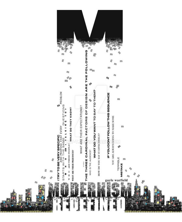
Modernism vs Post Modernism
kit-t —
Modernism vs Post Modernism
Published: 2006-12-12 01:13:33 +0000 UTC; Views: 41750; Favourites: 696; Downloads: 130
Redirect to original
Description
This is my Final for Typograpgy BThe criteria was this:
Create a book cover: 9 x 11
1.) Integrate the two art movements Modernism and Postmodernism
2.) Use a single letter or number as an element
3.) Use a quote (chosen from a list)
4.) Use a Title (chosen from a list; "Modernism Redefined")
5.) Use your name as the "Author"
Related content


Comments: 89

Bold concept you have there. It's refreshing, really.
👍: 0 ⏩: 0


hey there.
I've featured this here: [link]
I hope you don't mind.~
~Redeemer-of-light
👍: 0 ⏩: 0


Your wonderful typography has been featured in this News Article ! [link] So hope you'll like it and meet others who does the same type of art  (Smile)")
If you 

Sangiev,
👍: 0 ⏩: 0


This is a great design ... very good well done dude!!1
I love it... so nice!!!
Gorgeous!!!
Best regards!!!
👍: 0 ⏩: 0

")

 (Wink)")


The concept is simple, and the art is truly joyfull.
👍: 0 ⏩: 0


This is such a beautiful piece! I hope you don't mind if I use it for an example for my intro to graphics class for a "text as art" project I am starting with them. I think it will be so inspiring to them.
👍: 0 ⏩: 0

wow.
it's amazing.
i think i'd buy the book for the cover. :]
👍: 0 ⏩: 0


This is an amazing use of text! My favorite typography piece so far. You deserved the DD. Great work.
👍: 0 ⏩: 1


Makes me wonder if the M is actually a tightly grouped collection of m's or if it's an M with some sort of magic filtering on to appear as such.
Excellent work. ^_^
👍: 0 ⏩: 1

Thank you for that question. the 'm's are mostly single m's placed one by one. some are built up in lines of "m"-text for shape. .....lets just say that everytime i closed my eyes i saw 'm's imprinted on the backs of my eyelids!!! lol.
👍: 0 ⏩: 0

It's amazing how boundaries can force us to express ourselves more... you did a great job with the theme

👍: 0 ⏩: 1
thank you! it was definitely a challenge
👍: 0 ⏩: 0


You've really done a great job with this
I'd read this book
👍: 0 ⏩: 1
I'm glad u'd read the book!
👍: 0 ⏩: 0


cooooooool looks lika album cover, either way, pimpin pimpin
👍: 0 ⏩: 0


this is amazing. wonderfully executed. i love how you integrated the quote with the whole piece and modernism with post modernism.
👍: 0 ⏩: 0


| Next =>