HOME | DD
 kitton — page 0101

Published: 2005-06-11 22:20:02 +0000 UTC; Views: 2698; Favourites: 24; Downloads: 763
Redirect to original
Description
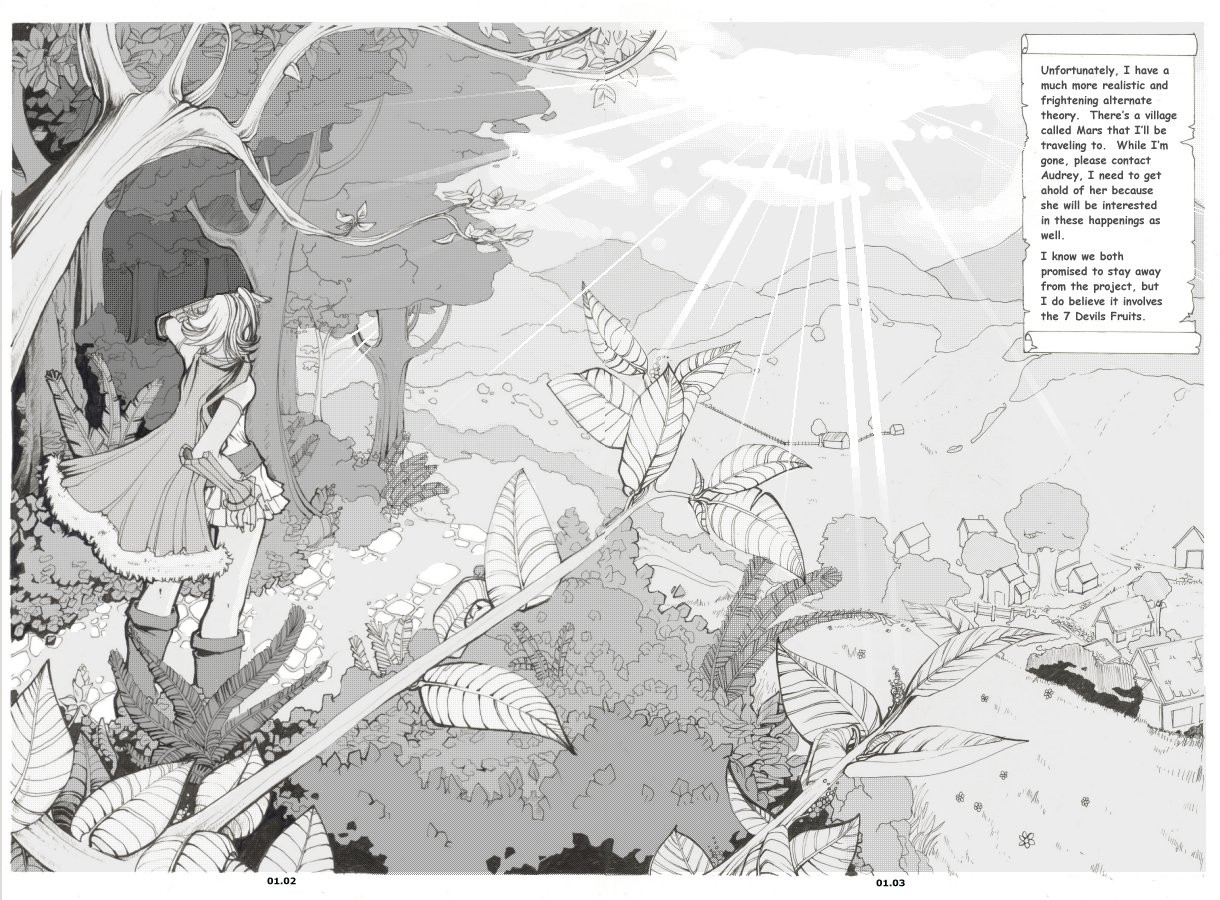
I apologize in advance for the lengthily description:Wow. So this is my first page of my old comic project redesigned. I worked on SO many pages for this comic before, but it really felt like the story wasn’t going anywhere. After thinking for a long time, I decided to revive it and for the first time ever-I decided to actually redraw a comic that I had already drawn. Then I was faced with the dilemma of how much I would change. I felt if I didn’t change enough, then I would feel bad for throwing years of work down the drain, however, if I changed it too much it didn’t make sense that I shouldn’t just start a brand new project. I decided to redesign two of the characters, and change the plot a little (I cut some of the slower chapters out. The pace in the script is a little fast, and quite daring, but I hope to adjust it as I go.)
Things I like:
My inclusion of a for ground (leaves and branches) as well as a background in the largest panel. The leaves themselves (I actually took a big chance by not closely referencing them, even though I have been studying trees and leaves recently just for this comic. I’m happy at how they turned out) My inclusion of dark spots. I once heard that a comic should ideally be 25% black, 25% gray, and 50% white. I think this is a bit absurd, personally, but I definitely agree that most comics don’t have NEAR enough black on them. Hence, the big black spot. Which also acts to draw you eyes down the page, and will also contrast the lighting (which will be more apparent when I have time to tone).
Things I don’t like:
The weakness of the structure. I don’t think your eye follows the page or the panels too terribly well. It also doesn’t quite have the boost I was hoping it to have (after all, first pages ARE first impressions) Her legs and some other small anatomical anomalies.
>>[link] (top left panel is the original first page of this comic. As you can see, I changed it around a lot as well as her design. But the concept is pretty much the same, as is the lettering.)
[edit]: Some tone added. I think I have to go darker in the background but I'm worried that its getting really gray and muddy. I almost liked just the inks more >>; anyway, please tell me what to fix before I finish.
[edit2:] SORRY for the resubmit
") Just changed the text, lightened the boxes and touched up some things. Its now considered "done".
Just changed the text, lightened the boxes and touched up some things. Its now considered "done".
Related content


Comments: 82

Thank you! I really wish I had the patience to tone, because I love the end product. But unfortunately, I find it so terrible boring so I have a really hard time doing it,... it also takes forever ;_;
👍: 0 ⏩: 1

I got tones but im too affraid to uuse them
👍: 0 ⏩: 1
I don't have tones ;_; *worlds smallest violin plays just for me*
👍: 0 ⏩: 1
*puts hand on shoulder* poor you....hmmm...try the interwebs?
👍: 0 ⏩: 0

wow. ; ; the details are fabulous! the cobbles, the leaves! your comic pages are better than anything else in your gallery! why don't you make more?
👍: 0 ⏩: 1
I'd love to, but they are far too time consuming! I also can't stick with a project for the life of me.... and one more excuse (oh, how I love them!) is that my monitor doesn't show light colours (especally greys) properly, so I see very little variation which makes it complicated
👍: 0 ⏩: 0

")
Thanks! Sometimes I miss inking pages like this... but I just don't have the motivation because it takes me too long to get anywhere with a story ;_;
👍: 0 ⏩: 0


So pretty! And lots of perspectives in one page ^.^ So preety, love her outfit <3
👍: 0 ⏩: 0

Really great detail, love the characters in this comic they have a great design!
As far as page layout is concerned,
Suggestion: its good to keep in mind, that the viewer always tends to look at the eyes of a character first, and then in the direction they are looking, so eyes can be a useful pointer when prompting the viewer to look in a certain direction!
It negotiable of course!
Likewise hands are very expressive, and pointing fingers, outstretch arms also add to the cause! When a character is wielding a gun or sword, that object becomes and extension of the expression and likewise a pointer!
Panel layout in itself is quite an art, position of the characters and shape of panels can dramatically change pace, mood and direction! There are certain rules of thumb but a lot has to do with composition, leading lines, pace and practice I think!
You have a real talent for this you know, and a great style! ")
Once again, great work on the backgrounds!
👍: 0 ⏩: 1
Thanks for the long comment and crit :3 I totally agree. I think that comic work is sooooo much more complicated than most people think :3
👍: 0 ⏩: 1
Tell me about it! Storyboarding for animation is just as complicated as comics if not more, but you have to plan the movement of the characters also within the fame! Hence the pace and timing are very important and that it matches with the score and sfx!
So pretty much all the comic page layouts are very similar to those of animation in storyboarding! Comics are like laying key frames in Ani!
All the cinematography, composition, and linear rules etc are used!
Think you have a great scence of design/concept and creation when it comes to characters and bg a big inspiration to other artists!
👍: 0 ⏩: 1
Nope. no full script..... I have a general plan for where its going, though :3 Blah I'm lazy and would rather have a writer do it for me :3
👍: 0 ⏩: 1
hahahha Nice! Almost done with the lines, you want me to mail them to you? Note me or something?
👍: 0 ⏩: 1
Yip! Are we still gonna do a collab on [link]
👍: 0 ⏩: 1
If you send me decent inks by the 2nd? (otherwise it'll have to be CG and I make no promises because my tablet is broken so I get frusterated quickly mousin' in) Also we could work together and do a new piece, too. Or whatever. I do like that piece, but it is a bit static for me. I'd prefer something that tells more of a story or with more movement/action :3
👍: 0 ⏩: 1
Dont really ink my work! Colour pencils.... these ok? [link]
Another piece! Cool, im down with that!
👍: 0 ⏩: 1
Welll I read in your desc that more than one people may be colouring it. I'm actually not so cool with that. I prefer to do collabs scrictly with one lineart, I don't know if it makes sense. Hmm.
👍: 0 ⏩: 1
Cool! No problem, dunno if the other guys is colouring it, he offered to thou...
👍: 0 ⏩: 0

Your use of tones is very good. I actually started my Take away comic with tones but it jsut didn't work... So i removed them and started a graphite schemed comic. I think i am gonna make a comic with the crosshatching. I really enjoyed it and it went SOOOOOooooooooooo Fast. I completed pages like it was going out of style plus it looked spffy! I woudl practice with tone more often its just expensive. Especially here in colorado! Have you made more of this comic? I am so obsessed with ghosts and stuff and not many mangas or comcis delve into the supernatural that much
👍: 0 ⏩: 1
Thanks for showing interest, hon. I agree that tone is rediculously overpriced, so I do mine all CG.
Do think twice about quick methods. It IS important to get a lot of pages out, and whatever is your style is cool, but from past expierience the only comics I really learned a lot from are the ones that took me forever. The more time == the more experience. That could be just me, though :3
👍: 0 ⏩: 1
How do you do them cg? I always wonder how...... Is there any specific tools or something? GAH! @_@ Your AMAZING!!!!!!! Do you use photoshop? You should post a tutorial or at least hook me up on the basics of making tones in a digi program so I can start trying to make my own!
Yesh I do feel like if you take the time on them you learn alot from them! I learned a lot about contrast and I developed my shading skills a lot better when I mused graphite and such! Plus I learned this spffeh way to make tree bark!
 (Smile)")
👍: 0 ⏩: 1
No I use PSP 5. There are 3 dither filters I use (25%,50%, and 75%) thats it. I really wish there was more to it, but thats all.... I was also asked to do a tutorial on it, but my method is probably not very insightful, I'm sure you can find better material elsewhere :3
👍: 0 ⏩: 1
I have adobe photo shop seven XD Ill have to figure it out then ! XD
👍: 0 ⏩: 0


>ww< I'm afraid I can't really give advanced critique just the way you want, but I love the art and I think the trees and leaves look incredibly good. >__< As for the rules on grey, black, and white-usage, I believe it really depends on the author... some of the "lazier" artist use less shading, but some artists also do this for effect. Effect... as in Clamp's XXX Holic. Shaded a little differently than manga normally is (for example, usually tan skin would be darker... but that's maybe not what you were going for anyway), but I still think it comes out well.
Here's a critical comment: I think that the cobblestones look too... straight, as if they were in a wall rather than from the ground. I think if they were elongated a little bit horizontally, than this effect might be better achieved (though I very well could be wrong. I'm not that good of an artist, actually).
A little long... ^__6; sorry about it! But that just means I like it~
👍: 0 ⏩: 1
Thanks for the long comment and crit (and all the other comments! wow that was so nice of you!!) and I agree about the rocks. Its just one of those stylistic things I've done for years. Its wrong, but its just something... I do?
👍: 0 ⏩: 1
Okay then ^__^ No problem with the commenting! It's fun~
👍: 0 ⏩: 0

looks really awsome
the persepctiveo n the first litle one is nice
👍: 0 ⏩: 0

waaah. i was gonna comment on this when you very first posted it, but i guess im a bit too late.
but wow.
your inks, and lineweights are absolutely amazing. they're thick where they need to be (like in the foreground) and also thin where they need to be. it seems like alot of people nowadays don't really pay much attention to the importance of lineweight. so it's really good to see that you take it into consideration (even if it's an unconcious thing). 
design/layout wise, the foremost leaves and the long strip of black on the right really tie the smaller panels together. what i mean is, if that black/dark area wasn't there, and you just had white area, or more bg/leaves there, it would have looked muddy and too busy. detail is great, but sometimes its better to simplify~! but i sortof agree that it doesn't have the 'impact' the first few pages of a comic shoud. even still, it is amazing~!!


👍: 0 ⏩: 0

her thigh sticks out a big it looks to thick but thats it shes beautiful and i wish i had her outfit ^^ good work. Her boobs are a bit high where shes starting in the forest with her eyes closed they just look smaller and to high up. you still did a good job i know i wouldent be able to draw that the backround looks fantastic aswell.
👍: 0 ⏩: 0
her thigh sticks out a big it looks to thick but thats it shes beautiful and i wish i had her outfit ^^ good work.
👍: 0 ⏩: 0

I really really like the texture on the leaf's
the top right panel is just amazing, i really really like how your use of perspective makes the audience view it like a movie
and the tiles the little mushrooms are so cutee!
one thing i would suggest in the future to make her stand out more, would be to make the background(forest) that behind her a little darker... but thats just an opinion
viewing your toning works is always a pleasure
")
👍: 0 ⏩: 0

Love love love the leaves... actually, all the plants are pretty. She's cute, too.
Also really like the shading you used... sorry I can't give better critique, I'm no artist so it's hard to tell what might be wrong. I just think it's good.
👍: 0 ⏩: 1
Awww tyty for taking the time to comment it means a lotttt :3 You should upload more!
👍: 0 ⏩: 0

I like how the far background (the shaded part) blends nicely with the trees, but there's still a definition between the two of them.
👍: 0 ⏩: 0

I could only wish thast my comic looked as professional and beautiful as yours does now. I adore this page so much

👍: 0 ⏩: 0

mini-crit, since I can't think of much helpful to say - Youuu need to darken the lines a bit. it looks very odd with the black lines outlining the panels being intercepted by grey-lined big leaves. It just looks...uneven, I guess, for lack of better working. I'd suggest you either lighten up the outlines of the panels, or darken everything else.
The girl's legs look too thick for her extremely thin body, but seeing as this is the second picture I've noticed this in, I suppose that's mostly your style, yes?
anyway, I really like this! The detail is beautiful, and I really like her skirt. I want to find a place like that, a place to call my own~~ blah.
👍: 0 ⏩: 1
Thanks I always adore a good crit :3 I really think I should post a picture of myself.... because I get most of my poses off myself--and as you'd guess, itty bitty waste and thicker legs. Thats just how I am, therefore, thats how I draw my characters :0 I know, its no excuse--but it obviously isn't WRONG either, is it? ;; haha maybe I'm deformed!
👍: 0 ⏩: 0

...two words: Utterly amazing. That is about all I can say. I hate not being able to give more advanced critique, but I couldn't if I tried. You're just that good (at least when I compare myself to you)
👍: 0 ⏩: 0


even though you gave a lenthy description of your deviation, i still think you did a fantastic job on it

👍: 0 ⏩: 0

I think this is wonderful. I love the background forest, it's detailed yet simple enough for a comic...just right, and the leaves in the forground adds a nice depth. The inking is very smooth and the tones seem to be in all the right places. I really know nothing about creating such detailed illustrations, so I can't really say much more....I like it alot.
👍: 0 ⏩: 0

It's a very good early attempt. But you're right the panels are a little weak. If you lower them in the right hand corner and make them bigger with smaller margins and maybe some at ascue angles to add interest
👍: 0 ⏩: 1
Its not an 'early attempt' this will be the, more or less, final version of the page (I will dance with the tones a bit maybe) I actually originally had the pannels skewed, but I didn't like the effect. Also, I LIKE the spacing of the panels. Thats how I've always spaced panels and how I always will space panels. Thank you for the crit, though, its just that I personaly don't agree. I still appreciate you took the time to say those things though ^_^
👍: 0 ⏩: 1
no problem. It's your porogative not to agree. Glad I could try to help anyway ^^
👍: 0 ⏩: 0

Wow! Amazing! i love the detail you put into this! so amazing!
The leaves are soo detailed and the bark on the trees
I really love the mushroom on the tree and the stones on the ground
You character is soo pretty and i love her cloths I really love the detail on her cape
You made the matieral look heavey but light at the same time!
I really love her hair design, its so..Funkey fresh! XD
I like your anatomy alot. even though the arm in the first pannle looks a little short but I couldnt really tell until i read some of the comments people left you. I really love her expressions. The pannel where shes looking up is awesome, nice prospective. You so much better than me so i really couldnt Critique you too much Lol
Very VERY good job! I really love it! Cant wait to see more!
👍: 0 ⏩: 0
| Next =>