HOME | DD
 kitton — page 0102 and 0103 ink
Published: 2005-06-15 21:28:41 +0000 UTC; Views: 3848; Favourites: 52; Downloads: 833
Redirect to original
Description
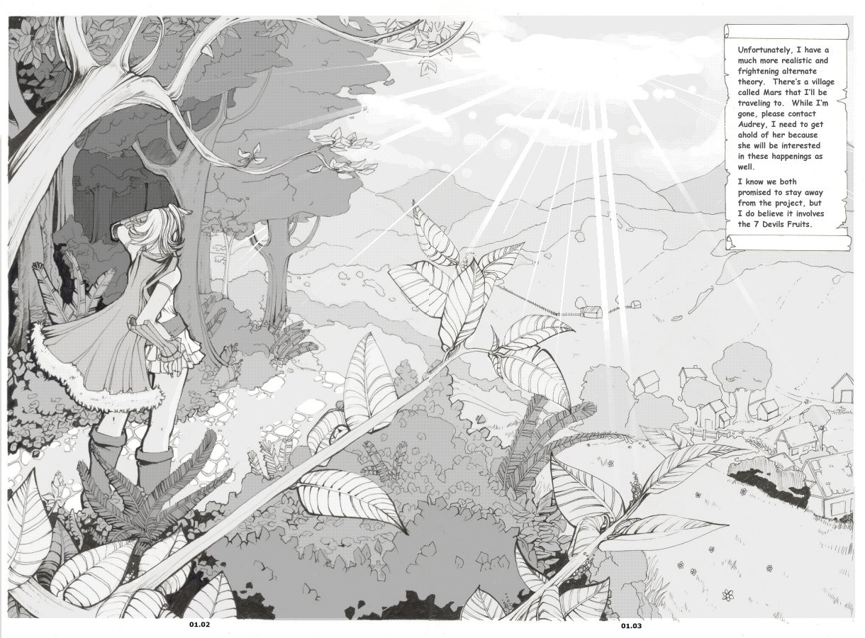
This page was actually begun before the first one. I had actually intended to do something like this when I had originally done the comic, but I never considered a 2-page panel and the horizontal orientation just didn’t fit to a single page. I have been working on this for at LEAST a few hours everyday for about 4 days. As a result, its not nearly as good as it should be. In the end I just totally rushed it, because quantity over quality is something I need to practice more. I fully intend to try to get the first chapter wrapped up by the end of June. I can’t afford to spend any more time on these two pages.Things I like:
Not much.... I actually like her pose (I know, at least SOMEONE is going to say ‘her legs are too thick’, but I draw them like that on purpose ;
 (Wink)") I tried to force more linear weight into the figure like Nicole suggested, and I think it worked out ok. I left no border on purpose to give it a more “open” feeling. I hope :3
I tried to force more linear weight into the figure like Nicole suggested, and I think it worked out ok. I left no border on purpose to give it a more “open” feeling. I hope :3Things I don’t like:
Actually a lot of things. Mostly when I look at it I just feel like I could have spent a lot longer on each detail. It feels kind of bare... for how much time I put into it. But hopefully some tones will snaz it up (like I’m going to add a sky.) Haha I think I did a terrible edit of the cut in the page (yes, this WAS drawn on two separate pages... gosh, that was probably more trouble then it was worth)
[edit:] I hope this is the first and last edit for this page. Mostly just added the sloppy tones (I know, but I spent WAY too long on these pages already I NEED to move on) and some text. The text was a dilemma because I wanted it to make sense and be clear, but also spark interest. Most importantly, I wanted it to act as an intro for not just the 'first few chapters' but also the overall scheme of the comic itself. Unfortunately, you won't be hearing too much about the project itself our find out who Audrey is for a long time... The project should be explained a LITTLE in scene 03 I think, but I'm not sure how much I want to reveal so early on :3
Related content


Comments: 71

it will be grate if we can seeit in secuence the perspectives are great.
👍: 0 ⏩: 0

wonderful use of tones, texture and jargon! i adore this!
👍: 0 ⏩: 0

Love this piece! ")
Think I would have silhouetted a few branches in the foreground, I think you can create a big illusion of depth like that, separates the foreground, middle and bg jus a suggestion though!
Non the less, all your hard work certainly shows and is really appreciated! 
👍: 0 ⏩: 1

Thanks for such a detailed comment :3 I like your idea with the silhouette, I think I did that for some of my other pages though I'm sure people are getting sick of it ^_^; Critiques are always muchly appreciated :3!
👍: 0 ⏩: 1
Cool! will take a look at some other pages and see what you got!
👍: 0 ⏩: 0

Okay... I would die even thinking to draw a background like this.
Very nice work ^_^d
👍: 0 ⏩: 0

O__O *blinded by the utter awesomeness* haha, I'm spamming your gallery now... hope you don't mind.
You inspire me to work on the comics that I want to work on~ Also, what size paper is this drawn on?
By the way, everything looks good and I don't know what to comment on, except that I'd love to read manga from you. >__<
👍: 0 ⏩: 1
Hmm its drawn on normal computer paper (thats all I ever use) and I use bulk mechanical pencils and staedker and micron pens of varying thickness!
👍: 0 ⏩: 1
Okay, thanks for the info! *looks up staedker*
👍: 0 ⏩: 0

i really love the whole flow of this picture, and the toneing is pro  (Smile)")
👍: 0 ⏩: 1
Thanks for the nice comment sweetie. Long time no see :3
👍: 0 ⏩: 0

wow. again great work~!!!! your inks/page design could cave easily carried this without tones, but your tones just add that much more depth.
especially in the second page.
the only thing i can say against it is on the third page with the scrawling background, that maybe you should add some kind of darker tones here and there. in comparison to the second page, it looks slightly bland. and a little more tonal contrast would help that.
but omg, these pages are turning out so cool~!!!!!
i cant wait to see more.
(i hope you don't mind me commenting like this?)

👍: 0 ⏩: 1
Of course I don't mind ^^ I really appreciate you took the time to write such a lengthily comment + crit :3
👍: 0 ⏩: 0

wow, thjsi must of taken for flippign ages!
fair play, its all good!
👍: 0 ⏩: 0

This is mind blowing.
It really is amazing - all that detail - and all in your unique style.
It really is lovely. I am ultra envious~
👍: 0 ⏩: 0

It looks really nice now, I especially like the sun rays 
Now this piece looks more completed, I like how it came out, great work!
👍: 0 ⏩: 0

actually I don't see any problems with this page. Detail is good, but too much in manga-style comics make the pages really hard to follow, so the amount is right on these pages. I can't do backgrounds very well myself yet, but I can always respect someone else's. I also like the female character's cape. I get a red riding hood vibe from it
👍: 0 ⏩: 0

You're really good indeed!! I'm trying to learn how to ink like you, this page helps a lot!!!
👍: 0 ⏩: 0

well I like it i like the view and the pose she is standing in
👍: 0 ⏩: 0

@o@ Didn't think it could get prettier. I like the tones, nice and soft, not distracting textures in there.
👍: 0 ⏩: 0

It's beautiful, but NEVER USE MS COMIC SANS. [link] Find a free comic font at [link]
👍: 0 ⏩: 1
yea I would but this is my dads computer ;__; so when I move back to VIC I'll retext them, but I won't bother editing them for that...
👍: 0 ⏩: 0

Post-scriptum: while writing this comment, I´ve seen you changed the art and added the art with shading effects...
👍: 0 ⏩: 0
Awww... ahn, before I left my comment, I would like let one thing clear... I´ll let my comments as personal comments... I am not an art expert, my area is other, but as I appreciate art, I wish let some personal points of view here...
1 - The best things in this art, that really called my attention and made enjoy this artwork:
1.1 - The composition
I liked the progressive change of units that appear in the drawing - the nearby branches and leaves, followed by the bushes, trees and the little stoned road with the stones, as well the char. She is still in the border of a forest in a mountain region - after it cames the small village in the mountain foot and in the backgroung there are the other mountains of the mountain range... it means she is going to a place located in a valley. Appears to me that you divided the art in a diagonal line - at left the char and the forest, at the right the valley, village and the mountains. The use of black ink in the forest in the space between leaves and branches (is this the "negative space you commented in your journal?) also suggests that the forest is quite dense and dark, but the char is going out the forest.
The apparent emptyness of the right is compensated by the text, but also with the feeling that we, the observers, are also sharing with her the same vista, like we were actually with her.
Of course that the composition also uses the idea of perspective to give a sense of depth, distance or 3D, whch reinforces the idea of "being there" with the char. Also good use of the claen and fluid lines... it´s difficult to say, but it gives a sense of continuum of the whole art. I said that in my perception the art is split in two parts divided by a diagonal line that crosses from the upper left to the lower right corner, but the "fluidness" and cleaness of the lines joins with harmony those two parts of the art.
1.2 - Details
I like details. Again, the details in the forest, as well the use of thick lines in the objects at the right is really nice to see, like the small fruits (or seeds) in the first plane branches, or the other species of plants, as indicated by the different types of leaves, and the stone blocks used in the paved road. Even in the village there is details that reinforces the idea of a rural or countryside area - the houseroofs (you used only this details in some houses, and is ok) the fences as well the road in the village - I can see that is paved too!
Char details I´ll comment ahead.
1.3 - Char
Uhn, I don´t see many problems about her legs... even considering that I have this problem in my arts... 
Of course her outfit is nice, suggesting the RPG like story behind the adventure that is ready to unfold and comprises the storyline.
2 - Negative points
I am sorry, but I can´t find any at all... but I would like state that it would be interesting (just it!!!!! Interesting, not exactly essential!!!) add some idea of time... if is morning or afternoon... for example, some water droplets in the leaves and branches nearby, like dew, could give an idea of morning time, I suppose that this scene occurs in the afternoon. OF COURSE, it could also be stated on the text at the upper right.
Ahn, maybe some additional details in the mountains, to show their distance and altitude... I am not sure if they are near by or far away from the village.
Again, those details I pointed out... are details... they not affect the excellent quality of the overall work.
I want get the joy and pleasure of watch a nice art... and your art does it... I am not here to find the worst in it.
And besides it, there is something that increases the value of this art... the artist her/himself. You have been kind and nice to us all, it increases the value of your art. Is, let´s say, the "invisible" component of the art.
Hope my comment does not appear as something snobbish, please. I just don´t want appear that I left a short comment - like my last one - as a fool attempt to call your attention, as well a long one to do the same... I hate imagine myself as the nasty boy trying call the attention. I am an amateur artist - I am a geologist - not an art student or art professional.
Again, nice art overall.
Sincerely yours,
Z. K.
👍: 0 ⏩: 2

What he said, I agree! Sorry to be sucha crappy commentor at this time, but I can't even say what all I like about the way this picture was created at the moment, I would do it no justice. The inspiration I feel from looking at it is immensely refreshing, tho, and it makes me want to be able to try harder at making comic scenes look more realistic and less rushed and squashed down, which is how I usually work at them.
Just, wooooo.... 0____0 Utterly brilliant detail, line quality with the utmost of care used to create very convincing depth and structure, and character/environment placement that actually makes sense and sets the mood, they almost speak for themselves as to how great a work of art this picture is.
👍: 0 ⏩: 1
Uhnnn... you are not a crappy comentator... what you add here is the fully emotional side of an art, that´s really important. Your feelings and reactions... and also a great kndness from the side of how much you really care to express this to Kitton´s art ^^
Art is something that speaks not only for the eyes, but also for the heart... and you expressed it wonderfully ^^ Kitton must have enjoyed this comment ^^
👍: 0 ⏩: 0
No thanks so much for the lenthily comment :3 Its like.. amazing to get one that long! I guess you and I have something in common :3 I'm an engineer (so, also a scientist) not an artist. Its nice to know there are other scientists out there who can appreciate art :3
Thanks so much for the lovely comments and the suggestions. I think you got out of it exactly what I wanted you to :3 Unfortunately, I'd like to go back and fix some things (like the mountains) but I think its more productive if I just leave it be and forcus on the upcoming pages :3
👍: 0 ⏩: 1
Aw, you are welcome. A engineer! That´s fantastic. Uhnnn... I forgot add that I wrote this "little" comment taking a look in your journal! 
Aw, and I am glad you liked the comments. Ahn, and yes, I agree that is time to go ahead onto the next pages. ^^
👍: 0 ⏩: 0

Wow~~~~ ;3;
another thing going on myfavorites.
The line quality and ork is gorgeous. I love the little detials on the leaves and the trees. So much detials really. Especially how you did the little hints of the texture on the trees.
👍: 0 ⏩: 0


wow..The detail is amazing. i could never do something like this. When i work on something i usually do it in one sitting. I swear like 99% of all my work is done in one sitting..unless i have to potty for something XD
But omg wow..i just love this. your leaves and scenery are so beautiful. and I envy you for being able to draw ppl from behind Lol and i love her clothes and the thickness of the lines.
👍: 0 ⏩: 0
Your details in this are really making it unbelieveable. Nice lineweight as well.
👍: 0 ⏩: 0
Oh, if I am honest I didn't see that you have put two pages together. First as I have read your comment I have tried to search for the point or 'line' where the two pages were placed together. I think you would only need to fix the leaf and the branch. These are two points where you can see the crack, but the rest is totally fine, you can't recognize a crack there.
Something very, really very, positive about this piece is the way you have expressed the shadow in this image 
A special thing that I would like to point out and which caught my attention as I first saw this image, is this beautiful and very detailed tree in the foreground at the left side, it looks so magical and charming, it is definitive an eye catcher!
I can't think of something negative or of ny mistakes here, really. And this what you have done with her legs fascinates me, she is looking so much more realistic now.
You have done very well with this piece, I haven't seen so nice lines for a long time
👍: 0 ⏩: 1
Thanks so much for the lengthily comments :3 You are so nice to sit down and write it for me! Oman drawing those pages together was such a PAIN. Thanks for the comment about my linear weights :3 I thought maybe I had overdone it... and anyway... kinda gives it a more 'north american' comic feel. So I don't know what "style" this is in, anymore. hahaha. Yup! It will be toned soon enough :3
👍: 0 ⏩: 1
You are welcome. In general I really like your artwork so it is a pleasure for me to write comments. No, I don't think that it is overdone, it is really pretty like it is
👍: 0 ⏩: 0

Wow! It looks like this was time consuming, lots of details on the plants. I like the sense of adventure this creates. It sets the right mood, a sense of exploration. I think it has a lot of white spaces though, maybe it could use some more black or gray areas.
👍: 0 ⏩: 1
Thanks :3 Thats exactly what I wanted with this page!
👍: 0 ⏩: 1
You're welcome, I'm interested to see where this goes.
👍: 0 ⏩: 0


Woow!!!*__* Is really amazing, the effort you put in the bg is really awesome, so detailed, moree!!
👍: 0 ⏩: 0

👍: 0 ⏩: 0

wow this is really beautiful, and so detailed *_*!! I love her pose!
👍: 0 ⏩: 0

It's lovely, the wee houses are so cute!
Where and how did you start your comic? And what process do you follow? All out of interest as I've always fancied advancing towards comics myself, but have no idea of the process involved.
Crit - I'd agree with the cloak idea. It seems as if it's caught in the wind, but there's no signs of a gust. But I like the fluid feel it gives the character. xx
👍: 0 ⏩: 1
Thanks for the comment and the crit.
Its funny, because I can actually answer that question? I "started" drawing comics in grade 5 (I was about 9 I guess.) These were just random horse comics or gag comics. In grade 6 I met a girl who started drawing fantasy comics with me. I've worked on many projects since, none of them ever seem to complete themselves >>;
If someone tells you there is a "process" involved in making or drawing comics, this is completely BS. A comic is ONLY you telling a story through art. There is no right or wrong way to go about doing this. The more you try to do your own thing, the more unique and ultimately styalized and entertaining I, personaly, think your comics will become.
If there is a "process" to follow, most people more or less: Work out a script (this IS mostly important. Some people can get away with doing things on the top of their heads, but their scripts and stories seem to have a lot of pot holes and often don't read smoothly or well) then begin to plan out pages. Some people go so far as to work out storyboards (I have in the past and I sometimes do but most of the time I don't) Then... begin penciling! Most artists then ink their pages. Some colour or tone them. Some skip directly to colour or tone with no ink, and some just leave pencils. Its all up to the individual.
DO remember to work out a concrete and ORIGINAL story. PLEASE don't reference another source (more often then not its painfully obvious to others, and it isn't to the writer or artist.) Remember, a comic ISN'T about "pretty art" it IS about telling a story.
👍: 0 ⏩: 1
Thankyou, that was really very informative, and I will adhere to not copy and be original...not that I've ever copied anything anyway. I like originality.
Thankyou again! Very useful! Weeee xx
👍: 0 ⏩: 0

omg eye h8 u, this is so cool.
I am soooo in love with her hands(nails!), legs(booooots!) and skirt(frilly~!!). Omg i think the thickness of her legs is perfect ")
👍: 0 ⏩: 0

I really like everything over all ")
👍: 0 ⏩: 0

Very nice, the amount of detail is so good! I'm afraid I don't have anything to add!
👍: 0 ⏩: 0

Not bad. ")
Crits... I don't know, but aside from the weird bit in the middle where the two pages come together... hm. I think that the plant stems in the foreground could use a little more line weight, especially since they're so close to the viewer. There's this one leaf on the lefthand stem, near the end, that looks especially thin - all the other leaves have some line definition, so shouldn't it match? 'Course, since you're going to throw tones on later, you've probably accounted for that already... I'm not used to tones of any sort, so I'm just saying stuff considering only the lineart. XD
There's something off about her cape, to me - it's lefthand edge (from our perspective) is flared up, but there's no sense of a strong wind that would create that effect. The motion of her arm coming up to shade her eyes wouldn't make it fly out like that, either. But, uh, that's just my opinion. It would depend on what material the cloak is made of, really, but the fur-lined edge makes it seem heavy, so it would naturally cling to the body rather than fly out.
From what little I can see of the path, it looks really steep. XD I'd hate to walk down that.
👍: 0 ⏩: 1
| Next =>