HOME | DD
 kitton — page 0104

Published: 2005-06-18 04:15:12 +0000 UTC; Views: 1982; Favourites: 20; Downloads: 516
Redirect to original
Description
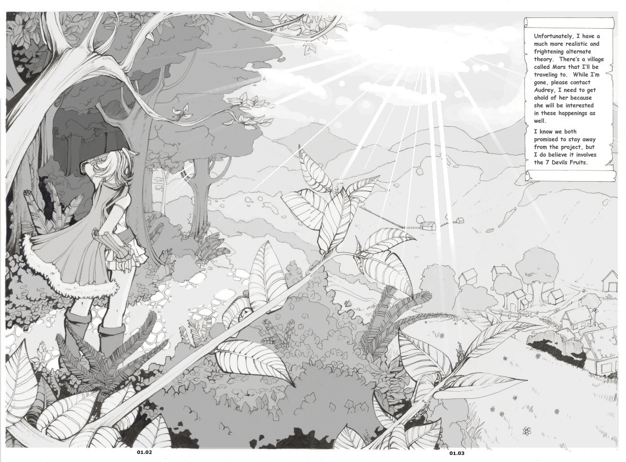
This concludes the 4 page "introduction" to the comic. The next page should have some actual dialogue. Once again, I hope the letter wasn't too vague. It was difficult to write because It had to be personal (it IS to her mother), but it had to be urgent (like she was in a hurry to leave), it had to explain the general premise of the story to the reader ( I wanted it to act as an intro for the whole comic, not just the first few scenes), but it couldn't give too much away. I hope I achieved that :3This was a pretty fast page, but I like it anyway. It was actually completely inked the same day I finished pages 2 and 3 (I just wanted to wait until they were DONE before I posed the next page :3 ) I like her hair, but its a good example of why I can't draw hands. Goodbye pretty leaves
") Now its town-scene time.
Now its town-scene time.
Related content


Comments: 51

Your so good at drawing x__X This looks so professional!
👍: 0 ⏩: 0

I love the way its simple with all the detail in the right places. If you ever have animation team please let me be on it heheh

👍: 0 ⏩: 1

I never plan to do animation :3 Its not my thing...
👍: 0 ⏩: 0

When will this come at as a manga? It has a amazing calm feelings, as a childish wind smiling back at us.
Only critique is that left eye is alittle higher up the the right eye (from my view), and maybe add some windows on the houses, looks like they are living in a shoebox XD.
I am never mean soo do never take my critique as a way to make you sad..^^
Also love the character design.. still strange that this is no published!
👍: 0 ⏩: 1
Nah I love crits :3 Thanks for taking the time to write long comments. I agree with what you said; but I don't really have any immidiate plans to publish it. I would if I knew I could keep up with some kind of schedule but I;m far too busy/lazy haha
👍: 0 ⏩: 1
Ha ha ha, I love lazy artists! I am one myself.. that is why none of my images are correct.. bah make correct anatomy.. takes effort.. no?
👍: 0 ⏩: 1
As long as you try. Idealy you should strive to make your best work, and I always do except when I'm in a rut. And I'm in a pretty big rut right now haha ;_;
👍: 0 ⏩: 1

Think the hand looks great! ")
Great illusion of depth in the background!
Two questions thou, I obviously need to read the script but non the less:
Why a split panel in the first?
Howcome we don’t see the mother in the big panel? Think it would place her in the scene!
Last panel is great! K.I.S.S principle working very well here!
👍: 0 ⏩: 1
The panel is split because its one of the little stylized things I do. I like introducing angles because it creates interest in a layout and its just... one of the little things I just do? I never realized I didn't have a good explination of it @_@'
The mother isn't in the scene. Its a bit difficult to explain, but its the daughter on her travel and in the background you can read the letter she's written to her mother about why she had to leave, thats all. Its kind of lame and I thought it made sense at the time :S
K.I.S.S.?
👍: 0 ⏩: 1
Cool! Usually tilted panels are to introduce pace or confrontation, direction of flow! The combination of a slanted horizon line and tilted panels bring about a very dramatic mood to the page, hence the reason the use break-through and triangular panels in fight scene usually!
K.I.S.S principle……. Keep It Simple Stupid! You can create “icons” with it that the viewer will remember eg. Like the kiss was applied in the nike, puma logo or like south park! Effective more than pretty! and it remains in the mind of the view, even know i still remember that panel clearly, more than the top ones!
👍: 0 ⏩: 1
Yea ok I get it. I especially think its important in detailed comics. If you make each of your panels all detailed and gorgeous your eye just gets totally lost and you loose flow. You need some boring negative space and simple panels to keep the flow and direction, too :3
👍: 0 ⏩: 1
I fully agree! Your work is very striking i dont really think viewers will have any complaints about the art!
Thanks for all the comments on my work, greatly appreciated!

👍: 0 ⏩: 0


wow this is stunning ;___; it looks VERY professional and clean!!
👍: 0 ⏩: 0

Just seen all pages. Your comic skills are amazing! I love the use of halftones and the panel layout is pretty much perfect. It's a great intro, it'd been cool to see the rest of it now
👍: 0 ⏩: 0

your comic project looks promising to say the least...  (Smile)")
👍: 0 ⏩: 1

im so in love with your inking skills~!!! hehehe. (you're probably really tired of me saying this).
what are you using to tone your pages?
👍: 0 ⏩: 0

I am very curios to see how you will manage to draw the town scenes. Your landscapes are wonderful and I hope to see as wonderful town scenes, too. The path looks so nice, it is only a little part of the whole image but it is made so nice that I have recognized it at first glance.
I don't think that there is something wrong with her hand, but it is possible that I don't 'see it
In general you are using soft toning, but I like that effect pretty much. Beautiful page and I can't await to see the town scenes on the following pages
👍: 0 ⏩: 0

and she stroles intot he village....
eeee.. whens the nexst one out?
^_^
👍: 0 ⏩: 0

It's absolutely gorgeous. As all of the pages before. I still think you can use a better font on that scroll but still.
she's a cute character. would you like it If I made a gift art for you of her?
👍: 0 ⏩: 1
Thanks that would be totally sweet :3 Except you don't know her colours (unless you meant B&W)
👍: 0 ⏩: 1
well, you'd rather have a colored one? I don't mind. do tell me the colors if you want to! I'd love to!
👍: 0 ⏩: 0

her hand is fine. It's her neck and jawline that are the problems. The neck seems too long and too thick with not enough taper to suggest a real human body. Also her jawline seems too angular (though it may be result of the neck)
However, they way this page was layed out is wonderful and I love the detail you put in the backgrounds-- you haven't done it yet be remember not to go too overboard with detail
👍: 0 ⏩: 1
I really appreciate you took the time to crit me, but unfortunately I have to once again disagree. Actually her neck is NOT "too thick" AT ALL. The average guys neck is almost as thick or as thick as the width of his face, and girls necks aren't much thinner. If you look at photographic evidence, even models have thicker necks then most people presume.
I try to stick a LITTLE to anatomy with my general proportions rather then comic art. I think its a good practice that most artists should also attempt more frequently.
(again, not an attack at you. Its a common misconception. Actually, her neck is TOO thin as it is. I was worried it was far too thin... I NEVER imagined getting a comment that said it was too thick.. never ever imagined I would...)
👍: 0 ⏩: 1
you're right that people's necks are pretty thick in proportion to their heads, but they also taper and get a little thinner from the shoulders up. The lines for your character's neck are almost parallel
👍: 0 ⏩: 1
Apparantly not everyones necks :S because I referenced my own when I drew her. I just ran upstairs and looked in the mirror again. My neck is perfectly straight except maybe widens a little right under my jaw (I don't have a terribly gorgrous underhang ;; ) Again, I respect your opinion and in SOME cases you're right. But my own anatomy tells me otherwise :3
👍: 0 ⏩: 1
ah yes. I forgot that we, as artists, tend to draw all people like ourselves (that's why all my characters have small hips and short chests)
can't wait to see your next pages though!
👍: 0 ⏩: 0


i love the backgrounds in this picture ^_^ very detailed!
👍: 0 ⏩: 0


Wow, I think I like your toned stuff even better than your colored stuff, that's possible... You must be incredibly patient to have all that detail in there... Great character design. I really can't find one wrong thing, right down to her perfectly-manicured nails ^_^
👍: 0 ⏩: 0

Omgosh wow! You comic pages are alll so detailed and pretty. You make my comic look like poo! XD I wish i knew how to ink like you cause all your inking is so pretty and they way you use tone makes your comic so original along with the great art. the details in the background, the leaves and such, are so wonderful. i dont even see this kind of detail in published store bought comics. I seriously think you should get the published when your finished. Because I would so love to buy it and im sure alot of other will too. You character design is awesome, I love her hair and her eyes are beautiful. You draw hands great, i dont see anything wrong with them. But then again you are alot more experianced than I am and spot flaws alot more than I do. But I really do love everything about your comic. I Letter to her mother is a great start for the comic and everything is very clear. I also really like the rock path and her cape. And the line weight really makes a diffrent in you comic. Thats why I wish i could Ink like you. If you have any pointers or tips i would glady take them^^ n e ways Everything is beautiful and very well done. nice and clean. Good luck on your next pages! Cant wait to read more!
👍: 0 ⏩: 1
Thanks so much for the lovely and lengthily comment :3 I was thinking about making a tutorial on inking and toning comics because a lot of people sound interested, but the truth is that there really isn't anything special about how I do it...
My tips on linear weights... is just to work with various pens. I usually use my super fine pen first (I don't know what brand mine is right now but its CRAP and keeps running out of ink so I have to shake it really hard every 3 seconds to get it flowing again ughhh), then go over it with a .5 staedler for the dark parts. I have a "fine" (no width given) black pen for the widest lines and then a rollerball thick blank ink for large dark parts. So I'd basically just suggest going back and drawing out the darkness and thickness of the lines with various thick pens :3
👍: 0 ⏩: 1
Oh! thanks for the tips! i still really think you should make some tutorials! only if you wanted to though. but im pretty sure ppl would get alot of help from them including me. Thanks alot!
👍: 0 ⏩: 0


This art is really great! you should think about getting it publshed!
👍: 0 ⏩: 1
Thank you for the comment :3 But I doubt I ever will.... I do art as a hobby, so its just something I do for fun :3
👍: 0 ⏩: 0

Nice Introduction. Everything looks very detailed. From the eyes, the leaves, and even the cape like thing that she's wearing. Okay, now I'm in learning mode: I'm just curious but how did you make the leaves have this dots-inside effect thing? And another thing to say...you may want to change the font on the letter if you want to make it look medieval/fantasy like :3. The signature's good though.
-Kaminaga
👍: 0 ⏩: 1
The "dots" effect is just a really cheap custom brush "dither" effect or something. It comes with almost all programmes (even my old PSP 5 :3 ) Someone else also suggested I use a different font, but I'm using my dad's computer (home from uni for the summer 
👍: 0 ⏩: 0


*_* i love her eyes, and the way the whole bg come out.. x3
i hope you'll post more page of this comic <3 seems interesting
Keep up teh good work ^_^
👍: 0 ⏩: 0

Wow, this is so pretty, i really like how you drw her hair, its so real O_o ... and God i wish i could draw hands that well!! @___@ her nails *dies* ... in the pannel behind her i really like the texture on the ground XD your extremly good with textures did ya know that ? and in the bottom panel i think you did an amazing job on the leaf's!! the only thing i would have changed is make the bg where the clouds are a little lighter >.> but thats just me!! XP overall this is some amazing toning and inking work!!!!
XOXOXO
👍: 0 ⏩: 0

beautiful face shot on the first/second panel, Kat!
👍: 0 ⏩: 0

Another amazing page of the comic
I have nothing to add to that, it's beautiful ^^
👍: 0 ⏩: 0


aaah, its so gorgeous! i love her face so much x_x <333 IRENESISHOTSTUFF.
👍: 0 ⏩: 0
