HOME | DD
 kitton — page 0101

Published: 2005-06-11 22:20:02 +0000 UTC; Views: 2698; Favourites: 24; Downloads: 763
Redirect to original
Description
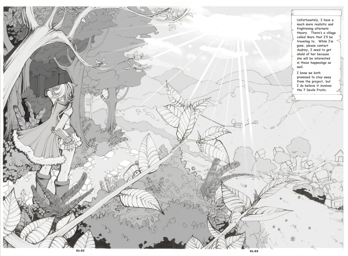
I apologize in advance for the lengthily description:Wow. So this is my first page of my old comic project redesigned. I worked on SO many pages for this comic before, but it really felt like the story wasn’t going anywhere. After thinking for a long time, I decided to revive it and for the first time ever-I decided to actually redraw a comic that I had already drawn. Then I was faced with the dilemma of how much I would change. I felt if I didn’t change enough, then I would feel bad for throwing years of work down the drain, however, if I changed it too much it didn’t make sense that I shouldn’t just start a brand new project. I decided to redesign two of the characters, and change the plot a little (I cut some of the slower chapters out. The pace in the script is a little fast, and quite daring, but I hope to adjust it as I go.)
Things I like:
My inclusion of a for ground (leaves and branches) as well as a background in the largest panel. The leaves themselves (I actually took a big chance by not closely referencing them, even though I have been studying trees and leaves recently just for this comic. I’m happy at how they turned out) My inclusion of dark spots. I once heard that a comic should ideally be 25% black, 25% gray, and 50% white. I think this is a bit absurd, personally, but I definitely agree that most comics don’t have NEAR enough black on them. Hence, the big black spot. Which also acts to draw you eyes down the page, and will also contrast the lighting (which will be more apparent when I have time to tone).
Things I don’t like:
The weakness of the structure. I don’t think your eye follows the page or the panels too terribly well. It also doesn’t quite have the boost I was hoping it to have (after all, first pages ARE first impressions) Her legs and some other small anatomical anomalies.
>>[link] (top left panel is the original first page of this comic. As you can see, I changed it around a lot as well as her design. But the concept is pretty much the same, as is the lettering.)
[edit]: Some tone added. I think I have to go darker in the background but I'm worried that its getting really gray and muddy. I almost liked just the inks more >>; anyway, please tell me what to fix before I finish.
[edit2:] SORRY for the resubmit
") Just changed the text, lightened the boxes and touched up some things. Its now considered "done".
Just changed the text, lightened the boxes and touched up some things. Its now considered "done".
Related content


Comments: 82


Like it. Legs are a little bit too big but that's actually no biggie. doesn't looks as something bothersome.
I sincerily think you can use a better font for the narration in the scroll.
I would say more contrast in the background (to focus in the road ahead by means of light) could help
Overall... Nice job still!
👍: 0 ⏩: 1

I was actually thinking about the font, too. I just don't really have any good fonts atm. If I get farther in this project, I will probably come back and rewrite some of the script (because that always seems a fault of mine) but moreso, its supposed to look like some kind of letter. Heh. I actually never thought of that ;___;
I think I am going to go ahead and make the background darker...
👍: 0 ⏩: 1
yeah! that'll be nice. you know a good font site is [link] for comics.
Artists tend to use gothic or roman fonts in such "scroll" narrations so you might want to give it a try if you think it's cool.
👍: 0 ⏩: 0

Oooooo it looks even better with the tones!! Woooow hehe. I would maybe make the boots like one shade lighter but unless that it looks awesome!
👍: 0 ⏩: 1
Actually thats really a good suggestion, and I hadn't thought of it before...
👍: 0 ⏩: 1

You left the art down to the smalledt leaves details!!! I am amazed... I would do a long comment, but I can´t... the clean lines, use of shadows and everythiong else... I can only left here my amazement.
Fantastic art, dear Kitton


👍: 0 ⏩: 0

When I compare this with the page you have drawn before I can surely say that you have made a huge progress in drawing comics. Everything is far more detailed and it also seems to be planed better. The panels are arranged better now. When I'm honest I would only recognize one thing that could be changed and this are, like you mentioned too, her legs. Her calfs seem to be a bit too thick, but that is it. Everything else seems to be fine how it is  (Wink)")
It looks even more awesome, after you have toned it, I would add some highlights on the leafs in the foreground, because they are nearer to the observer and so the lighting conditions could be more visible.
Such a beautiful comic page, I'm curios to see more of them 
👍: 0 ⏩: 1
Thanks so much for the lengthily and lovely comment, honey! (You need to update more yourself so I can return the favor!!!)
I agree that my pages look better, but at first I was worried that they weren't better ENOUGH to bother redoing it, so its really nice to hear, thank you. I WOULD totally agree with the forground leaves comment, except that the big dark shadow is also the leaves, so it doesn't make sense that the leaves right behind them would be light. Then I was thinking about adding some highlights to the grinds, but my pictures get really, really muddy because I overwork the shading. And its always a problem for me
👍: 0 ⏩: 1
You are welcome 
")
Right, I see what you mean with the leafs. I haven't try to tone an image until now so I'm unfortunately not able to give advice 
👍: 0 ⏩: 0

I like the choice of tones – very effective.
👍: 0 ⏩: 0

man oh man is it awesome! quite goregous!
great work!
~PV
👍: 0 ⏩: 0

I think that the overall comic page looks good. The proportions all look good. When she is looking up she seems a little strange looking so mabe you could fix that. And do you read this comic Japanese or American style? It looks like American. So it is readable and it seems exciting. Sorry I couldn't really critique this well. I think that this page looks fine. All you need is more comic shading.
👍: 0 ⏩: 0

oh I can't give tips at comics becuase I don't know any. :< but umm I think it looks pretty!
👍: 0 ⏩: 0

Wow.. That looks so good...
I can't find anything to critique here, probably 'cause I've never done any comic page ")
Very nice work

👍: 0 ⏩: 0

Love the background, especially the little stepping stones and all the detail on the leaves! I think chara's really lovely, the only crit I coul offer is that her forearm in the large panel is too short, and in the panel where she's looking ahead it's the opposite (her upper arm could use a little more length). As far as panelling goes, I think it's really good! I can follow the action quite well, but if you're looking to streamline, the small panel where she's seen from below might be a little damaging to the flow. You might want to replace it with a closeup of her face or something more...I don't know... revealing about what's going on in her head. (at first, when I looked at it, I didn't notice that she noticed something in that box) If you really want her to jump out, I'd suggest darkening her silhouette. (There's a hierarchy in line widths when you want something to appear more three-dimensional, if you want I can explain it more
👍: 0 ⏩: 1
Wow your comment was so nice and helpful :3 I haven't recieved such a crit from a fantastic comic artist such as yourself for a longgg time (OMG I still cehck your comics :3 and OMG they still aren't really being updated that much *gets out the whip* who said you could have a life??? kidding, of course 
Thanks for the comment on the details, thats what makes this take so long, but in my opinion also what makes it good. Hahaha, you're right about her arm, too. I was thinking about redrawing the little panel, but I actually think I'm going to leave it. It somehow makes it more like... shes turning from facing one way to another, and I just really wanted to tone the clouds :3 chu...
Yea I was already using an abusing line widths a LOT more, so I think it helped and I like the style a lot more.
HAHAH this character cannot hold her own, hopefully I will get to some pages soon that display how utterly useless and pathetic she is :3
👍: 0 ⏩: 1
Thanks!! Usually I'm just not all that talktative on the net, but I read your journal about how you liked in-depth crits, so I try to help out!  (Smile)")
Anyway, keep up the great work! I know I say this a lot, but I really really love your style! Can't wait to see what happens in this little comic of yours!
👍: 0 ⏩: 0

The first thing that jumped out at me on this was the beautifully detailed background. It is stunning and would look really beautiful with raindrops and dew settled on the leaves and grass.
That scroll looks totally awesome. It adds a nice look to the comic, and is something different from the usual.
To be honest, I didn't notice the black area until I completely read the descrition 
I didn't have any trouble following the page, even if I am someone who dislikes reading comics for that very thing.
The character's hairstyle is awesome, and her new outfit is really nice. I want boots like that ")
I don't know why, but perhaps make the lines a bit thicker. It makes the page more jumpy-outy like.
I hope you find my comment useful, and goodluck with the comic. I do look foward to seeing more, and the finished result of this page
👍: 0 ⏩: 1
Thanks for the lengthly comment <3 Yea her anatomy is generally a little off, but I decided I have to push for quantity over quality when it comes to comics, so I try my best.
👍: 0 ⏩: 1
Very welcome
Lol, yes, which is one reason I would never do a comic lolz
👍: 0 ⏩: 0

I love the detail in the leaves & her hair!^^
👍: 0 ⏩: 0


oh WOW! it's awesommeee! i love all the detail in the leaves and the trees and plants and things! wow! especially the mushrooms growing on one of the trees! haha such an awesome touch! i like the big black area, it does draw you down to the bottom/side panels, i can't wait to see this all shaded and toned up! eeek
👍: 0 ⏩: 0

I'm loving your improvement. I think having that stark black on one side is a little distracting, because it's the only place on the page where is shows up.. perhaps if it was evened out by darkening the forrest behind her?
I love the backgrounds, you get a very good feel for her environment, as well as the mood of the comic, and setting... though it's a little odd how her feet dissapear behind the leaf...
You've got something really good going here though, I'd love to see more!
👍: 0 ⏩: 0

well.. what can i say about the main cell... asides its amazing?
the detail, superb, everythings done with what is obvious a large amount of care, the scroll effect is great.
i mentally coloured t in as a vibrant forest scene, colours jumping out, but then again, i also mentally coloured as a dark, unforgiving place, both work..
still, gotta say, a worthwhile [fave]
👍: 0 ⏩: 0

oo, ni-ice! Don't mind about the structure. As long as it's coherent, do any crazy stuff you want! It gives some more spice to the comic.
👍: 0 ⏩: 0

I'm loving this! The background is very beautiful and the panel layout is looking good as well! Can't wait to see the final draft.
👍: 0 ⏩: 0
Wow!!! Great job D That's super cul. The girl's skirt is so pretty and I love her hair. Great job on your differents views and expressions. One thing though, the full body view of her, her legs look a tiny tiny bit too big, but it works! Makes her look strong *nod nod*
👍: 0 ⏩: 0

I folow the panels good, just I haven't read your old comic so I don't know whats going on >_>. Putting that aside, I like the way the ground came out. Wonderful job!
👍: 0 ⏩: 0