HOME | DD
 Koskish — Stigen

Published: 2011-03-15 18:06:53 +0000 UTC; Views: 458; Favourites: 4; Downloads: 14
Redirect to original
Description
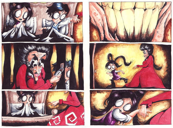
EDIT: Fixed a few things that people critiqued on. Now it looks a lot better. c:Title translates to 'The Path''.
Three-page comic that I plan on using for my application to that comic school.
As you can see I've based it around the story of Little Red Riding hood meeting the Big Bad Wolf who leads her off the path.
Somewhere in here is a rather controversial message that slipped in there by accident, mostly. I'm not going to say what it is, you'll have to look closer if you wanna see it.
This is based heavily around the song 'Pretty When You Cry' [link] by the group Vast.
I plan on putting in a swedish translation of the lyrics to the song for my final submission, but I'm not sure if I should now, since the message of this comic might be taken the wrong way, especially with the words of the lyrics being 'didn't wanna fuck you baby'. So yeah. I guess if I do it tastefully, cutting out the more vulgar parts.
Either way, I'm putting them here without lyrics, because I love how they look with no text.
Drawn in HB pencil, inked in India Ink and colored with Letraset Promarkers.
Characters in this comic belong to me.
Please do not use these pictures without my permission.
Related content


Comments: 9


the concept is so amazing*o*...and the art is just incredible
👍: 0 ⏩: 1

Thank you. I'm very happy with how this turned out myself. C:
👍: 0 ⏩: 0

This...this is dark, but cute! The style is very nice and clean, I do find it interesting that the man/puppet/creeper has such a dark menacing shadow, but the innocent Little Red is free of any sort of darkness. I like how obvious you've made her ignorance--or perhaps blindness?--by having her just disregard the blood on the trees, or the danger of a stranger taking you off the path. I like how creepy the wolf looks!! And I'd like to imagine that the face behind the mask is either super attractive or scary as hell~!
This deserves more views and more favorites, by the way :[
")
👍: 0 ⏩: 1
Thank you. I'm really happy you took the time to look at this and think about it. It really means a lot to me. c:
The comic is made to be taken any way you choose to interpret it, but when I did it, I had a rather controversial statement about pedophilia in mind. >A> But I'm really flattered that you read in your own things in to this! I really want to draw that Wolfman (as he's referred to in the notes for this XD) more often. I have some neat concepts for him. Possibly turn him in to one of my beloved monster designs.
I am so happy you like it, though! Thank you for the kind words!
👍: 0 ⏩: 1
Oh it was and is absolutely my pleasure~!
👍: 0 ⏩: 0

To start off, I loooooove the limited colour palette you've kept in this. It gets the mood across in a successful manner, and it also avoids making the pages look clustered with too many hues scattered about. The light blue and the wine red seem to contrast greatly with one another too, so I think the colour palette you chose was very successful. The panelling layout also flows in a wonderful manner, and my eye seems to read the whole comic without getting lost along the way.
As for any critiques I have on these pages, I feel as though the mysterious figure's posture and hand gesture in the 2nd page, on the large, open panel look rather odd or robotic. It's hard to fix this since you've already inked it unfortunately, but you can fix the appearance of his hand by inking and drawing the palm of his hand in. It looks non-existent in that panel since the several fingers seem bunched up together.
I'm also uncertain about you adding words to these panels. I personally like the impact and story-telling without the words, but if it's required in your portfolio, then add them. I don't know if choosing song lyrics for a portoflio piece is a good idea, considering it's copyrighted material, so if you DO add words, I would suggest to avoid lyrics. Possibly change the words a bit or juggle them around.
In the 4th open panel on the first page, the forest seems to be lacking depth. I think it's because it looks as though the row of trees is only in the front, and not IN the forest. To add that sense of depth, I'd suggest adding some silhouetted trees inbetween (just darker shades of gray) so it feels as though Red is going into the forest path.
Also, a last and final little detail, don't forget to add a little shadow to the lil Red girl! She is a figure after all, so she would have a shadow of some sort in each of the panels. Definitely not as big as the wolfman's, but still noticable.
Overall I'm loving the flow, subject matter, layout and colour for these pages, and I hope the presentation for these goes well in your portfolio.  (Smile)")

👍: 0 ⏩: 1
Hnnnnnghhh thank you.
and holy crap thank you for this honest comment! 8D
Yeah, I noticed that when I had inked it that he didn't look half as looming and intimidating as I wanted him to be. I feel a little stupid for not putting it down for a while before jumping in to inking. But I see what you mean with the hand, and I'll fix at least that.
Yeah, I thought it would be a cool idea to add words at first, but now that I see them next to each other like this, I don't think I should anymore. The lyrics just sounded really pretty in swedish in my head. But I've definitely decided against it by now. Thanks for the input anyway.
Yes, I see what you mean about the trees. I would so not have spotted that if you hadn't pointed it out, and I will most definitely add some more depth to it.
It actually has so much more shading IRL, but my faffing around in photoshop ruined that, I'll have to add some more shadows so that they don't get eaten up like that again.
And thanks again for the input, it was really valuable.
Hnnnnghhh. I hope this does well. I hope they don't read too much in to this and think I'm a total creep. <__>

👍: 0 ⏩: 1
You're welcome! Glad I could help!
And I don't think they'll think you're a creep. You're singing up for a comic school after all. Everyone is going to be weird if you're going into an arts program 8T
👍: 0 ⏩: 0