HOME | DD
 KP-ShadowSquirrel — It's Time To Welcome Autumn

Published: 2012-10-05 17:11:59 +0000 UTC; Views: 30128; Favourites: 2095; Downloads: 2603
Redirect to original
Description
(Autumn is such a strange word )
)Here are the recent Portraits as wallpaper versions (16:9 - 1920 x 1080): [link]
In case MediaFire doesn't suit you, here is an Imgur gallery with the wallpapers: [link]
Related content


Comments: 173

👍: 0 ⏩: 0

Overall
Vision
Originality
Technique
Impact
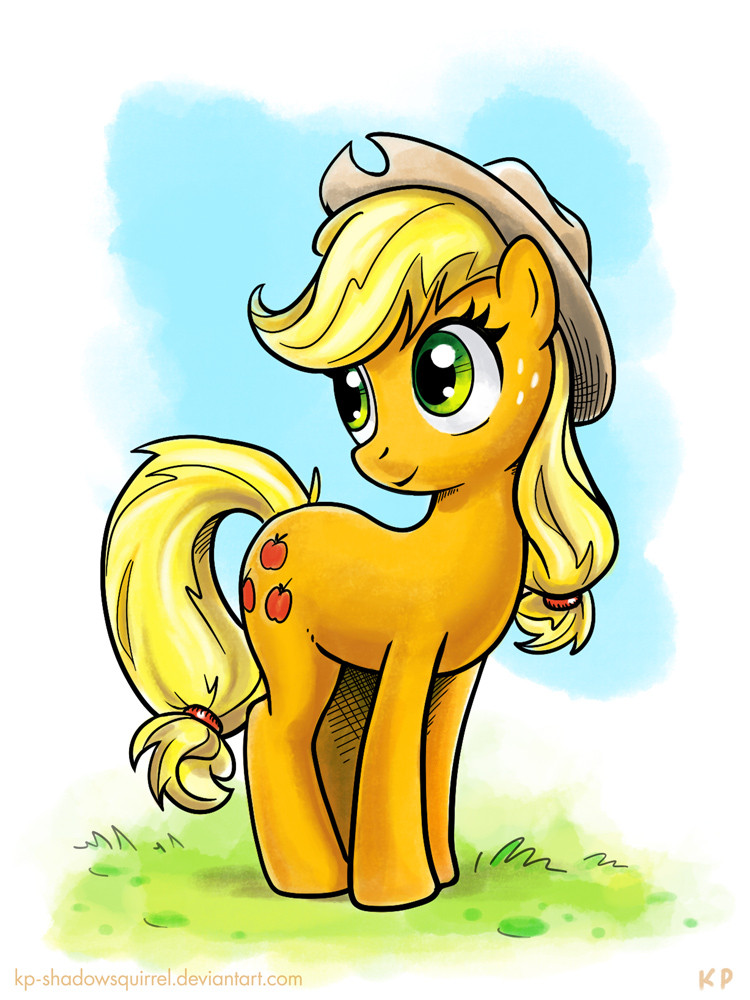
This wallpaper's coloring is pretty phenomenal. It is very colorful but at the same time does not have a mind-spinning mess or a poorly focused work that other people could end up creating if they used as many colors as you did. The backgrounds colors are all soft and doesn't distract.
Applejack's proportions might not be show-accurate as your proportions are much rounder than show-accuracy, but that's the very thing that still manages to keep them easy to relate to.
I cannot be entirely sure what level of realism you were aiming for, but here are some of my thoughts on the shading and lighting.
We can plainly see a yellow area on the top-right corner. Presumably, that's the sun so that should probably be the biggest light source here. It is positioned to Applejack's side, but the lighting on Applejack if anything suggests one in front of her; that's being a whole 90 degrees inaccurate. Not that it totally ruins the piece, but rather, it's a curious observation if you actually sat down and tried to analyze it.
As an earlier critique mentioned, Applejack also looks curiously shiny as the fur of a real horse doesn't create these sharp and strong highlights. You would need something very shiny and reflective, like water, to have fur that has highlights this strong. The placements of some of the highlights are even more strange as you've put them inside your shadows. I've observed that highlights are created by bouncing light like a mirror, so with that considered, it is impossible to have a highlight inside a shadow if both are created by the same light source.
With that in mind, they start looking like senseless specks of white stuff. There's also that little white spot overlapped by Applejack's right eye that seems to be an unecessary distraction. Little things like that just seems to take away from this piece.
Another tendency I notice is one I also have not yet understood. If you were to look at the bulbous part of AJ's lower mane, there's clearly a shadowed area, but the left edge has a lit part. What is lighting up that edge? I've seen a few people who also avoid shadowing the edges of a shape like what was done here, but I never completely understood why.
There are also a lot of really light lines that is sort of like outlines, except they're broken up quite a bit. That's also something I don't completely understand.
Overall, a great wallpaper, but with head-scratching lighting if you ever spent some time making sense of it.
👍: 0 ⏩: 1

Thank you very much for this critique
I'm happy that you like how the colors turned out.
You are right, I was not too concerned with the realism of the shading and the light sources (and the exaggerated shininess ")
The many seemingly random highlights are mostly just that - not entirely random of course - but they are not bound to a specific light sources. They are just an easy way to make her look shiny (and for some reason I seem to enjoy this effect...)
As for the light that comes form the other side - that's ambient light. Even if this part of the hair is not directly illuminated by the sun, it is still brightened by light that is reflected from the things that are behind it. (The effect may be exaggerated here though)
- Or there could just be another light source.
Anyway, adding additional light from the opposite side gives objects more volume where they might appear too flat otherwise.
The white outlines are an addition the the "shiny" effect - they are (loosely) placed either according to the light sources or wherever they help to emphasize a contour that might otherwise be too indistinct.
I'm not trying to justify any of the problems that you mentioned - I'm well aware that there is much to be learned and that many aspects of my artwork could be improved. So, thank you for giving me a few things to think about
👍: 0 ⏩: 1
You're probably right that the ambient lighting is a bit exaggerated. Reflected light will never be as strong as the main light source because really... think about it. If light will bounce from one surface reflected on to another, some light will be absorbed or scattered when it's reflected. That will never be as strong as the direct light source. Reflected light in general also appears to get pretty weak very quickly as you increase the distance.
👍: 0 ⏩: 1


Originality

(first ever Critique on DA so ill try my best not to me an ass ^^ although iv critic-ed a lot in my course so im not a total noob)
The shadeing and highlight are amazing. The depth and areas they have been put, they have clearly thought about the lighting and feel of the painting. As well as the edges having outer highlight lines, this really helps list the character of the page.
The thing that really struck out and amazed me was the effort in the small details, that have made the huge differences to this piece. The glaze on the eyes all those loos strands of hair. it really makes it stand out from other MLP Art work a heck of a lot.
The only downfall i can see with this is that she is a little too shiny, like she has just been hit by rain. Its still a lovely look and works well on the body and hair but it looks a little rubbery on her leather hat.
But as a howl a very impressive and outstanding piece of mlp art. that's probably why its the first one Iv ever gave a Critique on. e.deviantart.net/emoticons/s/s… " width="15" height="15" alt="
 (Smile)")
👍: 0 ⏩: 1
Thank you very much for this critique
👍: 0 ⏩: 1
Np I hope it was a good one
 (Wink)")
👍: 0 ⏩: 0


No offense but a lot of your art work looks like the ponies are made of plastic. XD
👍: 0 ⏩: 1
It isn't a problem, it looks cool. Your art work is great, so I'm gonna +Watch you.
👍: 0 ⏩: 0


Hey there! do you happen to do requests? if not it's fine but if you do that'd be 20% cooler! ^-^
👍: 0 ⏩: 1
I'm sorry, but I don't do requests.
👍: 0 ⏩: 1
It's totally fine! just keep up the good work!
👍: 0 ⏩: 1


YOU ARE WELCOME ^.^
👍: 0 ⏩: 0

Applejack seems really happy here, I wouldn't have it any other way.
👍: 0 ⏩: 0


Her Mane is like Golden River, her Eyes are like two large Emeralds, and her Face and Smile are incredibly adorable and gorgeous!!!!
👍: 0 ⏩: 0


This is such an adorable picture of Applejack, she just looks so happy! I adore the expression and her pretty eyes... it's so shiny as well!

👍: 0 ⏩: 1
Thank you - I'm so happy that you like this image
👍: 0 ⏩: 1
I definitely do! And you're very welcome, my pleasure!
👍: 0 ⏩: 0

so Awesome!
this portraits of your! you made them so quick! your incredible!!
👍: 0 ⏩: 0


woah the shading on this one is really well done! the shading of the eyes were done beautifully, the expression was adorable, and the color scheme with the background and the character matched perfectly *u* Keep up the good work! can't wait to see some future work from you.
👍: 0 ⏩: 1
Thank you - I'm happy that you like this portrait
👍: 0 ⏩: 1
No problem! Keep up the great work!
👍: 0 ⏩: 0


Autumn is a strange word, maybe that's why a lot of people refer to the season as "Fall". At least "fall" makes sense what with the leaves falling and what not, but I think the word "autumn" makes the season unique.
What can I say here? My favorite mane 6 pony paired with my favorite season...win, win? In all seriousness I think you did a great job with bringing AJ to life, the bright colors and shading make her stand out aganist the darker background.
👍: 0 ⏩: 1
Thank you, I'm happy that you like how AJ and especially the colors turned out
👍: 0 ⏩: 0

Autumn
Autumn
Autumn
Autumn
...
It IS a strange word. @_@
👍: 0 ⏩: 0

they call it
The run of the leaves !!!
and 6 months laters, they call it
winter warp up!!!
that excluding summer and winter, their season changes
")
👍: 0 ⏩: 0

Applejack: Thank y'all kindly for drawing this here pic of me! I look soooooo cute!
👍: 0 ⏩: 1
| Next =>