HOME | DD

krazytim β€” KrazyPlayer v2 Series

Published: 2007-07-11 22:20:22 +0000 UTC; Views: 5093; Favourites: 36; Downloads: 212
Redirect to original
Description Read Me: This is a deviation submitted under my old account (krazytim). My new account (timsilva) is here: [link] - Please watch my new account.

Do not make comments or add this deviation to your favorites. Instead, go to the mirrored version of this deviation here: [link]

----------

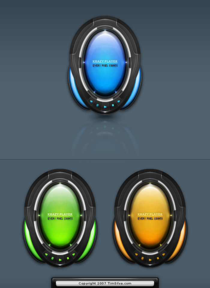
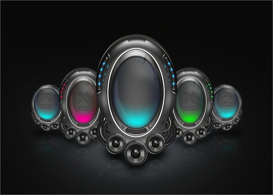
Just a concept player. I might code it but I wouldn't count on it. This was really just for fun. There are hundreds of layers for all the little details in each one of these suckers. Personally I think the blue is the best by far, but I liked the others and kept them

Comments and Favs are greatly appreciated
Related content
Comments: 84

emiKs [2007-07-12 07:56:32 +0000 UTC]

1337

πŸ‘: 0 ⏩: 1

krazytim In reply to emiKs [2007-07-12 09:59:27 +0000 UTC]

lol, thanks bro (& for the +fav also)

πŸ‘: 0 ⏩: 1

emiKs In reply to krazytim [2007-07-12 10:38:42 +0000 UTC]

no prob dude love it!

πŸ‘: 0 ⏩: 0

depthdesign In reply to ??? [2007-07-12 06:50:14 +0000 UTC]

real good!! +fav

πŸ‘: 0 ⏩: 1

krazytim In reply to depthdesign [2007-07-12 09:59:00 +0000 UTC]

Awesome Thanks a bunch for the +fav too

πŸ‘: 0 ⏩: 1

depthdesign In reply to krazytim [2007-07-12 17:25:12 +0000 UTC]

hehe, my pleasure!

πŸ‘: 0 ⏩: 0

Carl06 [2007-07-12 04:29:32 +0000 UTC]

cool conecpt dude

πŸ‘: 0 ⏩: 1

krazytim In reply to Carl06 [2007-07-12 05:03:42 +0000 UTC]

Thanks carl

πŸ‘: 0 ⏩: 0

shattereddesigns07 [2007-07-12 03:35:05 +0000 UTC]

this is awesome. orange is my fav!

πŸ‘: 0 ⏩: 1

krazytim In reply to shattereddesigns07 [2007-07-12 05:03:30 +0000 UTC]

Thank you I like orange too

πŸ‘: 0 ⏩: 0

LiDiL [2007-07-12 03:27:18 +0000 UTC]

I love them all!! awesome job

πŸ‘: 0 ⏩: 1

krazytim In reply to LiDiL [2007-07-12 05:03:09 +0000 UTC]

Thanks

πŸ‘: 0 ⏩: 0

gabrielaboone In reply to ??? [2007-07-12 00:57:33 +0000 UTC]

nice colors Where is pink?

πŸ‘: 0 ⏩: 1

krazytim In reply to gabrielaboone [2007-07-12 02:16:40 +0000 UTC]

lol I could have made a bunch more, but these are my 3 favorite colors for screens/orbs.

πŸ‘: 0 ⏩: 1

gabrielaboone In reply to krazytim [2007-07-12 02:21:44 +0000 UTC]

hehe, coolies

πŸ‘: 0 ⏩: 0

vica [2007-07-12 00:55:21 +0000 UTC]

Looks great, with all the display area in the middle you'll have to pull out your best GUI skills to make it not only fit well and be functional but also do the area justice.

Good luck

πŸ‘: 0 ⏩: 1

krazytim In reply to vica [2007-07-12 02:15:37 +0000 UTC]

lol, very inspiring Thanks

If I do code it, I think I could fit everything in there. I know I could make it happen w/ flash, but I want to start on something new, I like designing these, not making them work

πŸ‘: 0 ⏩: 0

xfragg3r [2007-07-11 23:58:45 +0000 UTC]

really great dude!

surely one of your best


keep up good work

πŸ‘: 0 ⏩: 1

krazytim In reply to xfragg3r [2007-07-12 02:15:48 +0000 UTC]

Thanks bud I had a lot of fun w/ this one.

πŸ‘: 0 ⏩: 0

JoeyS In reply to ??? [2007-07-11 23:49:57 +0000 UTC]

I like the blue one but you know my comments from TDA.
Would love to see i coded for winamp!

πŸ‘: 0 ⏩: 1

krazytim In reply to JoeyS [2007-07-11 23:54:45 +0000 UTC]

Thanks

I might code it, it would take time to learn tho.

πŸ‘: 0 ⏩: 0

celerayted In reply to ??? [2007-07-11 23:33:33 +0000 UTC]

ye the blue one is nice
especially the lights and shines

πŸ‘: 0 ⏩: 1

krazytim In reply to celerayted [2007-07-11 23:54:13 +0000 UTC]

Thanks, I put a lot of work into the little details

πŸ‘: 0 ⏩: 0

alexdesigns In reply to ??? [2007-07-11 23:09:24 +0000 UTC]

yep the blue one is my fav too
goo work tim

πŸ‘: 0 ⏩: 1

krazytim In reply to alexdesigns [2007-07-11 23:53:50 +0000 UTC]

Thanks alex, I like the blue as well

πŸ‘: 0 ⏩: 0

Dutch-Mp3 In reply to ??? [2007-07-11 23:01:27 +0000 UTC]

nice nice nice i think the blue one is the best

πŸ‘: 0 ⏩: 1

krazytim In reply to Dutch-Mp3 [2007-07-11 23:53:31 +0000 UTC]

I agree I like the green alot tho

πŸ‘: 0 ⏩: 1

Dutch-Mp3 In reply to krazytim [2007-07-12 08:34:39 +0000 UTC]

yea. but not the Yellow/orrange one

πŸ‘: 0 ⏩: 0

pogga In reply to ??? [2007-07-11 22:52:48 +0000 UTC]

very good

πŸ‘: 0 ⏩: 1

krazytim In reply to pogga [2007-07-11 23:53:19 +0000 UTC]

I hoped so

πŸ‘: 0 ⏩: 0

Scott-Kane In reply to ??? [2007-07-11 22:39:24 +0000 UTC]

nice

πŸ‘: 0 ⏩: 1

krazytim In reply to Scott-Kane [2007-07-11 22:45:48 +0000 UTC]

ty

πŸ‘: 0 ⏩: 0

ZeroniX-Designs In reply to ??? [2007-07-11 22:22:55 +0000 UTC]

Miss a bit depth in them (maybe better with a very smooth outher glow) but i really like them.
But as told on TDA - i love the orange version but itΒ΄s icons are too pixeled.
Remove this with a small inner glow

πŸ‘: 0 ⏩: 1

krazytim In reply to ZeroniX-Designs [2007-07-11 22:44:08 +0000 UTC]

lol, gotcha ty

πŸ‘: 0 ⏩: 0


<= Prev |