HOME | DD
 krazytim — de3 Concept
Published: 2006-12-27 16:14:06 +0000 UTC; Views: 3343; Favourites: 20; Downloads: 91
Redirect to original
Description
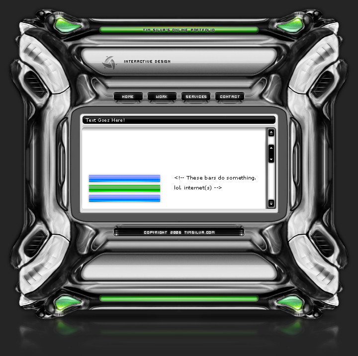
Read Me: This is a deviation submitted under my old account (krazytim). My new account (timsilva) is here: [link] - Please watch my new account.Do not make comments or add this deviation to your favorites. Instead, go to the mirrored version of this deviation here: [link]
----------
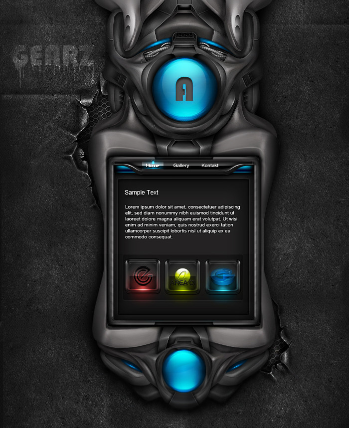
k.
I was gunna use it for my next portfolio site, but I still want to develop my brushing skills alot more. Inspirations... kinda obvious imo.
 (Wink)")
Related content


Comments: 53

very amazing work  (Smile)")

👍: 0 ⏩: 0


Well, if you go the the mished.net forums you might be able to find the one Jeff made. I started off brushing based off his tutorial.
👍: 0 ⏩: 0
pixel3 [2007-01-19 18:34:53 +0000 UTC]
i really think pixel fonts should be used in moderation, but the layout looks good.
check out dafont.com and spend 20 minutes there, it's worth while man. I used to use pixel fonts all the time on all my layouts, then i discovered how many fonts there are out there.
hope u don't take this the wrong way, just trying to help ")
👍: 0 ⏩: 1
Ya, i've been there before, I'll bookmark it and start exploring a bit. It's all good, I take comments as constructive critisism always.
👍: 0 ⏩: 0

looks good bro, the only Inspiration i see is the middle content box.
👍: 0 ⏩: 1
Yup, Jeff.
Mainly DemonDan though... My results are different than I intend them to be lately.
👍: 0 ⏩: 0


Looks very good , one of your best designs so far.
👍: 0 ⏩: 1

I kinda didn't like the original shapes so it made it hard to work with, but I've got a much more defined process for next time. Thanks for helping me out w/ this one.
👍: 0 ⏩: 0


the brushing is ok , but i know you will do better , btw good to see jimmy's vent tut in effect ..lol
👍: 0 ⏩: 1
Thanks, I am getting better.
Ya, I had an empty vent on there and I wanted to fill it in w/ something cool. The lines are simple but effective.
👍: 0 ⏩: 1
i agree a very good touch , i hope to try my hand at brushing templates soon, when i get some time freed up ..... aghhhhhhhhhhh too many client works. ( sob )
👍: 0 ⏩: 0

looks good ^^
you can good brushing
what was the worktime?
i think 3 houers ")
👍: 0 ⏩: 1
Not too sure, I worked on it over a week or so on and off. Probably somewhere around 4. I spend alot of time staring at it trying to find the parts that suck.
👍: 0 ⏩: 0

I'm slowly getting better at it.
👍: 0 ⏩: 0


Nice layout, but you can add some highlights in some areas to make them appear to be more 3d
👍: 0 ⏩: 1
Ya, it looks a little flat still, but I wanted to start a new layout anyways, I lose interest in most of them after looking at them for so long.
👍: 0 ⏩: 1

Your layouts are always soooo small in width.
Remember, you can Flash in 100% aswell
Anyways, i love the silver work you made on this layout.
Great work!
👍: 0 ⏩: 1
Ya, I want to try to break the habbit, but I never can. I just like really thin and sleek layouts. Thanks alot
👍: 0 ⏩: 0


Thanks, I am getting much faster at it too.
👍: 0 ⏩: 0
| Next =>