HOME | DD
 Krovash — Spectator
Published: 2012-05-10 19:02:04 +0000 UTC; Views: 1933; Favourites: 82; Downloads: 29
Redirect to original
Description
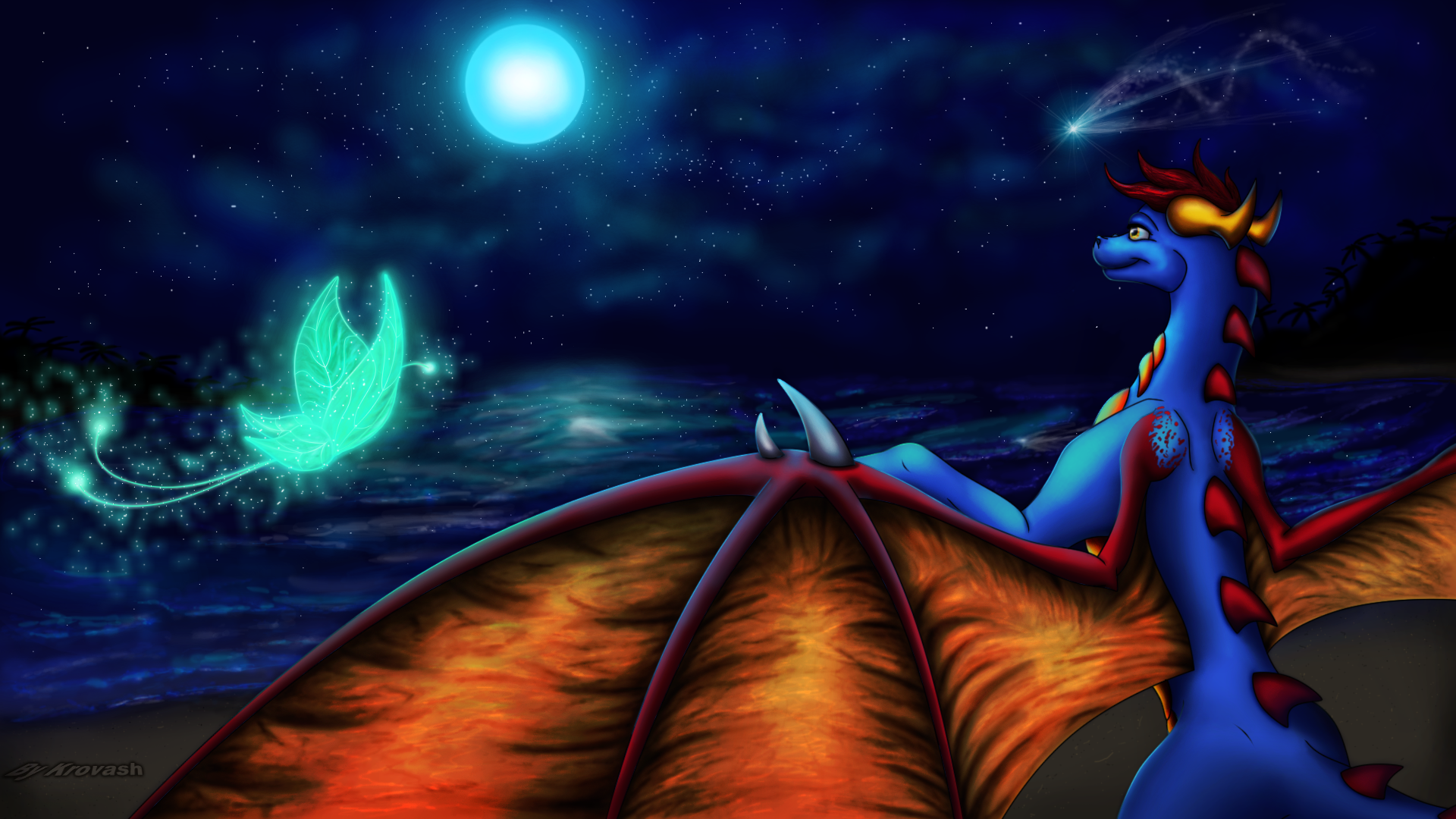
I drew Tau, just like that")
Ok i just wanted to practice and i must say that this artwork was a quick one, i spent around 12-14 hours on it.
I was mainly inspired by these two pictures
I really liked the background in the first picture and i wanted to increase my water drawing skills. And the second picture astonished me with those butterflies, they're so awesome
 So i went on and drew my own one (spent 2 hours on it) and wow it looks great!
 Originally i wanted to draw 3 characters in here, but i just couldn't find a place or a fitting pose for the other 2, so i decided to leave just Tau here... and I really can't say that i like the bg here that much...i think i failed miserably...especially with the reflection of the moon in the water, it looks so awfull
Well anyway, enjoy this if it's possible
Fullview/Download for details
Tau (c)
Art (c) Me
Related content


Comments: 48

This picture looks so magical, with the stars and the reflections of the water ripples. Tau's pose looks majestic! The butterfly flying through the scene looks fitting, as it matches the moon colour and the general cool-colour tone of the picture overall.
The main subjects of interest (Tau and the Butterfly) are positioned good, in accordance with the Rule of Thirds [link] . The butterfly is located a third of the way across the picture, and Tau is located two-thirds of the way across the page, which makes the picture look well-composed.
I like what you've done with the wing membrane. It looks quite detailed and makes it look like the membrane has a texture. ^^
Good job!
👍: 0 ⏩: 1

Wish i got more detailed comments like this one, and not just a one word ones... Honestly i didn't even think about rules or enything, i just drew it. That is what i find interesting about drawing, you follow the rules without even knowing it. Thanks for that critique, i really love it when people take their time and analyze my artwork
 (Wink)")
👍: 0 ⏩: 1
You're welcome!  (Smile)")
")
Yeah, I guess most of us subconciously follow rules on how to arrange a picture to make it appealing to viewers, while we're drawing.
👍: 0 ⏩: 1
Yeah those comments are tiring to read. And sometimes when i draw i just think something like: "Oh i think i'll put this here, becaaaaaaaaause i want it there" lol.
👍: 0 ⏩: 0

I didn't comment on this picture yet?! Ahh humbug, looks good.
👍: 0 ⏩: 1
Haha, you took your time
👍: 0 ⏩: 0

this cool and love the color. nice work my friends
👍: 0 ⏩: 1
Thanks a lot
Hey, didn't see you for a long time
👍: 0 ⏩: 1
you're welcome my friends, yeah still busy with a real life but I spent my time back to dA
👍: 0 ⏩: 1
Yeah i understand, real life is always placed on top of other things.
Thanks, i try my best :3
👍: 0 ⏩: 1
👍: 0 ⏩: 0

ОБОЖЕ!!!! ЭТО ПРОСТО ОБАЛДЕННЫЙ РИСУНОК! И фон и сама Тау просто с ума сводят! Вода смотрится просто волшебно! Как ты так здорово звезду нарисовал я до сих пор не поймулибо же приблизительно представляю как её нарисовать, однако же у меня выйдет не так, как здесь) Бабочка очень классно смотрится и Тау... Тау шикарна Её мордочка так хорошо смотрится*0* И крылья, и плавные переливы просто радуют глаз
Блин, ну и прогрессище у тебя)
👍: 0 ⏩: 1
Ну со звездой все просто, круглая кисть с низкой прозрачностью и потом поверх я нанес специальной кистью эффект блеска, далее только коррекция цветов.
Я смотрю только одного меня в этой картинке крылья не очень устраивают. Точнее они меня всегда не устраивают, а всем нравится...на ладно, с этим ниче не поделаешь
В принципе в рисунке ничего необычного не вижу. Я больше всего доволен бабочкой если честно...2 часа на неё потратил
Насчет прогрессища не знаю, у меня до сих пор проблемы с набросками, все достаточно кривовато выходит, в итоге просижываю весь день только над наброском...

👍: 0 ⏩: 1
Понятн)) Надо будет попробовать
Ну, мы же не понимаем, каково на самом деле. Вот если б знали, какими крылья должны быть... А так нас всё устраивает!
Ну бабочка, а Тау? Она ведь тоже хороша!))... Хотяяяя, бабочка действительно впечатляет!
С набросками тоже надо работать) Впринципе правильно делаешь, я тоже постоянно над ними работаю, это развивает точность линий и динамику в позах, да и просто от этого получаю удовольствие))
👍: 0 ⏩: 0

"ООХХХ " <- такая реакция у меня была, когда я увидела это у себя в оповещениях;;; омг омг омгмо ОМГ 
*^* wowowwowowowowow
;;;;;;;;;;
Прогрессируешь с каждым рисунком *^* Сразу зацепило освещение/атмосфера, если можно так сказать, ну вот нравятся мне такие волшебные ночные сцены *u* я могу бесконечно долго перечислять, как мне здесь все нравится: крылья, комета, звезды, бабочка, ВОДА ОМГ
*^* а каких ещё двоих ты хотел нарисовать, если не секрет?
и what 
;www; Превосходная работа, Спасибо огромное!! 


👍: 0 ⏩: 1
У меня почему-то ночные сцены лучше получается рисовать, чем дневные
По поводу ещё двоих: я изначально хотел изобразить всю вашу троицу: Тау, Асин, Скай. В итоге я нарисовал Тау, а потом просто не смог придумать занятие остальным персонажам...подумал, что нарисую задник и после этого попробую ещё раз, но в итоге персонажи занимали большую часть работы и заднего фона практически не было видно. В итоге остальных пришлось вырезать. Даже название картинки от старой задумки, Тау должна была наблюдать за действиями двоих...
У меня ещё остался набросок Скай'а в позе Come at me Bro, возможно попозже выложу законченную работу с ним. Вода мне понравилась в картинке у Шримп тем, что она очень плавно переходит из синего цвета в прозрачность, у меня здесь это не везде вышло, этим и не доволен, вот
И блин, гиганский коммент , рад что тебе понравилось
👍: 0 ⏩: 0

Растешь
👍: 0 ⏩: 1
Меня перепонки здесь бесят честно говоря, вроде детализированны более-менее, но они выглядят мерзковато, хочется чтобы они более аккуратными были, менее скомканными, но в итоге выходит каждый раз вот так... И бабочка действительно вне комментариев, затратил на неё 2 часа и очень доволен результатом
👍: 0 ⏩: 1
Хм, а попробуй в следующем арте самые темные линии сделать не по всей перепонке, только на местах перегибов пальцев, чтобы избежать "скомканности", хотя я сама каждый раз хз как их рисовать.
👍: 0 ⏩: 1
Надо будет попробовать, тут проблема в том, чтобы сделать очень плавные и мягкие тени в таком случае...здесь просто мазюкаю рандомно и получается, а там уже более осознанно придется работать с кистью.
👍: 0 ⏩: 0

I don't know what you're complaining about, it looks very nice C:
As always I love the shading and her wing membranes look really realistic. And the butterfly is just so fucking awesome I love glowing things 8'C
The background looks decent, too. I love the ripples at the shore. The reflection of the moon could've been better, but it looks nice this way too :3
And you're getting faster at drawing! Not to mention better >3>
👍: 0 ⏩: 1
Thanks
And well i bitch about stuff cause other way i won't get better at drawing... When i bitch about something it makes it harder for me to forget, so i never forget what i should improve on. That moon reflection looks too blurry, i'd like to make it better but i just couldn't pull it off for some reason. And yes i'm very glad it goes faster and faster, at least now i enjoy it a lot more than ever.
👍: 0 ⏩: 1
Enjoying is one of the main parts in drawing
👍: 0 ⏩: 0

Speak American language damn it: "Dose wings!"
Although those wings give me a feeling they're not detailed enough...and i don't know how i can improve with drawing them
👍: 0 ⏩: 1

Those Wings..... lulz.....
Hmmmm.... have you thought of adding scars, cuts, or bruises anywhere on their body?
👍: 0 ⏩: 1
Not for this dragoness, she doesn't havy any in the original design...
👍: 0 ⏩: 0

Awesome dragon and beautiful backgroun! You did an epic job there, well done!
👍: 0 ⏩: 1
Thanks a lot, it was a lot of fun to draw
👍: 0 ⏩: 0


Thanks
👍: 0 ⏩: 0

I can see that you're getting better. You realizing what you like and don't like about your art helps you improve your personal style of art, which is a good thing.
👍: 0 ⏩: 1
Well i always realised what i like and dislike about my art, it's just me not always stating the fact what i like about the picture and what i don't, but i always keep it in my head. Right now i'm mostly focusing on the speed. A month ago i spent 2 months on a gift picture...then i spent 2 weeks (24+ hours) on a picture, and with this one i spent just 6 days (12-14hrs) to draw.
👍: 0 ⏩: 1
Yeah .. it's really a matter of focus for your art.
Sometimes it's easy to get side tracked and forget art.
👍: 0 ⏩: 0

Wow realy awesome, like the many lightning effects, the stars and the water are realy pretty, and Tau also looks awesome, like the wings, good job
👍: 0 ⏩: 1
Hmm i think i did horrible on highlighting the character...it should have more gradations of blue, in other words - softer color transition. The wings are really strange...i feel the lack of detail, but i really have no idea how can i make them prettier...
Glad that you like it anyway, good to know someone likes my work when i'm not as pleased with it as i'd like to ^_^
👍: 0 ⏩: 1
lol, I wish I could do such things, highlighting is a pain for me, I have no idea where to place highlights or how
👍: 0 ⏩: 1
Well here is a theory i use for myself when highlighting: lineart the character, then flat color it, after that forget about the character and draw a background, when finished with the background you will have your light source in the scene so you just use highlight the areas of a character that are closest to the light source using the color of the light source itself. I don't see why people find coloring hard, it's a lot easier than sketching and linearting...at least for me.
👍: 0 ⏩: 1
thats the second problem - BGs xD
but I will try this next time, thanks for tip
👍: 0 ⏩: 0

Thanks, although i wish it was more beautiful
👍: 0 ⏩: 1
That's cool, candy = awesome :3
👍: 0 ⏩: 1