HOME | DD
 kuma-x — TutorialsClub CSS Journal

Published: 2010-08-31 12:29:26 +0000 UTC; Views: 5115; Favourites: 42; Downloads: 69
Redirect to original
Description
The CSS skin was created exclusively for the #TutorialsClub .
(The .zip file is password protected and anybody else than #TutorialsClub is not authorised to use the skin.)
_____________
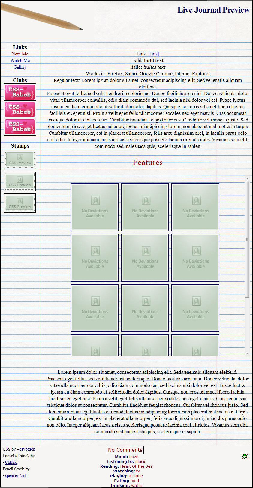
The main theme of the design is blueprint.
I hope it's obvious the connection between instructions on blueprint and tutorials.  (Smile)")
To make the skin more clean I removed "eating-drinking" module,
because it only eats space on page and seriously nobody cares what admin has for the dinner..
In live version you can see nice hover/push effect on menu buttons
and on comments link and you could see the true colors of link text.
The menu could be simply removed.
Just go and look at the live version! (link down the page)
*************
The AVATAR for the group.
*************
The STAMP for the group.
*************
LIVE VERSION OF CSS HERE!
*************
How it could looks like:
*************
CREDITSThe logo, buttons, wood textures and all other pictures used in the design they are my own work created in Ps CS4.
(Tutorial thumbs was randomly chosen from TutorialsClub gallery. If anyone don't want his tut there, leave a message and I'll remove it.  (Wink)")
Related content


Comments: 15

Congrats on contest. I already knew you would win

👍: 0 ⏩: 1


Wow, I really love your design! The avatar, the stamp, AND the journal skin. They all look so professional, very clean cut and I LOVE the blueprint theme. You've got my vote.
Good luck with the contest, I hope you win!


👍: 0 ⏩: 1

Thank you for the nice comment!
👍: 0 ⏩: 0

Really an epic design I voted for you too but I would consider making the icons smaller, more space between them and a little more space between font and icon. Moreover I would lower the icons in total a little more from the banner they stick too much together.
👍: 0 ⏩: 2
Thank you very much for the constructive critique!
In my very first design I made the icons smaller, but the white lines was not so clear so I made it bigger for better contrast. I agree there's not much space between the icons, if the design wins I will change it.
👍: 0 ⏩: 1
You are so welcome and for such a masterpiece you realy deserved to get a critique! Alright! Was it hard to make it? *wants to make her own one day if she ever gets a subscription* Hm yeah in the live version it looks a lot better! Moreover I am glad that you accepted my critique! ^^
👍: 0 ⏩: 1
I allways appreciate critique because it shows me that someone really thinks about my work. 
It was not hard to design it for me it was more fun in Ps.. I love it. ")
 (Cool)")
👍: 0 ⏩: 1
Yeah I truly did because that journal skin was so epic! ^^
Yeah you are right!!
👍: 0 ⏩: 0

Thank you!
I appreciate it!
Happy you like it!
👍: 0 ⏩: 1

