HOME | DD
 KVirtanen — DIXYU SEICI 0.1b (TrueType font)

Published: 2012-09-24 18:36:13 +0000 UTC; Views: 4060; Favourites: 27; Downloads: 138
Redirect to original
Description
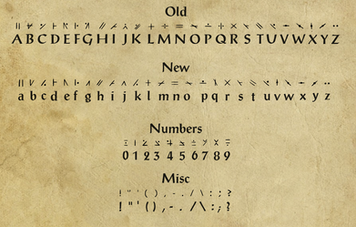
This is the new font used in the latest Sceistian Grammar Reference fav.me/d4smk3rDixyu seici means "the rational alphabet", but a lot of irrational love has been poured onto making this font —
maybe a few tears too
This is a very early version of a new script style font used in an imaginary language called Sceistian (name changed 11/2011, for more see: kvirtanen.deviantart.com/art/S… ).
Its appearance borrows characteristics from Japanese, Chinese, Devanāgarī, Arabic and Hebrew script, and last, but not least, the Latin alphabet. The pronunciation and grammar (which certainly isn't by any means completely covered here) is a mix of Japanese, Latin, French, Finnish, English, Italian, Slavic languages and Greek.
This font is freeware and can be distributed as long as it stays together with the included text file. I would love to hear if the font is being used somewhere or, even better, to see the results.
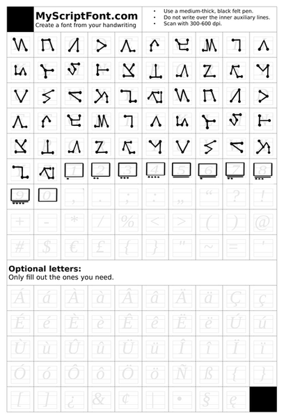
See the 3-stage process here:
1: fav.me/d52c7aj 2: fav.me/d54ih0h 3: fav.me/d5fv77a
(you can open them in separate tabs for comparison)
Other Sceistian-related stuff:
sceistia.tk/ ← WEBSITE
fav.me/d4smks3 ← BINDING GUIDE FOR THE REFERENCE BOOK
fav.me/d4smk3r ← REQUIRED PDF FILE
CHANGELOG
2012-09-24
- INITIAL RELEASE
Related content
Comments: 15

Great work! Beautiful characters, very well designed, and the presentation is pretty neat too!
👍: 0 ⏩: 1

This is truly amazing. I've never seen a conlang font so lovingly built, much less one with such technical precision. Usually the hinting on conlang fonts turns out awful, and I was particularly impressed to see that the thin diagonal and vertical strokes remain legible at regular body sizes. Have you thought about trying OpenType features like automatic ligatures? How long did it take you to put this together?
👍: 0 ⏩: 1

Hi there, and thank you so much for the feedback 
As for ligatures, I'm currently compensating for them with a large amount of kerning pairs that tie some of the characters closely together (like in the writing example at the bottom). But it would be a lot nicer to have them specifically made for this script.
👍: 0 ⏩: 1

I've heard a lot of good things about FontLab ; it appears to be ubiquitous among professional typographers, although the pricetag puts it on par with Photoshop. Its contemporaries are FontMaster (also pricey) and the open-source FontForge , which has its own inconveniences as the newest versions have to be compiled. And there's a tutorial here .
👍: 0 ⏩: 1

Wow, thanks! I'll look into them for sure.
👍: 0 ⏩: 0

Pretty script. I like how you've handled capital letters.
👍: 0 ⏩: 1

Yes, well, partly, because that's just in this particular style; the 'ideal' characters I have in the 3rd draft ([link] ) for these letters can be drawn in many stroke styles. I've been meaning to make a more free, hand-written version of them at some point, which will look less 'hebrewish'.
👍: 0 ⏩: 0

I really like the look of it, and how clearly and neatly you've laid out the file.
👍: 0 ⏩: 1

Glad to hear that; thanks for the feedback ...!
👍: 0 ⏩: 1


