HOME | DD
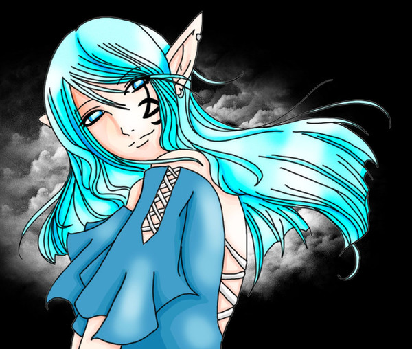
 KyraShangea — Delicate - Colored v.2
Published: 2007-12-12 05:21:45 +0000 UTC; Views: 1622; Favourites: 34; Downloads: 12
Redirect to original
Description
Story: End of the WorldCharacter Name: Kyra Shangea
Edit: Critique the piece, not the gallery. Yes, this editing what I've said before, considering I've calmed down. Oh no, this might be taken as hiding stuff! osnap! End edit.
"A delicate smile
On a delicate night
As you delicately left us.
I miss you, Kyra."
-Aneth
------
Mmm, watcha say
Mmm, that you only meant well?
------
Om nom nom... I really disliked the old colored version... considering it was very half-assed ._.
<_<
Hope you like it! x3
Brushes (c) ~JavierZhX
Artwork (c) Me
has full permission to submit this to their club's gallery!
Related content


Comments: 74

Beautiful, as always. Amazing what you can do with your talent.
👍: 0 ⏩: 1

What is the big deal about this picture? Why do people think it's so good?
It looks like every other piece of shit anime picture on the internet.
👍: 0 ⏩: 1

Obviously other people think differently. Got any other questions?
👍: 0 ⏩: 0

I think its lovely! The only thing I would say is that the lines that are closer to us (in perspective) should be a bit bolder than those further away to give it more depth. 
")
👍: 0 ⏩: 1
Hrm, I've never really messed around with the boldness of lines... XD; Thanks!
👍: 0 ⏩: 1
Yeah, it's just something I learned from doing perspective in art classes, it just helps bring certain things out and gives it more depth.
👍: 0 ⏩: 1

You did very well this time. ^-^ This piece really stands out from the rest of your gallery. What was your inspiration?
👍: 0 ⏩: 1
Aw, thanks!
... I can't remember. XD Probably a song.
👍: 0 ⏩: 1
*laughs* That works. ;'3
👍: 0 ⏩: 0

Ogm it's sooo awesome! I love it ;]
Your coloring is great xD
👍: 0 ⏩: 1

The whole thing is beautiful, but I'm in love with the color of her dress the most, and the shading of it. And the lace-up design...yeah, I love that dress. (Or top, I was just assuming it was a dress...I shouldn't do that).
And she is so, so pretty, a gentle, sweet look, so I understand the title completely.
👍: 0 ⏩: 1

o_o
You're gallery isn't boring.
You already know my opinions on this piece, but I do like the black background on it.
👍: 0 ⏩: 1

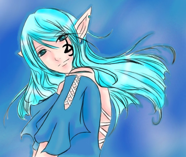
The coloring looks better. Considering that you now have Photoshop and a tablet PC, I'm intrigued of the new potentials and possibilities that you will deliver later.
👍: 0 ⏩: 1

lovely! I must say you are improving fastly!
👍: 0 ⏩: 1
Thanks a lot. ^^
I've got a Gateway, and that's about all I know. xD; I'd have to ask my boyfriend for more information.
👍: 0 ⏩: 1

I love how one of your deviations is telling people how to [not suck on deviantart] yet you break-out of the ordinary and upload another of the exact same picture painted slightly differently. Seriously, how many times have you uploaded this one? I mean its a nice picture but come on. After the fifth time it loses its identity and people just end up getting freaking anoyed with it. Your an awesome artist but youll never be recognized if your gallery consists of the same picture with different color schemes.
👍: 0 ⏩: 1
Wow. You stop, and listen a second.
The first three that were uploaded were uploaded because I was asking for opinions on the pieces. I did three different styles for the pieces by asking people what they thought -- something that I can't do by just sitting there and staring at the screen. Do you see me doing that for every single piece of artwork? No. I don't even upload works in progress, like a ton of people do.
Second of all, I colored it for the first time in July. That was 5~6 months ago. I colored with OpenCanvas, and with a mouse. So now, I wanted to recolor it, as the description says, because I was in the mood for coloring. I have photoshop and a tablet pc now. I don't upload artwork to get people's approval of what I do. I upload to get critique, and to show artwork that I've done, and what I'm proud of. I'm not showing my gallery to someone who I'm looking for a job from. This is a personal art site where I look for critique.
If someone is annoyed with my piece, they should just say nothing, and close the window. Then everyone wins.
And how does "How to Not Suck on DA" have anything to do with this...? Did you read that, even? I have done nothing of the sort that goes against the piece.
👍: 0 ⏩: 1
SO, basically, what your saying is you dont upload artwork for peoples approval but for yourself? Well then why the heck did you make a tutorial crucifying people who upload stick-figures? They did that for themselves, not for you to judge. You said if someone was annoyed with your piece, they need to keep their mouths shut and close the window. Why didnt you do that instead of making a tutorial about how much they piss you off? Im not saying stick-figures are art Im just saying at least follow your own advice.
And as I look back and read my comment I realize that I do need to chill out. Im starting $hit thats causing unecessary problems. -Josh
👍: 0 ⏩: 1
-shakes head- See, what I said is that stick figures aren't quality... I say that they really don't belong, because they aren't really trying. Those people shun critique. From my experience, that is. But seriously, most stick figure people don't... care about anything. They treat this entire site as a joke. I don't personally go comment on someone's deviation that is of a stick figure to bother them -- that's not my business. But that doesn't mean I approve of it. My tutorials have been more at the moronic people who don't understand these things.
I appreciate that you think you do need to chill out... though with stuff I've been getting lately, I still feel strongly about what I said.
👍: 0 ⏩: 0

Beautiful! I love how the clothes are flying in the wind! Her expression is nice to. She looks thoughtful.
👍: 0 ⏩: 1

I think it looks way better. ;D
I didn't think it looked bad before, but you have to admit this one is much better looking in comparison.
Um, well, imo. >>
👍: 0 ⏩: 1

This one is a lot bolder and prettier, IMO.
Bold = good.
It gives it a stronger look, which, to me, seems like it's a contradiction to the title. Almost... "I'm delicate, but strong. Don't screw with me."
IDK.
It made more sense in my head. xD;;;
👍: 0 ⏩: 1

I gotta say I like the other one better ._.
Its just that here colors are like really contrasting and everything in the piece just pops up. In the older one everything is more subtle (or however its spelled/said) Also the lines here are stronger and gives it a cartoonish look, whie in the other one they almost mix with the colors. Finally the eyes are way more expressive on the last one.. I m sorry ._. its just that the other one looks well... more "Delicate" .-.
But thats just me... (I also like the other bg better... don't hate me '-_-)
Feel free to hide this comment
👍: 0 ⏩: 1
Thanks for the opinion. It's alright if you like the other one better. ^^ I just simply like this one better~
👍: 0 ⏩: 0
You can color it if you want, as long as you credit me. ^^
👍: 0 ⏩: 1

lol i always credit ppl XP
👍: 0 ⏩: 1

Nice work! You did a really good job on the lighting and the way you draw eyes is really cool.
👍: 0 ⏩: 1

Oh wow This is AWESOME!!! I love it
and this background really adds to the delicate mood and it makes her pop plus it adds kinda a mysterious look to the picture too
This is my fav of all the versions ^_^
👍: 0 ⏩: 1

I WUVE IT!!!!!!! IT"S SO PREEEETTTTTYYYY... *wants colored copy*
👍: 0 ⏩: 1

I'm getting sorta tired of this pic, but it's still pretty nice.
👍: 0 ⏩: 1
o_O... That was ... unnecessary.
👍: 0 ⏩: 1
Er... I didn't mean to offend you or anything... I'm sorry...
...but it's like the 4th time you posted this pic.
")
👍: 0 ⏩: 1
| Next =>