HOME | DD
 Lannean — Consealed In Shadows

Published: 2012-08-10 01:25:31 +0000 UTC; Views: 3251; Favourites: 66; Downloads: 0
Redirect to original
Description
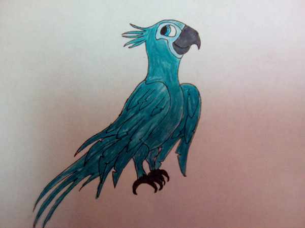
Finnaly done!! Worked on this one for around 30 hours (This includes all the previous sketches)...
 A4 paper - Jewel lineart made with a black fineliner, everything else colored with FaberCastell Polychromos...
The basic idea of the picture is just Jewel emerging from the shadows.... The background should be simple, yet it should give an idea about where this scenery takes place, so in this case, the jungle...
Farewell, my black pencil, I will never forget you...
Though seriously, This is the blackest I could get it
")
Jewel (c) BlueSky Studios
Art (c) ME
Related content


Comments: 73


this is pretty amazing, i love the detail that you gave the whole piece from the coloring of the leaves to the shading of the feathers..im loving the eyes of the bird, really lovely detail, a great job!  (Smile)")

👍: 0 ⏩: 1

Thanks so much! 
👍: 0 ⏩: 1


A critique from the inexperienced founder...
The first thing I notice when I look at this picture is the amazing amount of detail and color put into every pencil mark put onto the page in which this piece is drawn you really did do a very good job of incorporating lights and darks into this picture. I also love the patterning that you have going on for the representation of leaves.. it is very appealing and attractive to look at. This being said I do have a few suggestions for you in the future. first off... look at the design of the piece... the layout, and Jewel's posture... If you would have maybe put some more principals of design into the piece before you completed it and colored it, I think you would have rendered an entirely different result of the picture... Not saying that this version is bad, because it isn't.. its actually very pretty, but if the bird was in a more original pose, and positioned on the page differently I think it would do wonders for the overall feel of the piece... correct me if I'm wrong in guessing that you were going for a romantic/ majestic look for Jewel, as she emerged from the shadows of her den, and into the daylight? A tilt of the head and narrowing of the eyes, would do wonders for you here, as it would give jewel a determined, but ehhem... sexy.... look as she came out... and also.. I believe you would benefit by not completely blacking out the areas of Jewel's body that are in the shadows.. but maybe drawing them.. and making them so they are hardly visible instead.... overall I love this piece... it has lots of heart, lots of color, and it is a definite eye catcher...
with all that has been said I would rate this a solid 3.75 out of 5, considering the lovely use of color, and the minor setbacks of design...
Hope this critique was helpful to you... and as always, keep on learning!!!
 (Wink)")
👍: 0 ⏩: 1
First off, thanks for your feedback! This is really helpful.
You started with the design of the piece... I just uploaded the very first linearts of this picture here ([link] ), maybe to give a deeper insight on how this piece looked at the very beginning. And yes, I was going for a sort of majestic look for Jewel. I wanted to experiment a little bit with light and shadows, curious at the outcome.
And looking at it now, as it is finished, I can only completely agree with those last tips you gave me... a tilt of the head and narrowed eyes would truly do wonders.... Especially the narrowed eyes... And drawing the rest of her body, though only hardly visible, like her neck... I wish I could redo the whole thing with your tips.
Moving back to the design, you said to give her a more original pose - could you be a bit more specific about this? I choose this pose because it shouldn't be too complicated, and I wanted her wings a little bit in the foreground. How would you have done it?
Anyhow, thanks for taking your time to comment on this, thanks a lot

👍: 0 ⏩: 0

Wow thanks so much! I'm really glad you like it!
👍: 0 ⏩: 0


This is mind blowing, totally amazing work! 
")
👍: 0 ⏩: 1
Wooow, thank you sooo much
👍: 0 ⏩: 0


Thanks
👍: 0 ⏩: 1

*I'm implying that this is a freaking amazing piece of artwork*
👍: 0 ⏩: 1
Well thanks - But what did you mean with the HOTEL INTERNET xD
👍: 0 ⏩: 1

Wait~ You paid 15$ to access the internet in the hotel? T_T
👍: 0 ⏩: 1
Hotels should have a free WLAN for all their guests D:<
👍: 0 ⏩: 1

Nice!
👍: 0 ⏩: 1
Thanks a lot! And what do you mean with fuller feathers? Like longer feathers? I didn't quite get what you mean xD
👍: 0 ⏩: 1
^^ I mean that her feathers at the very end of her "hand" look very thin. They should be longer and thicker than the rest of the feathers.
👍: 0 ⏩: 1
Oh! Those~ Yes, I probably should have drawn them a bit thicker, but they are longer than the secondaries... You can still blame it on the perspective though xD
And thanks for your advices, I really appreciate it
👍: 0 ⏩: 1
👍: 0 ⏩: 0

Thanks so much! I'm really glad you like it!!
👍: 0 ⏩: 0
| Next =>