HOME | DD
 leahzero — Logo Study: JT Music v2
Published: 2007-09-29 00:18:00 +0000 UTC; Views: 21758; Favourites: 128; Downloads: 1379
Redirect to original
Description
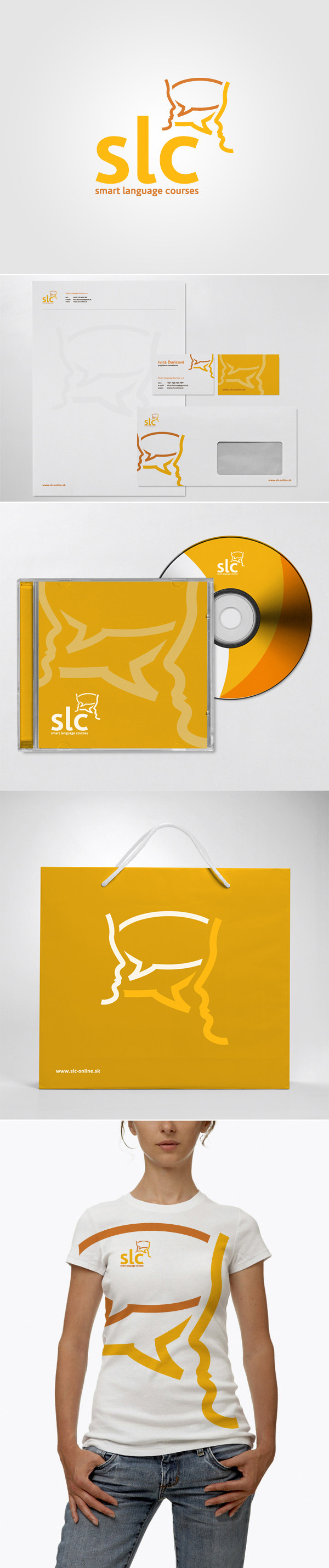
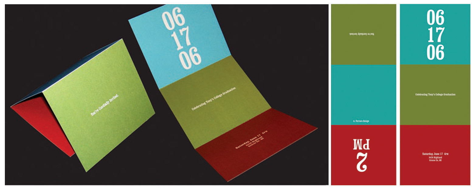
Version 2 of the JT Music logo, and a more serious attempt at a business card design.Illustrator/Photoshop CS3 + Cinema 4D.
Related content


Comments: 29

Hi friends please click this link watch this video start and run your successful music company...
flowertechonlinejob.blogspot.c…
👍: 0 ⏩: 0


very nice also veryni nice presentation ...
design a 9+ layout 9+ but are you saying the card holder pic is 4d stuff not foto.....
👍: 0 ⏩: 0

Great work with the logos! And its amazing how you get the card to look so real! Is it bump maping or something?
👍: 0 ⏩: 1

Yes, just a simple noise pattern in the bump channel.
👍: 0 ⏩: 1
wow, I'm awful at 3D stuff. But this is amazing!
👍: 0 ⏩: 0

this is so amazing and creative, your really good
Of course this work gets a fav
👍: 0 ⏩: 0


 (Wink)")


Thank you so much. It helps even more than words can say right now. I'm definitely at a point in my life where I need to apply my work into a 3D environment, so I am very glad you could help.
=] Keep up the good work!!!
I'll show you some finished results after I explore a little.
👍: 0 ⏩: 1
No problem, man. ")
Would love to see what you come up with, really enjoy your work as well!
👍: 0 ⏩: 0
I love it. The colors and everything in this design basically flows. Awesome work. I am trying to learn how to use Cinema 4D to gain the realistic and perspective effect, but I've been using Photoshop's tools instead. Do you have any suggestions on the best way to present print work like the one above?
Thanks for the comment by the way. =]
👍: 0 ⏩: 1
Thanks very much for your kind comments!
For learning 3D, I'd just jump right into it. Any of the basic overview DVD tutorials will really help. Lynda.com's C4D Essentials is decent, but there may be better titles from other companies (maybe VTC etc.?).
Once you get the basics down, I cannot recommend this highly enough: 3D Fluff's Cinema4D tutorial DVDs . They're simply outstanding. They'll give you a fundamental understanding of certain modeling, rendering, and animation concepts in 3D that you can apply to anything, not just C4D. I was shocked at how good these are.
Also, the free video tutorials on c4dcafe.com are excellent, too. 3dattack.us is another good C4D site.
Hope this helps.
👍: 0 ⏩: 0

nice choice of colors.. striking, clean, yet simple. good job
👍: 0 ⏩: 0

this is really sweet! I love the color selections
👍: 0 ⏩: 0

i totally love the presentation, why the hack i did not try to make any of my logos in c4d?
👍: 0 ⏩: 0


Excellent work, I like the color scheme and the logo. Keep it up
👍: 0 ⏩: 0


much nicer than v1. looks very pastel with a sleight reflective surface on the ground. very nice.
👍: 0 ⏩: 0


nice ~ love the clean style. good choice of lively colours. not more than 3, yah?  (Smile)")
if i were you, i will change the black to a warmer shade of grey...like a 70-80% of black? but that's just me...heehee
the 3D effect is awesome...can show that to your client as a signage.
the photography of the namecards rocks too. very professional!
")
👍: 0 ⏩: 1
Yeah, I was flipping back and forth between 100% black or 70-80%...it would probably depend on if the cards are gloss or matte too.
")
👍: 0 ⏩: 0
