HOME | DD

no-preview — Type Axo by-nc-nd

Published: 2010-01-21 14:47:45 +0000 UTC; Views: 3299; Favourites: 74; Downloads: 14
Redirect to original
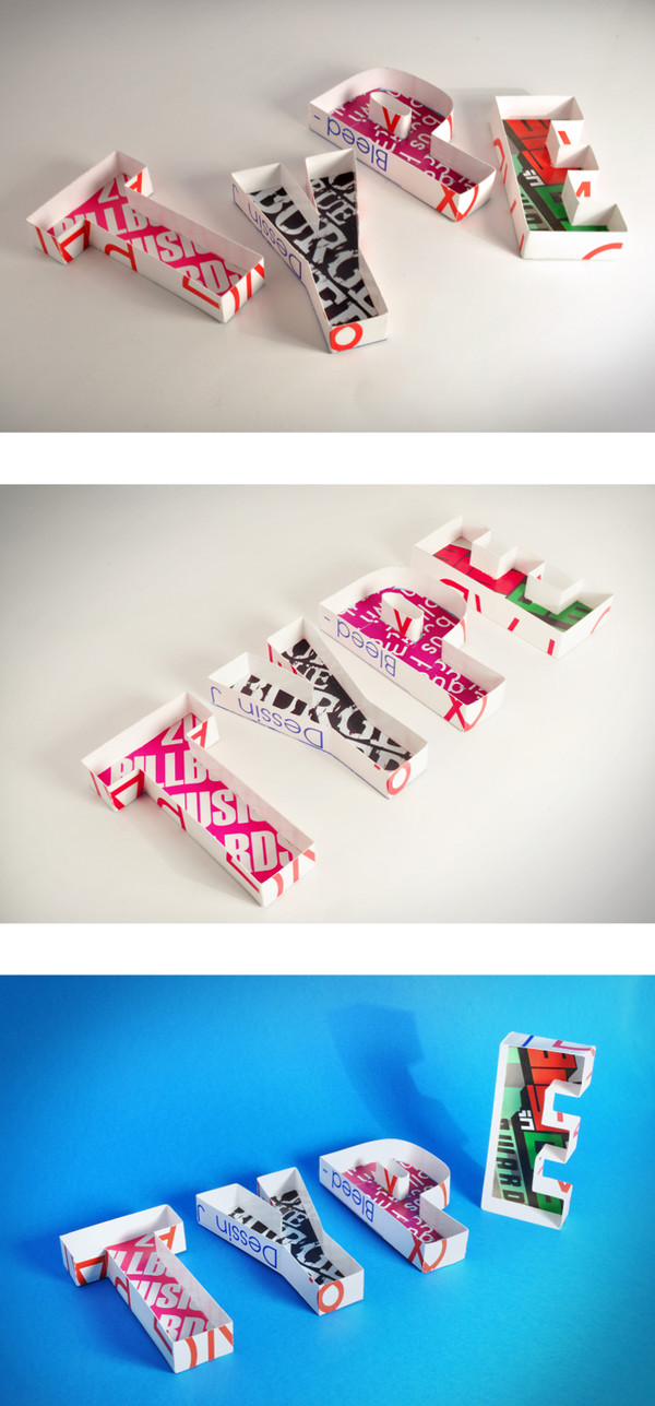
Description

Am planning to submit ONE of these three shots ..So whats ur favorites ..?


Handcrafted with love by ME
Photography: Me
Related content
Comments: 74

no-preview In reply to ??? [2011-12-21 07:36:33 +0000 UTC]

Thanks Dan, I totally agree with ya. .

👍: 0 ⏩: 0

iknowuneedme [2010-10-25 13:06:17 +0000 UTC]

greeaatt
GENIUS

👍: 0 ⏩: 1

no-preview In reply to iknowuneedme [2010-10-25 18:51:27 +0000 UTC]

👍: 0 ⏩: 1

iknowuneedme In reply to no-preview [2010-11-16 03:49:20 +0000 UTC]

👍: 0 ⏩: 0

caramelkarma [2010-09-30 21:41:57 +0000 UTC]

the second one if you lowered the contrast. is it too late to take a 4th with the 2nd's setup with the 3rd's blue?

👍: 0 ⏩: 1

no-preview In reply to caramelkarma [2010-10-01 02:06:24 +0000 UTC]

No its not late, But if i had time to do it..

👍: 0 ⏩: 1

caramelkarma In reply to no-preview [2010-10-01 02:28:16 +0000 UTC]

ha, yeah.

👍: 0 ⏩: 0

Love2B [2010-08-12 14:30:46 +0000 UTC]

This has been featured here: [link]

Please the news article so more people will see it!

👍: 0 ⏩: 1

no-preview In reply to Love2B [2010-08-12 19:17:00 +0000 UTC]

Thaanx ..

👍: 0 ⏩: 0

Calliope00 [2010-06-08 12:19:09 +0000 UTC]

love this project! why do not leave the three together? otherwise, my fav is the last one, i'm biased for blue

👍: 0 ⏩: 1

no-preview In reply to Calliope00 [2010-06-08 13:37:10 +0000 UTC]

I'm glad u like it, as long as every one choose his fav then ill leave it as it is.

👍: 0 ⏩: 0

UEY-S [2010-06-02 09:31:54 +0000 UTC]

quite interesting i must say

👍: 0 ⏩: 0

Osx86 [2010-05-29 14:29:17 +0000 UTC]

great!!,I choose no.2

👍: 0 ⏩: 0

3r35t0r [2010-04-10 22:13:20 +0000 UTC]

love the concept and everything
nice doing!

👍: 0 ⏩: 1

no-preview In reply to 3r35t0r [2010-04-11 08:20:10 +0000 UTC]

Thanx

👍: 0 ⏩: 0

noOnah [2010-04-07 19:14:13 +0000 UTC]

boy am i glad i watch you !

👍: 0 ⏩: 1

no-preview In reply to noOnah [2010-04-07 20:41:42 +0000 UTC]

Shokraan. But am not a boy ...

👍: 0 ⏩: 0

euzebije [2010-02-22 09:23:07 +0000 UTC]

first one is the best, but i think you need more highlights
(more "hygienic" look, if you know what i mean)

👍: 0 ⏩: 1

no-preview In reply to euzebije [2010-02-22 10:38:11 +0000 UTC]

I think so. .Thanx

👍: 0 ⏩: 0

bigdiZZay [2010-02-05 22:17:33 +0000 UTC]

this is badass!

👍: 0 ⏩: 1

no-preview In reply to bigdiZZay [2010-02-06 06:50:35 +0000 UTC]

👍: 0 ⏩: 0

magedart [2010-02-03 08:16:31 +0000 UTC]

1st one I think

👍: 0 ⏩: 0

dubutterflydesign [2010-01-26 13:15:50 +0000 UTC]

i like the idea.... great collage

👍: 0 ⏩: 1

no-preview In reply to dubutterflydesign [2010-01-26 15:41:40 +0000 UTC]

👍: 0 ⏩: 0

nevo-evo [2010-01-25 07:22:20 +0000 UTC]

first one is cool ~*

👍: 0 ⏩: 0

nevo-evo [2010-01-25 07:16:11 +0000 UTC]

I likeeeeeeeeeeee so nice

👍: 0 ⏩: 0

DarknessHope [2010-01-24 12:44:32 +0000 UTC]

I like the third one

👍: 0 ⏩: 1

no-preview In reply to DarknessHope [2010-01-24 13:45:58 +0000 UTC]

Thanx for ur comment ..Am checking up ur gallery right now ..Wait for my feed back soon ..

Have u ever visited my other account? . ..

👍: 0 ⏩: 0

Adila [2010-01-22 19:52:26 +0000 UTC]

all!

i like the 3rd one most cuz of the background
composition wise, i do like the 1st one as well

👍: 0 ⏩: 1

no-preview In reply to Adila [2010-01-22 21:06:25 +0000 UTC]

Shokraaan ..

👍: 0 ⏩: 0

3xlifestyle [2010-01-22 12:13:25 +0000 UTC]

Great! nice hand work, perfect...
the first one for me...
or if you wanna try...
other variation of third one... cause the letters "typ" are too straight...
I was clear enough?!?
for some speech my english is awful...
bye and good weekend

👍: 0 ⏩: 1

no-preview In reply to 3xlifestyle [2010-01-22 14:17:00 +0000 UTC]

Ya , i got ur point ...

👍: 0 ⏩: 1

3xlifestyle In reply to no-preview [2010-01-23 02:27:42 +0000 UTC]

which do you choose?

👍: 0 ⏩: 1

no-preview In reply to 3xlifestyle [2010-01-23 06:52:41 +0000 UTC]

Am helvetica addict. .And u?

👍: 0 ⏩: 1

3xlifestyle In reply to no-preview [2010-01-29 08:35:45 +0000 UTC]

I'm guilt of charge! I confess...

👍: 0 ⏩: 0

AliAlbdri [2010-01-22 03:16:49 +0000 UTC]

very nice work
I go with # 1 with background #3
combine both maybe add different colored light also

👍: 0 ⏩: 1

no-preview In reply to AliAlbdri [2010-01-22 08:03:27 +0000 UTC]

This is , ill try it.

👍: 0 ⏩: 0

XamgnueL [2010-01-22 03:14:45 +0000 UTC]

i love the idea

👍: 0 ⏩: 1

no-preview In reply to XamgnueL [2010-01-22 08:02:47 +0000 UTC]

👍: 0 ⏩: 0

LPORTAL [2010-01-22 02:45:14 +0000 UTC]

Well Done!
I vote for 2nd One!

👍: 0 ⏩: 1

no-preview In reply to LPORTAL [2010-01-22 09:41:54 +0000 UTC]

👍: 0 ⏩: 0

evil-pumpkin [2010-01-21 22:35:43 +0000 UTC]

I vote for the first!

👍: 0 ⏩: 1

no-preview In reply to evil-pumpkin [2010-01-21 23:18:40 +0000 UTC]

👍: 0 ⏩: 0

Papa-figo [2010-01-21 20:40:55 +0000 UTC]

awesome

👍: 0 ⏩: 1

no-preview In reply to Papa-figo [2010-01-21 20:49:00 +0000 UTC]

👍: 0 ⏩: 0

Nadine-The-Bean [2010-01-21 20:08:57 +0000 UTC]

They are all good, but definitely the first one

👍: 0 ⏩: 1

no-preview In reply to Nadine-The-Bean [2010-01-21 20:46:17 +0000 UTC]

Thanx Nado ..

👍: 0 ⏩: 1

Nadine-The-Bean In reply to no-preview [2010-01-21 20:49:50 +0000 UTC]

You're welcome (:

👍: 0 ⏩: 0

wbeiruti [2010-01-21 20:01:16 +0000 UTC]

WOOOOW! AWESOME!
AM IN LOOOVEEE WITH THEM!!!
loved em all but prefer the 1st one. plz do more

👍: 0 ⏩: 1

no-preview In reply to wbeiruti [2010-01-21 20:48:34 +0000 UTC]

Thaaaaaaaaaaaaaaanx ...

👍: 0 ⏩: 0


| Next =>