HOME | DD
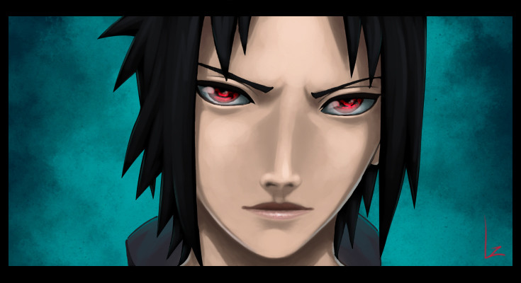
 Lee-nus — The Uchiha Prodigy
Published: 2007-04-10 15:37:15 +0000 UTC; Views: 6495; Favourites: 336; Downloads: 330
Redirect to original
Description
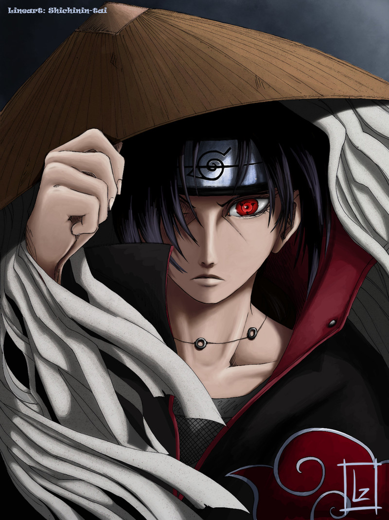
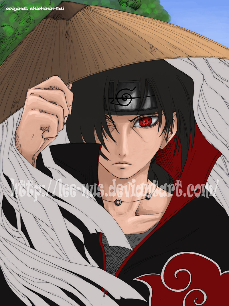
finally finished it, and im somewhat happy with it!i'd never have been able to make anything remotely close to this werent it for ~shichinin-tai who drew this masterpiece. so, if you like the drawing itself, i suggest you move along to her page and compliment her on it! matter of fact, her gallery is full of bedazzling drawings! ^^
anyways, i hope you like it as always. i'll be happy to see some comments on it. constructive crit is always appreciated as well!
")
cheers!
ps. if you want the fullsize version you'll have to download it... ^^
Related content


Comments: 56


nice job!!
👍: 0 ⏩: 0

Nice colouring job of Itachi! He IS the best character anyways
👍: 0 ⏩: 0


itachi's so...menacing? would that be the right word? I do't think there is one and you really brought out his personality h'm. tres bien!
👍: 0 ⏩: 0


hehe, its not sasuke, though... its his big bro, itachi... ^^
👍: 0 ⏩: 1

>.< oops, your right ")
👍: 0 ⏩: 1


from ur pic, I made this sig - [link]
thank u for this wonderful graphic!
👍: 0 ⏩: 0

wow very beautiful !!!!!!!!
i love it *-* !
he looks so mystriouse !
👍: 0 ⏩: 1


Niiiiiiiiiice. I love it! I like both versions...think I might go with this one in the end just because I like to associate Itachi with darkness. The suggestion of movement and energy is done really well with the thingamejigs on his hat and wrapped around his wrist (what are those called anyway?). Also, you've done his hand really well. I get really annoyed with people who make his hands ultra skinny and girly. Grrr! Nice to see you've given him masculine hands.
👍: 0 ⏩: 1
thank you! ^^ though i didnt draw it myself, that's all shichinin-tai's part in this! ^^
👍: 0 ⏩: 0

awesome..see teh dark background makes it so coool
keep it up
👍: 0 ⏩: 1


yeah, but its been malfunctioning for several months! i dunno whats wrong... but you can try adding me if ya want. its learn_to_fly@hotmail.com, but you prolly wont see me online a lot... T_T
👍: 0 ⏩: 0
Ah! You forgot his ring...
but I like the drawing 
👍: 0 ⏩: 2

well, it says in the description that i didnt draw it to begin with, thus there was no ring for me to color... *_*
👍: 0 ⏩: 1
oki ^-^ (not that it was forgotten XD)
👍: 0 ⏩: 0
")
hahaha, im happy you liked the way it turned out! thanks for letting me use it! ^^
👍: 0 ⏩: 0

duuuuude, förmodligen din snyggaste färgning hittills.
mäkta imponerad!
men e det inte dags för lite mer Kiba snart?
👍: 0 ⏩: 1
lol, tack, det var inte illa!
jo, jag är taggad på att göra kiba, men kombinationen av att inte hinna/kunna teckna innebär att jag måste hitta en riktigt fräsch lineart/teckning först! T_T
👍: 0 ⏩: 1
ah, inte så tokig alls! snygg teckning, men den skulle behöva en del cleaning. den är lite skitig, och så skulle jag behöva teckna om några linjer, och det är ju inte alla som är så positiva till det. jag har sparat den och ska fundera lite, måste ju kontakta henne och kolla om det är ok om det blir aktuellt...
👍: 0 ⏩: 1
yeah han e ju lite coolare nu med en lite större version av akamaru, fast jag kunde inte hitta nån snygg med hans nya stil.
👍: 0 ⏩: 1
nej, jag vet. jag har kollat i mangan och så, men han verkar ju aldrig komma tillbaka in i storyn, så det är ju bara gamla grejer alltihop... T_T
👍: 0 ⏩: 0

Excellent.
Although I think that generally, soft shading doesn't need the sahde lines, so you could probably get rid of them.
Did you do that sort of splatter technique on the hat and bandage-like thingies? It looks neat
 (Smile)")
👍: 0 ⏩: 1
well, it still needs an outline of some sort. just removing them wouldnt work at all, imo. perhaps a darker colored line, but removing it would make some areas blend in too much. anyway, thanks ^^
👍: 0 ⏩: 0

amazing work matey! really really nice
👍: 0 ⏩: 1

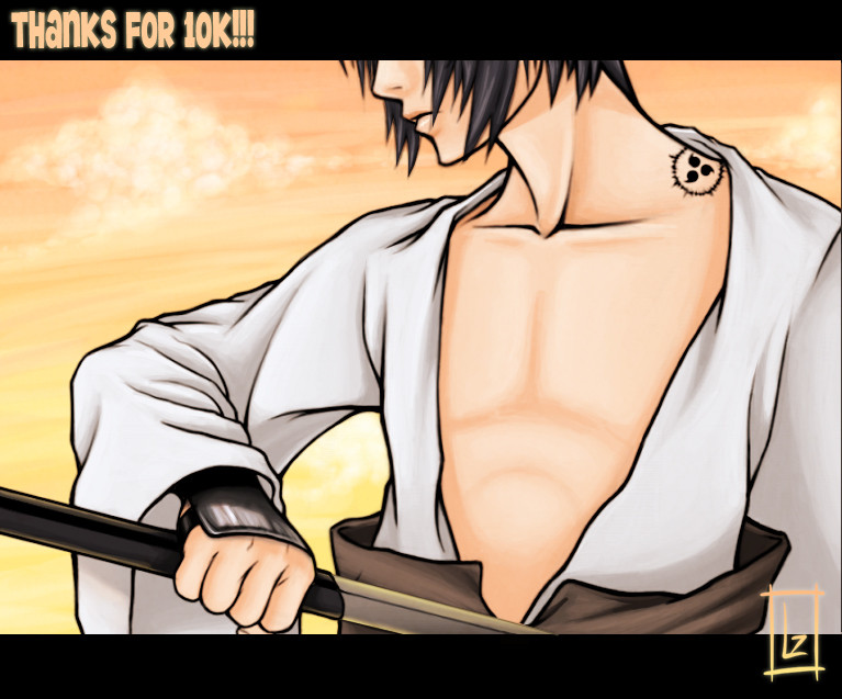
nicely done.
I like the texture on the hat and on the
paper strips thingie on the sides.
nice lighting effects too
great work ^-^
👍: 0 ⏩: 1

wow... that is amazing!! i thought it would be ^^ nice work!!
👍: 0 ⏩: 1
haha, thank you. im updating it in a few minutes, after adding a little texture ^^
👍: 0 ⏩: 1
ok. well i think i see 'said' texture and it works really well!
👍: 0 ⏩: 1
| Next =>