HOME | DD
 lee25 — D+G Vector and Drawing

Published: 2006-10-16 22:37:36 +0000 UTC; Views: 137409; Favourites: 2075; Downloads: 3603
Redirect to original
Description
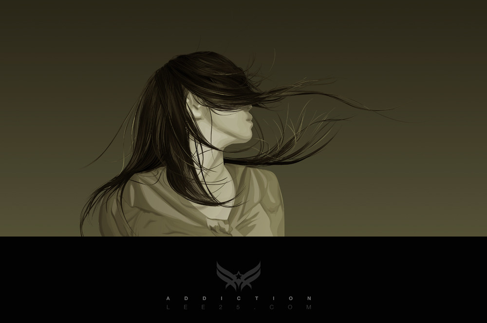
Combined the vector paths with the sketch for comparisson.[One of the 4 sketches I did for a collab between me and Aeiko/ Wirestyle for Dolce & Gabanna to be printed in a book.
To see the final image: [link]
The idea and inspiration for the typeface treament came from the baroque and rococco period, this was becasue this style of decoration emobodied the kind of decadence thats often asscociated with the fashion industry.]
Related content


Comments: 342

I think that is fantastic, and the final result is very cool. Congratulations. Add to favs
👍: 0 ⏩: 0

mate its insanely good and congrats on getting the exposure
👍: 0 ⏩: 0

bit cluttered at the end of gabbana, but other than that, well done
👍: 0 ⏩: 0


Like I said! This is better then the final piece made for dolce and gabanna.
👍: 0 ⏩: 0

So slick man, really enjoyed it!
👍: 0 ⏩: 0


It's so kitchy i don't know where to start. Trendwhorish, organic shapes things are not D&G stuff..
👍: 0 ⏩: 0

quite a nice result -- when mixed into the final idea -- later days
👍: 0 ⏩: 0

 (Smile)")


Better than the final product.
It's loose and natural-feeling.
👍: 0 ⏩: 0

I love the soft and sketchy feel this has. Script work has always been an interest of mine, although I've never really had much of a talent at it myself. I'd love to see this made into a font.
👍: 0 ⏩: 0

elegant, detialed, beautiful! wowwwwwwww
👍: 0 ⏩: 0

outstanding. cannot get enough of this stuff.
👍: 0 ⏩: 0


nice work man ! congrats for the job !
you can definitly see the baroque and rococco period influence!
i remeber when you started to post your typeface intervention sketches and i was pretty amazed about what you achieved with it. looks really great. some time ago i found a guy who also is into the same thing. might interest you. he has some great works.
Si Scott
[link]
👍: 0 ⏩: 0


I actually like the way this looks alot more than the final. The stlye, and shades are alot more intersting in this one. Good work man!
👍: 0 ⏩: 0


holly makarol... amazing.. just loving your style man..
👍: 0 ⏩: 0

That's some real cool type treatment. Did you do the type and Aeiko do the background image?
👍: 0 ⏩: 1

yep, I did the type and aeiko just dropped it into his work
👍: 0 ⏩: 1
...that's cool man, i like seeing photos of your work, most people just show the end result.

👍: 0 ⏩: 0

the sketch mixed with vector gives it such a great rough feel, which i love
👍: 0 ⏩: 0

God damn it.
I'm going to be in my drawing pad all day trying to come up with something half as cool, and we all know it ain't gonna happen...
Good shit though buddy
-Dan

👍: 0 ⏩: 0


Awesome work lee! Absolutly amazing!
👍: 0 ⏩: 0


that looks awesome, they need to slap that on a bag or something it's amazing
👍: 0 ⏩: 2

They shapes are either drawn or they are Floral Vectors
👍: 0 ⏩: 1
")

hey, that's awesome, how did you make the shapes around the letters? I'm new, to this level, but having bin designing flyers for the past year or so, can you offer any help, please?
👍: 0 ⏩: 1

i agree...im clueless as to doing that...i really need to learn, lol
👍: 0 ⏩: 0
<= Prev |