HOME | DD
 lee25 — Reverence
Published: 2005-07-16 12:43:34 +0000 UTC; Views: 15325; Favourites: 247; Downloads: 4304
Redirect to original
Description
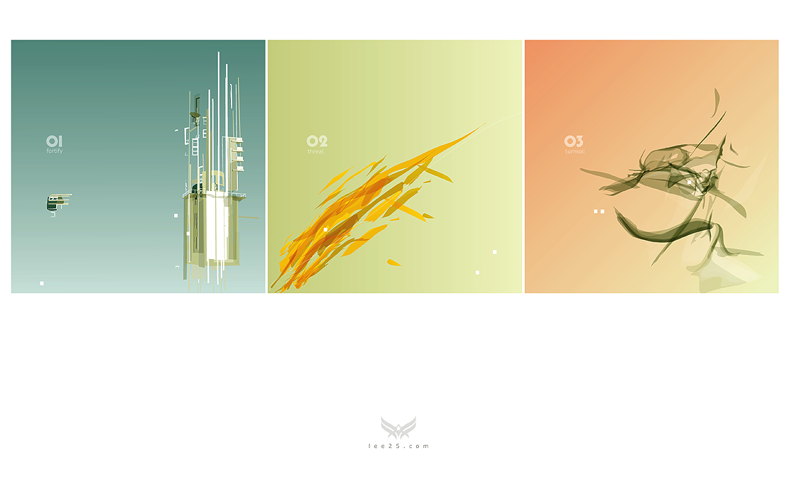
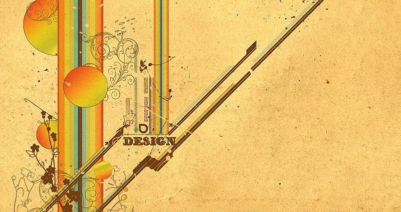
experimenting with shapes and colour. I used a square format simply because I don't usually do so.Related content


Comments: 113

square format rocks
this looks great
i love the colors and the composition 
")

 (Smile)")
👍: 0 ⏩: 0


green, yellow, orange!!
nicely done dude!! love it!

👍: 0 ⏩: 0

This is the kind of picture that you'd use as a album cover on Trip-hop, electronica, chillout or lounge CD. The colors blend in wonderfully and gradually..awesome work..dude/dudette...just awesome work
👍: 0 ⏩: 0

wow beatiful work Oo like the colours, the kind it's been made, simply everything ôô

👍: 0 ⏩: 0


I created them in adobe illustrator and photoshop
👍: 0 ⏩: 0

very unusual, like your style.
and i visited your web site, very beautiful!
👍: 0 ⏩: 0


3rd one is especiallly nice, what font did you use for the numbers?
👍: 0 ⏩: 1
the font i used is called 'pump'
👍: 0 ⏩: 0


i don't understand the continuity in the pictures (01, 02, 03 but not followed by the content?)
👍: 0 ⏩: 0

Your colouring is unique. The second one in the middle has a great balance  (Wink)")
Take care
Marius-
👍: 0 ⏩: 0

I like it, colors, shapes and typography. Great work.
👍: 0 ⏩: 0

I like it very much. 
Do you make it in illustrator or another soft?
👍: 0 ⏩: 0


")


very very nice work... no wonder you're gonna be in computer arts mag... i like the third picture too, its very natural looking... three very different pieces but they all go together really well... good work
👍: 0 ⏩: 1
hehe thanks, im glad you like it. I think i'm gonna be in next months issue.
👍: 0 ⏩: 1
woohoo! bugger tho i wont be able to see it cos the newsagents near me are CRAP! you'll have to scan it and post it here hehe
congrats!
👍: 0 ⏩: 1
hehe, if i remember i will scan it and put it in my scraps for you.
👍: 0 ⏩: 1


Sucsesfull experiments those you got there, good work
the colors are perfect
👍: 0 ⏩: 0


It's cool. Nice to see you branching out into different styles.
👍: 0 ⏩: 0

the thumbnail drew me in, and I must say I am very glad it did. This piece is so visually pleasing, like lithium for the eyes.
👍: 0 ⏩: 0


nice design
lovely typo too...01 02 03
good work!!!
my fav!
👍: 0 ⏩: 0

thats hot, i like when people try somethin new.
its annoyin when people are scared cause they
dont wanna produce an unsuccessful piece or they're
scared or w/e
👍: 0 ⏩: 1
Thanks, I know what you mean. I see allot of people doing the same stuff over and over, so i've always made a concious effort not to be like that. There are artists who are very good at one particular thing and go about producing the same stuff over and over and it gets boring.
Whenever im about to submit something differnt to my other works i get nervous, but I try and make it as good as possible before releaseing it. In the past ive learnt allot by taking risks its never easy but it can be hugely rewarding.
thanks for your support
👍: 0 ⏩: 0

this is nice! very minimal and pleasing to look at :3.
👍: 0 ⏩: 0

i like your simplicity and your choice of colors. i think i like the last one the most. pretty brown and light orange-red
👍: 0 ⏩: 0


Cool man I never seen this kind of abstract thing from you.
👍: 0 ⏩: 0


| Next =>