HOME | DD
 lee25 — Reverence
Published: 2005-07-16 12:43:34 +0000 UTC; Views: 15327; Favourites: 247; Downloads: 4304
Redirect to original
Description
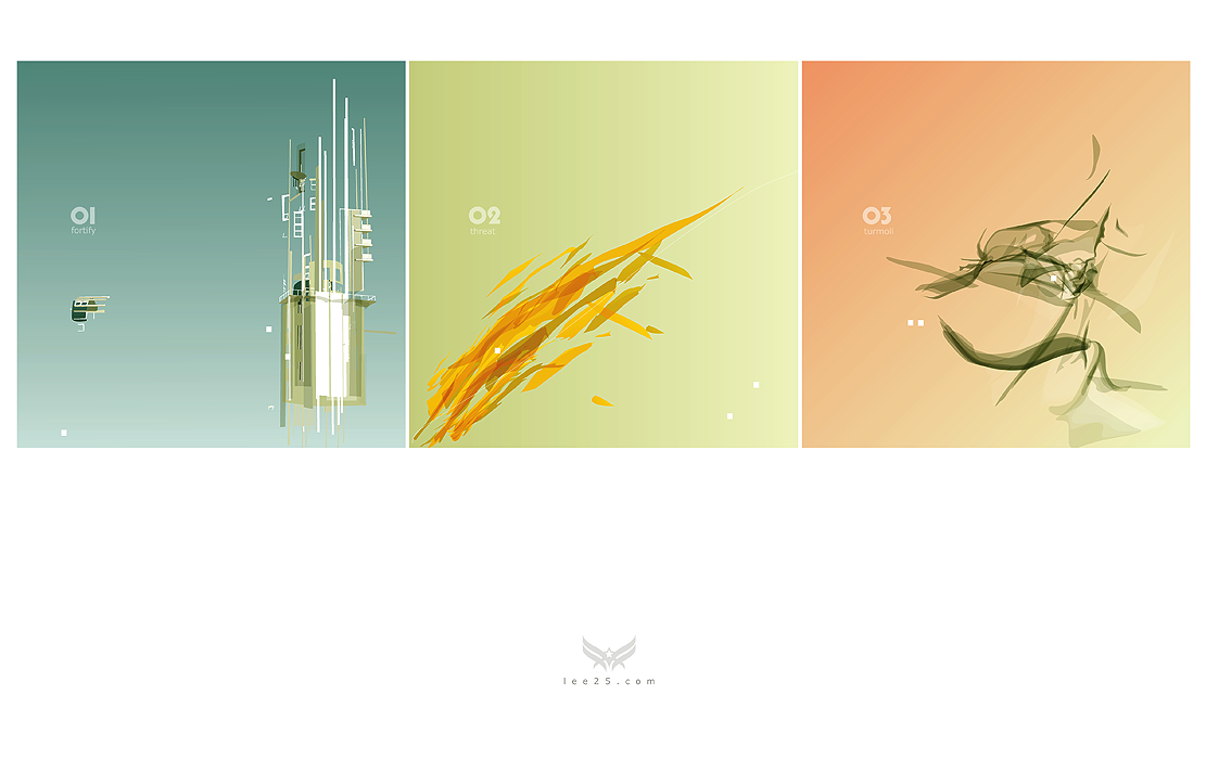
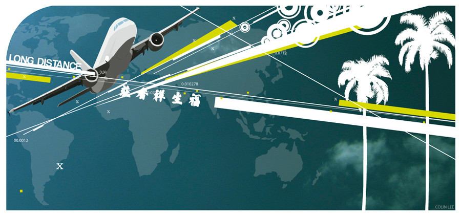
experimenting with shapes and colour. I used a square format simply because I don't usually do so.Related content


Comments: 113


lovin it
must say, nice use of white little boxes
👍: 0 ⏩: 0


👍: 0 ⏩: 1


1st is awesome! you should try out more with that. the second and third is just some blah with nice colors.
expreiments are great, keep it up

👍: 0 ⏩: 0

It's beautiful (but first one of them seems little out of place, maybe because different colortemperature).
And just being curious... What's the name of font you used? I like the shape of it and I have schoolproject that needs cool numbers on the corners of the pages.
")
👍: 0 ⏩: 1

yup thats a valid point. I made all three at the same time and felt that they were stronger together.
The font i used for the numbers is called Pump, and the small letters used Verdana. Even if you don;t find that exact font im sure you will find loads of similar ones. I don't remember where i got those fonts from otherwise i;d tell you.
👍: 0 ⏩: 1

Turmoil is my favourite one! Nice shapes + good composition. Well done.
👍: 0 ⏩: 0


i want to see a bigger version or maybe some detail shots .
👍: 0 ⏩: 0


Can't wait to see your next pieces coming out...love the architecture stuff in the first piece especially.
👍: 0 ⏩: 0

interesting. i like the lightness of it and the freeness of the simple forms. very nice work!
👍: 0 ⏩: 0

your use of color in this is really nice
and the three images have a good flow between them
👍: 0 ⏩: 0

I can't decide whether I like the first or second one more. awesome colors.
👍: 0 ⏩: 0

looks great, I especially love the first and second one. All three images relate to the text for each image very well, they are excellent visuals of the words
👍: 0 ⏩: 0

looks damn cool
love the first kinda architectual work!
👍: 0 ⏩: 0

that's tight.. love that minimal concept.. sweet layout too
👍: 0 ⏩: 0


love it, real different from you but also its got your "steez" with it..... so i can recognise styles...  (Smile)")
👍: 0 ⏩: 0


Oooooooh I liiike. I especially like the shapes you used in the middle and right ones. I love the colours too.
👍: 0 ⏩: 0


i really enjoy the architechture work you are doing as of late, its beautiful, reminds me of deconstructivism....but new and fresh
👍: 0 ⏩: 1
Thanks very much, I love architecture and im really pleased that people enjoy and appreciate it too.
👍: 0 ⏩: 0

dude awsome job
love the colors, its tight!!!!
defnitly a fav
 (Wink)")
👍: 0 ⏩: 0

I don't know but there's something odd about turmoil. Perhaps there are too many low opacity streaks and that's causing a bit of an out-of-focus look instead of the smooth fadeout look (?) you might have gone for, but hey it's great anyway. "Fortify" is the best of the 3 imo. Keep experimenting
👍: 0 ⏩: 1
Thanks very much, i agree with you on the 3rd one.
👍: 0 ⏩: 1
Hehe
👍: 0 ⏩: 0


great colors, shapes and composition. i dont really get it, cus i cant read small letters ")
👍: 0 ⏩: 0

I adore this. I think you've achieved what you were looking for in this. I love the series of shapes and colours and how they're all different. Nice composition.

👍: 0 ⏩: 0

gah, i really like what you did - how you mixed & matched the colors!

👍: 0 ⏩: 0


very sick man! you're work always looks so smooth, i love it.
👍: 0 ⏩: 0


great work, really
it would be nice, if you publish these 3 pictures in wallpaper size
👍: 0 ⏩: 0


i love that shapes - especially - that center yellow motive.
btw - did U used only Illustrator for that construction on the left?

👍: 0 ⏩: 1
thanks, I used illustrator for all of the bits.
👍: 0 ⏩: 0

| Next =>