HOME | DD
 Lexclamation — Hooch, part 2

Published: 2008-02-26 01:48:55 +0000 UTC; Views: 2259; Favourites: 32; Downloads: 14
Redirect to original
Description
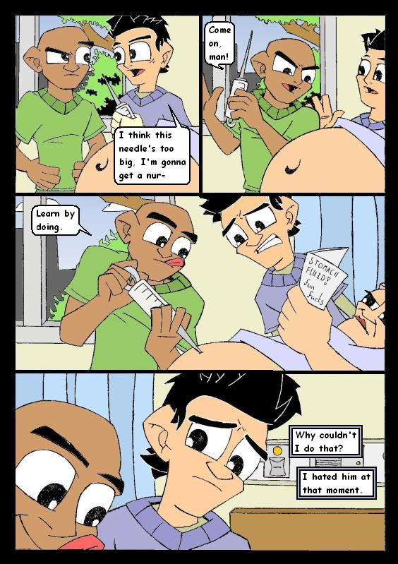
Hooch. Starts. To crack.I dramatically reduced the size of everyone's eyes. This meant I could do a much more effective close up on Hooch's eyes in panel 3. I tried a close up on Janitor's eyes in an earlier comic and they were so big and white it just looked weird.
I shoved some of the character designs forward too, to make their differences stand out. For example, JD's prominent nose is more... prominent, and Turk's head is rounder. See, I felt that my drawings of people just looked like slight variations on a base model rather than different to each other. Does that make sense? I want everyone I draw, at least the protagonists, to really look like individuals, rather than just a base figure with different hair and skin colour.
In regard to colour, well, as I said heavy detail on Hooch's eye close up, drawing with the colour rather than just my usual pointing and clicking.
Related content


Comments: 25


his eyes do look real Good. Turk still looks like Turk but J.D isn't looking like.... well J.D. his features are... mmm can't think of the right word....
Anyways I totally just watched the Hooch episodes last week. I bough 1-6 seasons online. XD. its Pure heaven
👍: 0 ⏩: 1

I haven't seen 6 yet! I'm only up to 5.
I know JD looks really different from before, but Im trying something out with the design. It's not done yet, still needs refining.
👍: 0 ⏩: 0

hey dude just wanna say you've really improved alot. range of facial expressions and stuff is great and each characters features are becoming more subtly distinct.
👍: 0 ⏩: 1
Fuzzbuzz! Long time. Thanks for the words and fave, dude.

👍: 0 ⏩: 0


Fantastic stuff! You've really brought your A game here with texturing the fabrics, and I love Hooch's possessed smile.
Hooch is really crazy.
If I had any kind of crit, it would just be that the back of J.D's head got a little flattened in the last panel.
👍: 0 ⏩: 1
Yeah, I know, I know... I could see a problem with his face shape, but I just didn't hate it enough to change it. Dare I say, I almost liked it. But I do agree with all you guys, it doesn't really suit the rest of the page.
Thanks for the words! It really does mean alot 'cos I spent so. Fucking. Long on it. I am way behind on my coursework...
👍: 0 ⏩: 1
Jesus, you're telling me. Of course, the reason I'm behind on my coursework is because of all of my crazy sex parties. Yeah. Yeah, international playboy right here.
👍: 0 ⏩: 0

Yeah, JD's head is a lil squished. still, just as good as ever
")
👍: 0 ⏩: 1
I noticed it was different, but I didn't think it looked squished... I thought it was just ultra stylised.
Stylised into a squished shape... hm.
👍: 0 ⏩: 1
i guess if you look at it long enough it doesn't seem as bad.
But just for the sake of nagging: ZOMG JDs HEAD IN T3H LAST PANEL.
Okay, I'm done now.
👍: 0 ⏩: 0

P.S. Nice fade on Hooch's hair there. I assume the gradient tool? Or some fanciness beyond my ken?
👍: 0 ⏩: 1
Gradient, but I'm feeling there must be a better way to potray a shaved head.
👍: 0 ⏩: 0
Nice detail on the eyes there. One thing; JD's head looks kinda like it's been squished in a vice in that last panel there.
*checks out Janitor comic* Whoa, that's quite a different look there. Almost... almost like Scrubs Babies.
...
Dude, you should totally draw some Scrubs Babies comics in that early big ol' eye look. Totally. Dude.
👍: 0 ⏩: 1
WOO, thanks for saying about the eyes. I really tried with those eyes. But as thankful as I am, I will not be drawing Scrubs babies. Although... NO, no.
👍: 0 ⏩: 1
DO IT. DO IT NOW.
👍: 0 ⏩: 0

Hhahaha, this is just excellent as ever!!! I love it!
👍: 0 ⏩: 1