HOME | DD
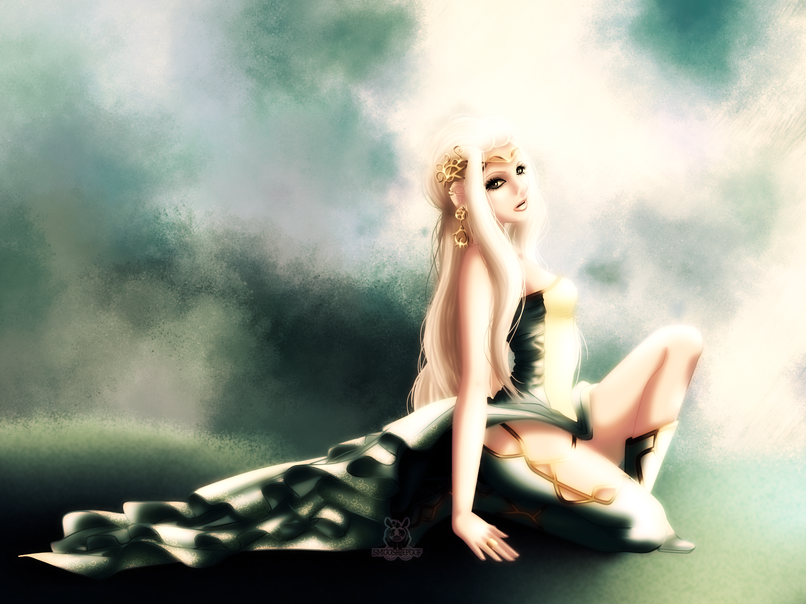
 leylaana — Gravity - edited version
Published: 2014-06-22 11:30:39 +0000 UTC; Views: 4143; Favourites: 87; Downloads: 0
Redirect to original
Description
Just for some practice (Smile)") Just can't decide if I use the original colours version or the edited version for my portfolio, what do you guys think?
Just can't decide if I use the original colours version or the edited version for my portfolio, what do you guys think?original colour version:
leylaana.deviantart.com/art/Gr…
Credits:
Brushes for the background
Visit me on www.smooshiepoof.de
Follow me on Facebook
Smooshiepoof
Related content


Comments: 82


Work on the light makes the sublime character.
I really love your work.
👍: 0 ⏩: 0


Wonderful! Though you could've adjust the light of her front dress cuz it's hard to see.
👍: 0 ⏩: 0


I like that the dress blends with the background, and her skin shines.
👍: 0 ⏩: 0


This is a beautiful image. I love the background and the woman's face. Well done
")
👍: 0 ⏩: 0

She's got a so sweet face... And mysterious...
👍: 0 ⏩: 0


The folds and jewellry are wonderfully done,like a praeraphaelitic painting.
👍: 0 ⏩: 0

👍: 0 ⏩: 0

I like the original version much more
👍: 0 ⏩: 0

hmmm....I like both. I think I like this color scheme better, but I feel like the brightness around the left side of her face makes the hair hard to see.
I love both versions though - great work!
👍: 0 ⏩: 0


Very hard light, but I thinks this is something good for this artwork, good job!
👍: 0 ⏩: 1

thank you so much for your nice comment and support
👍: 0 ⏩: 0

I like this version better personally - I think the overexposed nature of this piece lends to it being a more compelling image

👍: 0 ⏩: 1
I'm glad that you like this version (just like me <3), thank you so much!
👍: 0 ⏩: 0


It's really pretty :3 Maybe a little too much brightness in the background near the face but otherwise BUENO ! :3
👍: 0 ⏩: 1
thank you a lot :3 I'm addicted to shininess ^^'
👍: 0 ⏩: 1
Haha, I can see that ! :3
👍: 0 ⏩: 0

This is nice, design is great but there is just to much light and blurriness.
👍: 0 ⏩: 1
yeah I am addicted to light it seems x.x always trying to avoid too much light ^^" but in this case I wanted it to be shiny and blurry^^"
👍: 0 ⏩: 0

Love it, but personally, i like the original colour version although i like the kind of dreamy effect this picture has! but yeah 10/10 for both versions well done
👍: 0 ⏩: 1
thank you so so much! Many people prefer the original version cause it's less shiny :s
👍: 0 ⏩: 1
No problem! and yeah, i guess its just down to what people personally like because like i said i think they are both great
👍: 0 ⏩: 0


She looks so angelic with the way the light is hitting her
👍: 0 ⏩: 1
aww thank you so so much <3
👍: 0 ⏩: 0

I loke the beauty of her light skin and hair,also her earrings and the folds of her dress turned out wonderfully.
👍: 0 ⏩: 0

| Next =>