HOME | DD
 lhs — Brumous Observation
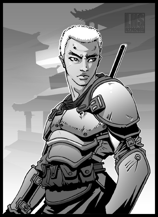
Published: 2005-02-20 07:01:07 +0000 UTC; Views: 3291; Favourites: 78; Downloads: 577
Redirect to original
Description
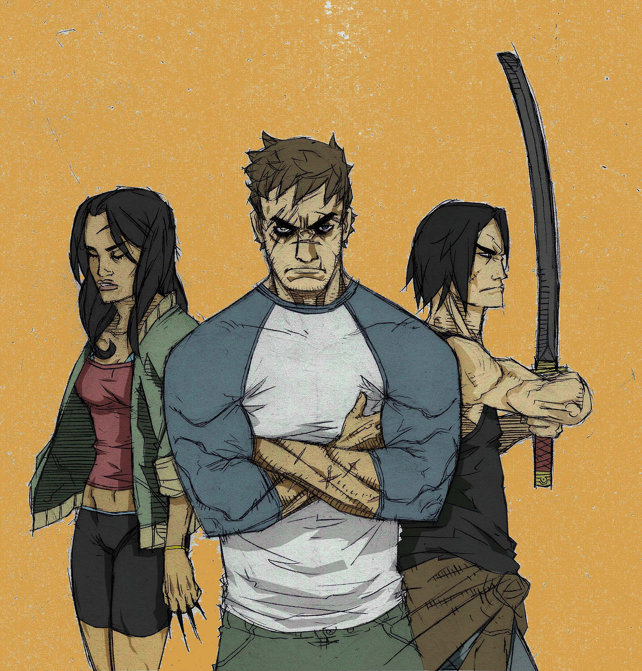
Inked lines with photoshop shading.Related content


Comments: 38


awesomee! i like the bg ! tot was vector art if u din mentioned it was on photoshop ^^ awesomeee as always ;D
👍: 0 ⏩: 0

This has a lovely subtle quality to it - great work. I like the expression of the character also.
👍: 0 ⏩: 0


The shadowing of your drawing is awesome, Lhs.
Excellent work!
👍: 0 ⏩: 0

Huh, it's like screentoning -- but not
Nice. Good use fo gradients.
👍: 0 ⏩: 0


the photoshop shading looks pretty cool
very cool sense of style
👍: 0 ⏩: 0


i can never shade correctly -_- you do it sowell ")
👍: 0 ⏩: 0

Cool mix of themes. Like the detail on the armor and the background.
👍: 0 ⏩: 0


Good work. But I think that stick on his back looks a bit thin to be a sword or else?
👍: 0 ⏩: 0

why does everyone think everything look like manga? i think manga is crap. this is not. Ergo it\'s not manga
")
👍: 0 ⏩: 0

the details on the armor looks awesome..his face is kinda cute..very nice piec lh
👍: 0 ⏩: 0

Interesting work, but I usually don\'t like the photoshop shadings in grayscale... I think if you tone the grayscales, and open some white areas to add volume on the character the results will look better...
But it still a good work.
👍: 0 ⏩: 0


dude where have you been? working on your animation stuff still?
👍: 0 ⏩: 0


omg...sweet man really sweet, I dont like his face though... he looks like Sisqo XD
👍: 0 ⏩: 0

that armor is just amazing... wonderful concept : ), a 
👍: 0 ⏩: 0


 (Wink)")

Great shading on this one. And i love the background. It looks great.
👍: 0 ⏩: 0

Cool  (Smile)")

👍: 0 ⏩: 0

Damn LHS, this is why your one of my fav\'s here on DA. It looks very Manga-ish, not the style so much but the B&W shading.
👍: 0 ⏩: 0

