HOME | DD
 LightBombMike — The Buzzards do CBGB
Published: 2006-04-12 05:22:36 +0000 UTC; Views: 4194; Favourites: 55; Downloads: 283
Redirect to original
Description
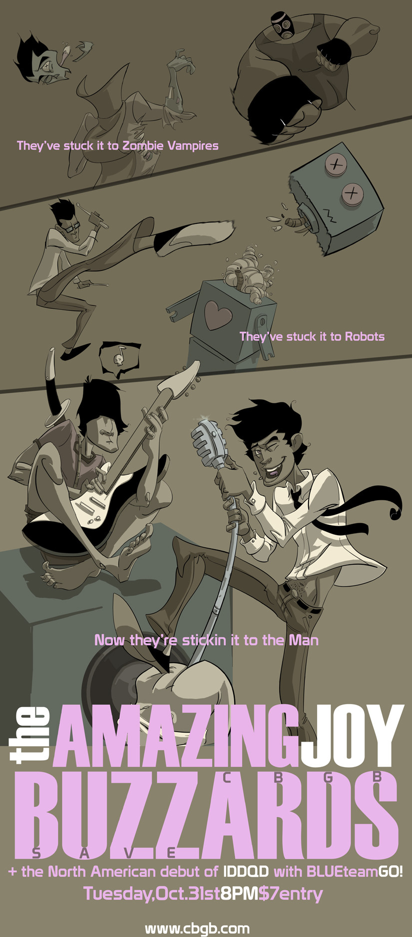
So I've been pitted against ~Kweli over at satellitesoda, and the topic was to draw The Amazing Joy Buzzards. But, to add to the challenge, it had to be a band poster, promoting their show at CBGB, the last show before it closes its doors. No small task.So, I worked this puppy up. And, even though I suck hard at graphic design, and fonts, my tavern boys and =skulldozer gave me some pointers on how to work this up to a nice lather.
There is also a "color" version floating about here:[link]
I really don't know which I like more, but this is how it was originally intended, so I submit this for your viewing pleasure.
Related content


Comments: 104

oh! and extremes can only become icons if they are repeated.
the idea is to understand the physics behind movement and the personality of the character so that the "extreme" is unique to the specific moment the character is in.
👍: 0 ⏩: 1

I agree with you totally. Repitition is death. So when animating all day at work, I try to come home and capture the inbetweens in one drawing. I might be going down an unproductive path, but it is something I want to explore at least. I think a lot of it will rely on more twist and torque in my poses. The more compression I have juxtaposed next to stretched parts of the body, the closer I will be getting to what I want.
👍: 0 ⏩: 0
you should consider studying the work of frank frezetta. his work manages to capture the moment where all the energy is released. it's very curious artwork.
renaissance painters like Michelangelo and Leonardo are great at this as well. very dramatic posing, very deliberate.
i'm very interested in where you want to take your artwork and i look forward to see where you go.
👍: 0 ⏩: 1
yeah, frazetta has always been a source of inspiration and admiration. And of course, how can you NOT be inspired by the masters. I have this giant art book with the complete works of Da Vinci... I still get all giddy when I page through it.
👍: 0 ⏩: 0

 (Smile)")

Excellent job mate")
 (Wink)")
👍: 0 ⏩: 1
chuffed I shall be!
👍: 0 ⏩: 1
*In DAvid Lo Pan voice* Indeed
👍: 0 ⏩: 0

I think this is the better of the two, but i'm struggling with the fact that it looks like the mike is coming out of someone's arse
Maybe this is intended! Anyway, love the feel and concept to this.
👍: 0 ⏩: 1
hahaha... it is indeed intended. That butt belongs to the man!
👍: 0 ⏩: 0

Man bro that is tight. Nice stuff man.
👍: 0 ⏩: 1

looks great, mike. the action poses are sweet. however, even though they are cool, the follow through punch, and the follow through kick aren't convincing. they don't have the kinetic energy for that follow through. maybe have the luchador's arm extend crossing his body more and that will expose more of his back showing more power.
as for the kick the body could use a bit more twisting, like having his 'right arm' go further away from the camera, and his 'left arm' coming towards the camera.
at any rate, this is a killer illo. great monotones too.
👍: 0 ⏩: 1
ahh yes, more twist. Seems to be what I am lacking in general concerning my poses. That shall be my next conquest. Thanks Sean!
👍: 0 ⏩: 1
man, i always forget the twist too! hahaha but whatever i mentioned doesn't take away from how kick@ss this illo is. you've definitely stepped it up. how dare you? hahaha we'll be in LA this week. let's get some dinner together again!
👍: 0 ⏩: 1
Thanks man... gotta keep steppin it up if I ever want to start running with you big dogs.
Hit me up on the cell whenever. My vote for food is anywhere in the Culver City/Santa Monica area this time! haha
👍: 0 ⏩: 1
no prob, bob... er... i mean dawg! hehe ok, culver city it is. that's the area where i'll be working at. tell hen to get his rump to LA quick-like. hehe
👍: 0 ⏩: 1
oh yeah... i'm just a lil bunny.... one day i hope to be a big dog. hahaha
👍: 0 ⏩: 1
if you are a little bunny, then I'm like.. still nursing in the womb.
Yeah man... Hen is working on it for sure. Hopefully by summers end at latest he should be calling Cali home.
👍: 0 ⏩: 0

Well man you already know the crits I tossed yer way. Other than those lil things, this piece makes me make yogurt in my pants.
👍: 0 ⏩: 1
dude... yogurt. I like vanilla.
👍: 0 ⏩: 0

You already know what I think of this.
I think it's spicy. You could still fix El Loco Chupacabra, but whatever, the piece is strong.
👍: 0 ⏩: 1
yeah, fix this, fix that. Tit for tat.
👍: 0 ⏩: 0
thanks Holly! How ya been?
👍: 0 ⏩: 1

I've been alright, Busy planning the wedding and all. Its this september. I'm also pretty busy at the photo studio, they have a lot of advertising projects for me there, I even got to do some illustrations for them so that was fun, and of course the sketchtavern tournament has me busy too!
👍: 0 ⏩: 0

Looks mighty awesome. Thumbs up
👍: 0 ⏩: 1
Thanks man? How goes the boro?
👍: 0 ⏩: 1
I's not bad, not bad. I took beginning animation last semester but decided to go into painting. I'm still drawing all the time and keeping a sketchbook with me wherever I go though. I'll scan some recent drawings and stuff when I get back after Easter. How's life on the outside?
👍: 0 ⏩: 1
Rigtht on man, as long as you are making art.
Life on the outside is awesome. Doing video game animation is a trip, and the comic book is coming along. So I've nothing really to complain about. If you are still workin at Res Life, tell Cathy and everyone I said Hi!
👍: 0 ⏩: 0

hahaha! awesome!! love teh comic as well, and u did it great justice! awesomesauce!
👍: 0 ⏩: 1
hahahaha... awesomesauce! Thanks man
👍: 0 ⏩: 0


I like this version alot better.
Gives it that classy look.
I think you'd do great at desgining posters/flyers etc.
It's funny and of course makes me want to attend the show!
I just think it's the rather plain pink font you use for "They stuck it to the zombie vampires" etc that ruins it.
I like the pink being used for the band name and the info below...
but there's something about it that doesn't look good for the smaller text.
👍: 0 ⏩: 1
yeah, I suck at font, so I figure, plain jane is better than picking something that is just obnoxious.
👍: 0 ⏩: 1
Trueeee.
Actually I think just something simple like rotating it a bit might make a huge diffrence (:
👍: 0 ⏩: 0

The drummer, its all about the drummer my man, nice work, now even I don't know which one I like better
👍: 0 ⏩: 1
hahahaha... yeah, Im gonna go back and forth forever.
👍: 0 ⏩: 0

MISSION ACCOMPLISHED! Thanks Jeff!
👍: 0 ⏩: 0

and I have you and your ilk to thank, since you bastards pitted me against a man that made me up my "game" considerably
👍: 0 ⏩: 0

Big dude at the top could use some more twist. But alot of this is like still frame, but with action. So i dunno, it might be too distracting. I prefer this one over the colored one though. It doesn't look as nice but it's got that poster feel to it which is what it's supposed to feel like. And i gotta go with this font over ryans. Works better in my opinion. But these lines are crimpin' tight. HOmeslice. The bottom panel is excellent to the max.
* i just reread this and it doesn't make sense. Enjoy the useless comment. mother freaker.
👍: 0 ⏩: 1
hahaha... it actually made sense to me... how jacked is that?
👍: 0 ⏩: 0

very nice.. i like the one you submitted here a lot better than the coloured one.
👍: 0 ⏩: 1
thanks man. Original gut instinct wins out again.
👍: 0 ⏩: 0

They are both good, respectively. But I personally like the colored version. Mostly because of the pink font you chose. I think it pops way too much with this duller toned peice. Having the purple background, like in the other one, it helps to have a sense of continuity. (Yeay, go Advertising Design class, lol) The basic rule is that if you have one art element in a peice, to add fluidity and continuity, use it somewhere else also. I see that you've done that with the font above, but the tone of the pink just doesn't go. And maybe even the fact that it's pink, altogether. Unless it, too, was a muted toned down pink (Moreso than it is now)
I personally think that black would do fine, or one of the darker colors from the rest of it, if you intended on using this one for the contest.
👍: 0 ⏩: 1
| Next =>