HOME | DD
 LightController — overfury

Published: 2008-04-06 07:29:04 +0000 UTC; Views: 963; Favourites: 11; Downloads: 38
Redirect to original
Description
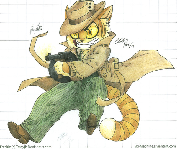
This is my final poster design for my design studio, social conscience campaign assignment. I have a few other versions of this, and other completely different designs that I was happy with. This one just got the best response, so thats the one I'm going with.Indian ink, black wash, kraft paper, inkjet printer ink, photoshop CS2.
Originally it was all done by hand except for the fox which was printed onto kraft paper (I love that effect). Later, for reproduction and editing reasons, I scanned it all into PS and had it reprinted and block mounted.
The name of the deviation is a result of working at 800dpi/a3 with 50 layers. It was so huge, I had to save it across the network to our file server because photoshop was using about 10GB of virtual ram (all the free space I had on my laptop).
Related content


Comments: 9


Thanks, I tend to work with them quite a lot..
👍: 0 ⏩: 1
 (Wink)")

I really love this!
Seems to be an effective ad campaign, because I started reading the red text inside the fox first, then the black text, still wondering what it was about, then the slogan in red at the bottom caught my eye and........wow! Well-fucking-done!
I'm very passionate about this issue, as well.
You've given me a few ideas with this splatter technique, I'd like to look into it further. Again, great work!
")
👍: 0 ⏩: 1
Wow, thanks for the comment. That's probably the best one I have had since I joined..
I'm glad you picked them up in that order. I really wanted the image to be the primary focus of the poster since a surprising number of ignorant bastards just stop looking at this sort of thing as soon as they figure out that it is an anti-fur thing.
The text in the fox is an idea I have wanted to try for a while. It turned out pretty well so I'll have to use it again in the future.
The ink splatters get a pretty hard hammering at in the studio because they are easy, fast and look cool. So many people were using them that I wanted to try to extend the concept into something new.
As for the subject, we didn't have a choice. It's not something I was overly passionate about at first but once I researched it a bit it certainly brought a lot of pretty powerful images to mind.
Thanks again..
👍: 0 ⏩: 0

Really cool design! I like the splatter effects and the text building up the wolf. Sweet!
👍: 0 ⏩: 1
Thanks! It is actually meant to be a fox but it is kind of hard to tell. For the splattered part, I just emptied out about half a bottle of Indian ink onto a piece of water colour paper and drop the exposure right down in photoshop. I've found you can actually get some really nice effects putting brown kraft paper through various types of printers...
Just been looking around your gallery; some very impressive work..
👍: 0 ⏩: 1
Ah, yeah I totally dig this sort of style and I've always loved experimenting with ink. Indian ink is hard to get hold of where I live to I usually do my splatters with water colors/acrylics. Gonna a get me some kraft paper too; I dig its textures!
Thanks for the look btw!
👍: 0 ⏩: 1
Really? I'd have thought art stores world wide, would have it, in cities, at least. I love some of the textures you can get out of plain paper just by wetting it a little. That happened on another project I was working on [link] . The paper was just slightly buckled from when I painted over it but it was enough that, when I closed the lid on my scanner, it came out in beautiful wrinkles flowing out from the wet areas.
Thanks again for the comments
👍: 0 ⏩: 0