HOME | DD
 LiHy — Reflection from a Dream
#cintiq #digital #draw #drawing #face #female #gimp #girl #illustrate #illustration #paint #painting #portrait #tablet #wacom #woman
Published: 2018-03-21 06:52:33 +0000 UTC; Views: 332; Favourites: 9; Downloads: 0
Redirect to original
Description
If you'd like to download the GIMP file, complete with EVERY layer I created to make this piece (except that it will be FREE from any watermark!), please purchase the download (over to your right). It may give you a glimpse into my process, if you're interested to see how I made this. Enjoy!~~~
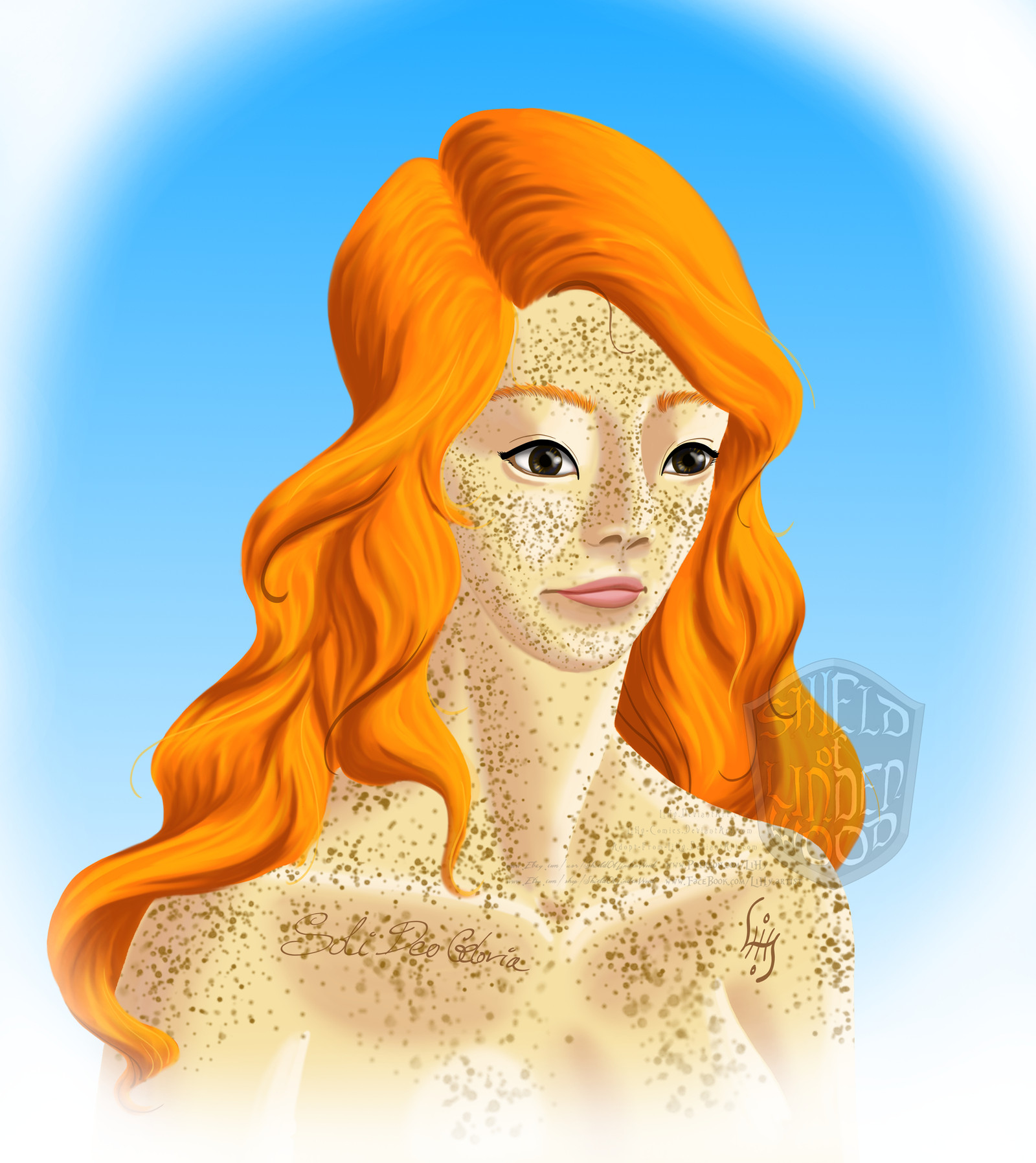
A few weeks ago, I had this dream in which I was looking in the mirror, and the woman I saw in the mirror (my own reflection) had this face full of freckles, with an Asian-shaped face--especially the eyes--surrounded by vibrant red hair. (None of those qualities are true of my appearance in real life: I am neither Asian nor a redhead, and I have never had any freckles.) She wasn't gorgeous--her face was actually somewhat plain--but her beauty was in the unusualness of her look. So I've been trying to recreate the face I saw in my dreams.
I lost track of how many hours I spent on this. It was good to practice with GIMP and my Cintiq tablet, and here's my assessment:
At my current level of skill, this is as good as the painting is going to get. So I'm calling it "done," because it's as good as I can get it at the time being. I tried to not rely too heavily on "outlines," but I'm not sure I like the outcome--she still looks more cartooney than I had originally intended, but without all those nice "outlines" I love so much in many of my other pieces. But the reality is that I do not have the natural talent to paint realism. I worked and reworked her eyes over and over again, and I both like and dislike them at once. They're pretty, and I think bigger and rounder than they were in my dream, and they don't look as distinctively Asian as I wanted them to look. I had a few false starts with her hair before I finally figured out a technique and got the hang of it, and now her hair is one of my favourite parts of the piece. I also had a lot of fun with her freckles, and I really like the way they turned out.
I welcome any constructive criticism, especially any critique or advice or suggestions regarding what I need to work on in the future. Thanks for checking this out!
~~~
Soli Deo Gloria!
Related content


Comments: 5

👍: 0 ⏩: 0

Hi! I'm from !
I saw your artwork and instantly wanted to comment on it. I really like how much is behind her design. The fact that you had a dream and tried to recreate it makes the drawing more interesting, so thanks for adding the description.
The drawing itself is good also. I can see what you meant by cartoony, though, but I don't think it looks bad, maybe you just wanted something else, and it didn't turn out as planned. I really like the eyes and the hair.
Now, to what can be improved. I guess it's maybe an outcome of you redoing the eyes a lot, but they don't blend as well into the rest of the drawing. There's no freckles on the top of her eyes and it makes the eyes stand out even more. The freckles themselves is maybe a tad too dark for her skin. They would probably look better if they were a little lighter, and some of them are a bit too big, mostly the ones from her chest and down.
I also suggest that you look up some reference for the neck and collarbones, because the way you drew it with no shadow almost makes it look like her chin and neck is on the same level. There's no depth there.
The highlighting and shadows makes no sense either. Where's the light source? It looks like it maybe comes a bit from the right, but then there shouldn't be highlights on her left collarbone. That side should be more in the shadows.
So, yeah. I do like your drawing, it stood out to me and I like the bright colors and the idea behind it. I just think it needs a more defined light source, plus you need to practice anatomy a little bit. But just keep it up, and I hope I wasn’t to harsh.
Cheers!
👍: 0 ⏩: 1

No, you're not too harsh at all! I know there's lots of room for improvement with this piece (and with my style overall), so I appreciate you taking the time to point out what qualities, exactly, need to be worked on. (I knew her neck looked bad, but I couldn't quite put my finger on why. Thanks for clarifying some of the issues and helping me to see it better.) I'm grateful for the feedback--even when it's critical, because how else am I ever going to improve if nobody ever points out what I did wrong in the first place?
God bless you!
👍: 0 ⏩: 0

hi! First of all this is really great-- you have a great grasp on colors. The colors you use for lighting and shading are beautiful! They also really fit with each other. The one thing I have to say about the shading is that it's really light in some spots (like the skin) while in other places-- the highlights don't get as light (like the hair.) I think either making the hair highlights lighter or the skin ones darker would really help. Also- for some reason in eyes shading looks better blue looking. You don't have to change that of course! It still looks great- just something about it is a little off-putting.
I read your description and like you said yourself the eyes turned out great. It's great that you're trying new things within your art like the way that you shaded her hair. Which reminds me, the way you shaded the hair is really beautiful. It looks really cartoon-esk which I love. Though, you said you were going for realism you said you just don't have it within you. So I think what would work really for you is going for a 3D Disney type style. It's cartoony but still has realistic shading and can be really beautiful. Another thing-- your anatomy skills are amazing! Another thing to maybe pay attention to is the facial shape though- you have the placement down but I just think that it looks like her head is more pushed back onto her head and I think that's what is making her look surprised to me. Going along with that I think the eye that's on the right is a little too far to the edge of the face. I do this myself and because I have a really cartoony/anime style it's more off-putting than usual. I think fixing little things like this will make you all the more happy about your work! I think you're doing amazing coming this far so keep it up and I'm looking forward to seeing more work like this from you!
👍: 0 ⏩: 1
Thank you so much for taking the time to give me such constructive feedback! I really appreciate it. And your comment gives me a lot to think about as well as some good reminders the next time I'm sketching/illustrating/painting a face.
Yeah, I typically do have a cartooney style, which I do love, but I was just going for something... different with this piece (which is maybe why it looks so awkward and off-putting in places, since it's kinda the first time I'm trying this undefined, digital-and-not-quite-cartooney style... in a way, this piece was good practice, so it's helpful to get feedback on it now to help me in my future work.) Also, thank you so much for adding me to your watch!!! That means sooooooo much to me, and I hope you enjoy what you see in the future!!!
God bless you!
👍: 0 ⏩: 0