HOME | DD
 Linnpuzzle — Quidditch pep talk
Published: 2004-10-24 15:06:51 +0000 UTC; Views: 21756; Favourites: 422; Downloads: 1727
Redirect to original
Description
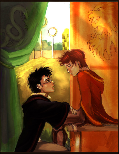
Harry and Ron. Harry's trying very hard to convince Ron that he doesn't suck at Quidditch, but it doesn't seem to work all that much.So... Saturated. *goes blind* I have a less flashy version, though.
Related content


Comments: 70


Nice handling with tools. The colors blend very nicely.
👍: 0 ⏩: 0

Looks like Harry would be talking to his son, not best friend.
But other than that, love it!
👍: 0 ⏩: 0

Aww...I like this. Yeah, Ron looks a little small, but that's really the only flaw in this piece and it looks like perspective. I like the super-saturation — really gives the scene that bright, sunny, quidditch-game feel.
👍: 0 ⏩: 0

this looks like a father/son thing LOL Truly beautiful
👍: 0 ⏩: 0

Before I saw the description, my imagination went crazy. I must mind bleach now. Excuse me.
It's awesome!
👍: 0 ⏩: 0


Ron looks a little young you could pull this off as a harry and james II
👍: 1 ⏩: 0

It's a very nice piece, with lovely details. The only issue I have with it is Ron seems so much smaller than Harry to me.
👍: 1 ⏩: 0

Well done. Really good job.
But Ron is looking so much younger than Harry...
Like he'd be his son.
 (Wink)")
👍: 1 ⏩: 1

That is what I thought! I thought that it was James....but it was Ron. The face is what makes him look younger, though.
👍: 0 ⏩: 0

I like this one: shade on the inside, bright sun on the outside. Very nice!
👍: 0 ⏩: 0

 (Smile)")

Haha, bet the Rorry shippers are loving this. <3
Personally I prefer H/Draco, but hey, this is cool artwork, and I'm not sure if you intended this in Rorry or just as, you know, fan art.
👍: 0 ⏩: 0


the saturation looks good like that, it's a sunny day after all (I think that match was sunny anyway). Harry does look a lot older than ron in this picture, but he's talking to him as a captain to a team member, so i guess it works.
👍: 0 ⏩: 0


this is brilliant. the coloring's so nicely done...but I can't color worth a damn, so, i might cry at the talent i lack. im going to fave this.
👍: 0 ⏩: 0

I like their expressions. Beautiful way colouring by ^___^
👍: 0 ⏩: 0


This pic is so cute! Their expressions are caught perfectly! Great work!
👍: 0 ⏩: 0

I like it. Ron's hair is kinda dull looking though. I don't know.
👍: 0 ⏩: 0

this is so cool! i love the colouring, and the day outside the pavillion looks perfect for quidditch! ron looks just right too! wonderful!
👍: 0 ⏩: 0

Yes, saturation burns., but in this case it's not bad. ")
👍: 0 ⏩: 0

I love the way they're looking at each other, the eye-contact is beautiful and deep, especially how Harry looks up at Ron with the confident smile. Im not a H/R shipper 


👍: 0 ⏩: 0


Oh, I luff it! There is nothing more to say. Simply wonderful. =^.^=
👍: 0 ⏩: 0

That looks so sweet to me. I have buckets of love for Ron.
👍: 0 ⏩: 0

The colours of this peice really capivated me, they grades of the greens and oranges work brilliantly and there is a real sense of warmth. Great composition in that regard. The character work is also solid, it helps to backup the narrative to the peice. Lovely stuff !
👍: 0 ⏩: 0

this is adorable!
And I really like the dramatic, slightly cheezy sunbeams 

👍: 0 ⏩: 0

aww he really does look lik hes tryin to instill confidence
👍: 0 ⏩: 0

Awwwww! *huggles both Harry and Ron* This is such a sweet pic!
👍: 0 ⏩: 0


I adore Harry and Ron to the ends of the earth. This is GORGEOUS.
👍: 0 ⏩: 1

Thanks! 
👍: 0 ⏩: 0

this is nice!!! i like the sunshineyness....it really creates a great mood. i also like the way you've balanced colors with the slytherin and gryffindor banners and harry and ron. mucho talento!!!
👍: 0 ⏩: 0

I really love it how you captured their friendship.
Such a tender moment...T.T
👍: 0 ⏩: 0

*¤gasps¤* So... shiny! I personally like the saturation... it's very "daybreak in the field". I reckon I just may eat Ron all up, he's so unsure + vulnerable, like a little boy. I simply adore how you've depicted him! *¤ruffles his hair¤* I always love to see your art! You? Stalk? Well, don't mind if I do! *¤fave, watch, glomp, worship¤*
Cheers!
*¤SnowSpiKe¤*
👍: 0 ⏩: 0

wooow such nice colours. You could almost taste the tension and excitement.
👍: 0 ⏩: 0

It makes me laugh to see this, because I get such joy from seeing your fabulous HP fanart. I like the companionship mood presented in this artpiece. The pose, and the way the two are intent on each other, shows how important one friend regards the other, and plus, it's just such a cute pose! I really like Ron's hair - the way it's shaped (if that makes any sense), and especially the fact that, finally, someone got his hair RED, not orange! The Gryffindor banner to Ron's right is a nice touch, and the artpiece would not be the same without the beautifully vibrant colors.
👍: 0 ⏩: 0

this is really great! I love the style you've done this in (all your hp fanarts are great!!).
I think that you've captured the mood well, and the bright colours actually work in contrasting with ron's expression (did any of that make sense 
Anyway
👍: 0 ⏩: 0

wonderful colors and lighting! i really like the way you can see the relationship between them!
👍: 0 ⏩: 0

Poor Ron. =\ Weasley is my King!! >:0 *beats up Draco* X'D
👍: 0 ⏩: 0

Yeah, a bit saturated but that's just fine. I like their hair, sort of ... flowy and spiky! Also the serpent and lion.
👍: 0 ⏩: 0

aw that is so awesome! I esspecially love Ron's face
👍: 0 ⏩: 0
aw that so awesome! I esspecially love Ron's face
👍: 0 ⏩: 0


Very awesome picture! The saturation gives it a perfect atmosphere.
👍: 0 ⏩: 0
| Next =>