HOME | DD
 LithiumFX — Completely
Published: 2005-04-07 00:54:17 +0000 UTC; Views: 1371; Favourites: 24; Downloads: 208
Redirect to original
Description
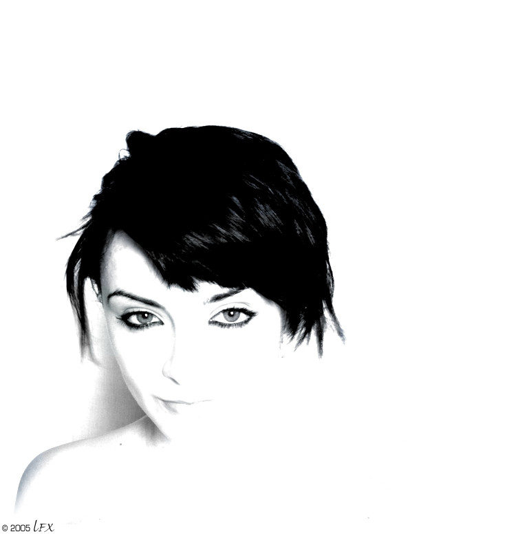
Further experiments with strange exposure.I think I may have a slight obsession with contrast.
I know this is harsh. I upped the contrast... obviously.
Related content


Comments: 23


I featured this photo in my latest journal.
[link]

👍: 0 ⏩: 0

Well, your contrasts are always good--at least I like 'em... Here, it's a nice idea to have included the shape of the shoulder, it gives a dimension to the whole pic. Nice work, keep experimenting! Flow.
👍: 0 ⏩: 0


no, the contrast is great, maybe just slightly too extreme but the way the shape of your face blends into the background as if it is part of it is very pleasing to the eye. great shot
👍: 0 ⏩: 0


That really is shit Faye.
I'm allowed to say that though, right? I mean, we slept together. That means I can be blunt. Right?
Tom
👍: 0 ⏩: 0


I like it; and I have to say, in contrast to rolfness, that I think the hair actually makes the photo better, because if it was smoother the stark white would be bothersome... well, maybe not "bothersome", but more... "plain". I think it's important with these overexposed images to have something to disrupt the uniformity of everything; and in a strange way it makes the sharper edges more defined by contrast. I just feel that it would have simply been "a nice overexposed pic of Faye" otherwise, and the scraggly hair disrupted that - it makes for an uncontrolled style. < /metwoschillings>
👍: 0 ⏩: 0

this is a really great peice but it feel incomplete. It needs the other side of her mouth and nose to complete the face.
Other than that it is Really beautiful. If you wouldn't mind i could alter it and submit it to show you?
👍: 0 ⏩: 0

excellent - that was precisely what i was envisaging
👍: 0 ⏩: 1

 (Smile)")
Thank you for the favourite.
👍: 0 ⏩: 0

I like it, but the hair bothers me, it seems kinda scraggly (no Im not trying to insult your hair cut) compared to the rest of the composition, everything is either very smooth and subtle (skin) or its very well defined (eyes) and the hair just looks like a big blob that is a bit overpowering. The high contrast makes the image very graphic design and the lack of control/ shape of the hair kinda jarrs against the graphic-iness of the image.
Hope you dont mind me saying so, its just my personal opinion
👍: 0 ⏩: 1
lol, yes.. point taken. Well.. I do agree with you that the hair could have been a lot better... but strangely I'm not bothered by it. I tend to squint a bit when looking at my own work.. and the blocks of colour just work. The intention was to have this big dark mass to contrast to the incompletion of the image (and then further contrast with the togetherness of the expression.. if that makes any sense). Hm. One could argue that the point of some photography is to evoke a reaction of any kind in the viewer.. if my hair upsets you because of the visual incorrectness... maybe that's a good thing?!
No.. I agree. It is too scraggly..
")
👍: 0 ⏩: 1
Heh Im glad you took it the way it was intended, I worry about commenting on photographic works simply because I know nothing about it and my point of view comes a tradtional art kinda viewpoint. If I ever say anything untoward feel free to spank me. lol
oh btw I do the squinty thing OMG.. Its been the bane of my life, especially when doing detailed work.
👍: 0 ⏩: 0

best one so far, fading in from the white wall...
coming through from the other side, a beautiful demon, ready to take lives and break hearts!
fantastic focus/exposure/pose
the way the slight shadow on the wall lifts you from the background really helps, and just managed to get some shape in the hair with the highlights!
bravisimo
+fav
a
👍: 0 ⏩: 1


ok - now im in tune with your whole high contrast thingy and it especially works here because there is no way i can go overboard with daft stuff like rescuing detail. what i would suggest is lifting yourself away from the bottom left corner just slightly and working on your shoulder line so that it tails down into a fine point. then it will look less like you have been framed and cropped and more like you are emerging from the page.
👍: 0 ⏩: 1
ahh... now there's some useful critique..
Yes, will work on that shortly. Cheers.
")
👍: 0 ⏩: 1
what - you mean previously wasnt? i'll have to buff up on my super power critiqueing skills
off to the bat-cave!
👍: 0 ⏩: 0
