HOME | DD
 LizardTheMaggot — Mariana

#dragon #pink #red #white #flightrising #flight_rising #flightrisingart #flightrisingdragon
Published: 2017-10-24 00:08:42 +0000 UTC; Views: 341; Favourites: 17; Downloads: 0
Redirect to original
Description
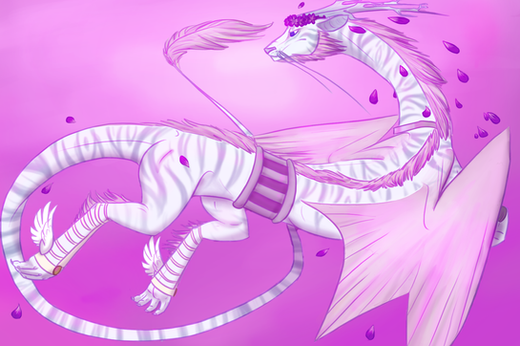
This is my starter dragon from Flight Rising, and since I'm a sucker for dragons I thought I might as well draw her in a wardrobe I'm planning out for her. I also managed to get some good looking shading and clothing wrinkles in this too. I'm actually really proud of this piece.Related content
Comments: 17

Hello Pandanias
Flight rising ... aha 
A great way to get inspired I think
I find the colors you used very pleasant to watch.
All very warm but still the subtle differences make it so that it doesn't become a big blob of redness
The gradient peach/pink background makes such a great contrast with the mighty dark red wings.
Makes them really stand out!
You say you added a wardrobe on her you are planning to use in game.
It looks very graceful and fluid
I wonder what your reference pictures, dragon, and wardrobe, look like,
as I can't really compare what your own addings and touches are to the design
The dragon's pose seems to be a bit out of balance because of her wings.
The left wing seems to point almost straight up in the air while the other seems to be spread more sideways.
It makes me think she would topple over with a little blow of wind.
It would make sense if the left wing would start a bit lower, around her shoulder,
less close to her spine and cast just a tad down.
Then if her right wing would point a bit more up it would be more in balance
What I really like is all those jewels she is wearing 
Also, her eyes are almost like gems so it seems to suit her character just fine.
I notice the gems/eyes, have a cast of light making them shine.
You did some shading of the rest of the dragon, like you mentioned
But still, the whole of it feels kinda flat.
And this is I think because of 2 reasons mostly;
*She doesn't cast a shadow where she's sitting, on the 'ground'
*There is a bit of shade cast but not really light (only on gems) and to have shade there needs to be light
You could try making the whole image a tiny bit darker and then in a new layer with overlay or soft light,
draw some light cast and see how it looks
All with all I think your dragon and clothings look rather fabulous
Beautiful colors and I'd be proud too
Have a nice weekend,
Whobleyh
👍: 0 ⏩: 1

Hey, thanks for the critique! I'm glad you like this piece ^w^
👍: 0 ⏩: 1

Single character portraits are my favorite type of art to analyze. They allow me to focus my attention on a single form, a single body, a single entity, and suss out as much as I can from the one resource. Without additional characters or an elaborate background to distract, nearly all of the information I retrieve will come exclusively from the character. Allow me to share with you what I see.
Mariana looks to be inspired by the snakelike dragons of the East rather than her bulkier, more aggressive Western counterparts. She is of the sort that possesses four legs instead of two or none, and she also appears to be quadrupedal in design, making her look more like a snake-horse. Though her head is in profile, standard laws of symmetry tell me she has four eyes, her tongue is not forked, and she has two fins on the top of her head to serve as either ears or stabilizers. The fins on her forelegs suggest she's built for swimming, while her massive wings would suggest she prefers he sky. I would imagine she could do both if the wings are capable of folding inward to her sides, which does look to be possible based on their design. One aspect of her design that does perplex me a little would be how far-reaching her wings are. They connect from the middle of her back to down past her butt, about to where her legs attach. I wasn't aware wings could stretch that far and be used as wings.
The color scheme looks on-point, with the reds and pinks blending to keep the colors harmonious. Though the consistency is present, I think your strongest colors lack the power to make the design really pop. The brightest and most attention-grabbing colors you used are definitely on the wings, and even those look a little muted, lacking a strong contrasting color to make that red stand out. One thing I appreciate is that you did not use pure white here for the dragon's main body, as unfiltered white tends to look wholly unnatural and hard on the eyes for most images, especially as a main color.
Though it's a subtle bit of mechanical know-how, I like how you made the clothing fall against the body. Standard rule of thumb dictates that your clothing was well-constructed if you don't lose the overall form of the character's body. The top curve of the dress appears to flow right along side the curve of her back while the bottom portion hangs lower, showing the effect of gravity on the fabric. The sleeves and underside have some wrinkles that provide info about the texture of the clothing, and the bit around the tail hugs it tightly like a sleeve. Personally, I think the biggest misstep with the clothing is actually Mariana's neck. With the texture of the clothing already established, having the same kind of wrinkles on the neck makes it look like her skin is made of the same material as her clothes or is part of her clothing. Changing up the line thickness and/or number of wrinkle lines should take you a little further in distinguishing the texture of the skin from the clothing. Consider studying the skin texture of the animal you wish to emulate to see how it differs from clothing in appearance.
The pose of the character is just about there, but it's a little weak in the rear. From the head, you start with a solid line of action that curves from the head and flows down to the tail. But then the tail loops back around and slams right through the established line of action, causing some visual conflict. The end result makes the pose weaker than it could be and adds ambiguity to the silhouette. If the tail wrapped around in front of Mariana instead of behind, you could have pulled it off with a much stronger pose that doesn't let your line of action overlap itself. Here's a little guide I found on dynamism and lines of action if you're unfamiliar with the concept: Nsio explains: Dynamism
Now to get into the real meat of what you can improve with this character piece. That's right. I'm talking about perspective, the artistic technique that will take your two-dimensional dragon and help her find that z-axis. Imagine drawing a three-dimensional cube around your character so that she was totally boxed in. Then imagine rotating that cube with your character still inside so that you could view it from the front, back, side, above, and underneath. If your perspective is solid, the character's anatomy and form would still look accurate regardless of which way you rotated the cube.
When grading your perspective here, one thing I can say is that your character passes the flip test. If I rotate the character on the x-axis, the character still looks the same. Beyond that, much like the clothing, you do have some technical aspects going for you. Her near foreleg appears to be closer than the further one, and her legs appear to occupy the space in between them. Her dress drapes over her legs and flows back to the neck and head. Her head looks to be closer than both of her wings, meaning her wings aren't in the way of what she's looking at.
I do see some issues in your portrayal of depth, however. Based on the curve of her spine, I can visualize the main body as a cylinder that moves slightly into the page in the z-direction. However, I don't see this same transformation with the points connected to that body. The feet and the neck, for instance, appear to be on the same plane even though the feet should be further back into the page to keep up with the flow of the body. The dress, tail, and wings should be repositioned as well to maintain the perspective. Another less noticeable bit of perspective you should check out is with the two visible eyes on the face. You placed them parallel to one another on this side of the face, but imagine how that would look from the front. Because of the curvature of the face, her bottom eye would be further to the right than the top one and pointing outward. Perhaps this is also intentional, but it's another point to keep in mind when thinking in three dimensions.
I would recommend looking into the principles of construction to help view your character as a series of three-dimensional components that make up a three-dimensional form. This other guide I found from the same artist has some insight on construction and analyzing your sketching: Nsio explains: Constructing and Analysing
As one additional point, I don't think the red paint gradient applied to the wings and dress came out particularly well. Since the whole piece has minimal shading, the gradient looks like an actual paint job that didn't get finished. The part on the dress applies the gradient more consistently and looks less painterly, but it has the effect of making the dress look like it has a rash. Considering the background already uses a gradient, I'd propose sticking to solid colors to keep the design looking consistent.
I hope you find this information useful. Make the most!
--
👍: 0 ⏩: 1

WOAH!!! Tysm for this critique! I found this and the guides rather useful. Thanks again for putting so much time and effort into this in-depth critique, I really appreciate it.
👍: 0 ⏩: 0

Haha thanks. I'm glad you like it ^w^
👍: 0 ⏩: 1

I love the design of the dragon and the red outfit
👍: 0 ⏩: 1

A really nice dragon, rare to find many of them wearing clothes. As part of the commentproject here is my two cents for things to work on.
The neck and tongue both off, at a glance they look passable but if you look at it longer you notice. The tongue is either at the wrong angle for the drawing or it is a
very wrong tongue as it comes out of the mouth and swells in thickness then narrows again. The neck gives the impression that someone snapped her neck due to the way it
turns at an angle that should not be possible. other than those I think it is very well done.
👍: 0 ⏩: 1

Hey, thanks for the feedback. You're the 3rd person to point out her weird neck, and tbh I'm glad people are pointing this out to me because before I didn't notice it at all. I'm also glad you pointed out her tongue as well because at second glance it does seem a bit odd. But anyways I'm glad you liked this piece ^w^
👍: 0 ⏩: 0

You did a wonderful job with the dragon! With all the sincerity of the world, you have my congratulations!
👍: 0 ⏩: 1

You're always welcome, like I say, you earn it!
👍: 0 ⏩: 0

Wow! This really caught my attention. It looks really bold and beautiful. The colors work really well together. To me white implies cold, and having her surrounded by warm colors makes it really interesting.
The only thing I might fix, is her neck. It is a bit strange that it is narrower at the body and wider at the head. I really like the shading on her ears (are those ears? I don't know much about dragons ). Other than the neck, I really like the design of it! Great job!
👍: 0 ⏩: 1

Hehe thanks. One of my friends pointed out her weird neck when I uploaded this to my gallery a little while back; but I'm glad you liked this piece ^w^
👍: 0 ⏩: 0


