HOME | DD
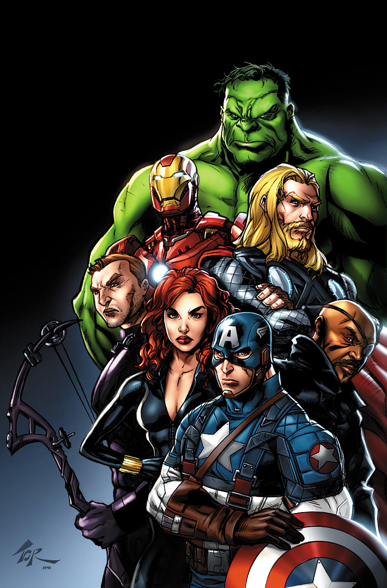
 logicfun — Avengers

Published: 2012-05-28 12:55:05 +0000 UTC; Views: 15268; Favourites: 420; Downloads: 415
Redirect to original
Description
Pencil and ink by [link]Digital colors
Follow me on my facebook [link]
Related content


Comments: 46

👍: 1 ⏩: 1

👍: 0 ⏩: 0

Overall

Vision
Originality

I think that the Iron Man is perfect. no detail should be added or taken away. Thor is great, although personally I'd like to see some of his cape go behind Iron Man, because it sort of looks too conveniently placed above Stark. If there were any more lightning I think there would be too much focus on Thor, so I think that's good. Maybe like one more streak of lightning. Everything is great, but I think Cap looks a little stiff. He looks really cool but it's not a 100% convincing sprint. I would like to see his shield arm a little more forward, his other arm a little further up, and his torso twisting a little more. Just tiny tweaks. Everything else looks perfect! Great job, I love it. Instant favorite. Wait a sec.. Where's Hulk!? Just kidding, he doesn't have to be there.
👍: 0 ⏩: 1
Oh whoops I didn't realize you didn't draw it..
👍: 0 ⏩: 1
Your not the first and not the last ^^
👍: 0 ⏩: 0

Overall
Vision
Originality
Impact
Ah! The Avengers! I like it. Awesome. Just, wow! e.deviantart.net/emoticons/b/b… " width="15" height="15" alt="
")
Although I haven't seen the movie yet, I have read the comics. Trust me bro, I think the story in the comics are WAAAAAYY better than the movie. LOL.
Anyway, texture is awesome. That classical look from Capt. America, fantastic. Thor needs a little bit of more lightning, and Mr. Stark right there needs more details though.
Ahm..just wondering, why does the Iron Man suit look a little bit more...well.."unrealistic". Not to say that it looks bad, but I think the suit lacks something which I really just don't know.
Needs a little bit of lighting too. Image is a little bit dark.
Oh, who am I to judge what the Avengers would look like? They are the Avengers, the world's superheroes!!!
Its a fantastic picture. Trust me. Very, very, very good. I appreciate it a lot. Overall? 4 out of 5. e.deviantart.net/emoticons/s/s… " width="15" height="15" alt="
 (Smile)")
---
Cheers for the good painting!
👍: 0 ⏩: 1

I love this picture. just need to say work on thor's face a little better.
👍: 0 ⏩: 1
Not only thor face make to be better on this picture, it's not my better color
 (Wink)")
👍: 0 ⏩: 0


i don't know who's strongest,but i prefere Iron Man
👍: 0 ⏩: 1


This is a great picture Thor, Captain America, and Ironman look well but Thor's facial expression looks a little off. Other than that this picture was pulled together beautifully
👍: 0 ⏩: 1
The same who draw all the characters,Robert Atkins
the original draw is link on the description
👍: 0 ⏩: 0

Since I saw all of your works, I would say, u do better than that :< its not bad....its great but u do better
👍: 0 ⏩: 1


j'aime beaucoup cette colo!! mais je me demandais si Iron Man ne devrait pas avoir un aspect plus.. métallique? tu sais une surface plus luisante? réfléchissante? je ne sais pas comment le dire en fait ")
👍: 0 ⏩: 1
Je comprend très bien ce que tu veut dire mais j'ai 3 bons arguments:
Iron man est plus ou moins en contre jour
l'ambiance est peut lumineuse
je suis une quiche pour les effet métallique sur des couleur autre que doré et chrome ^^
👍: 0 ⏩: 1
adjugé venduuu!! haha une quiche?.. ça fait longtemps que j'ai pas entendu l'expression :3 c'est mignon tout plein! de toutes les façons, ça ne gâche pas le dessin, mais là au moins je sais pourquoi t'as fait les choses comme ça :3
👍: 0 ⏩: 0


Great colouring for Marvel's Trinity, well done!
👍: 0 ⏩: 1