HOME | DD
 LostonWallace — SPIDER-MAN 3 Layout
Published: 2007-10-09 19:17:24 +0000 UTC; Views: 4009; Favourites: 73; Downloads: 103
Redirect to original
Description
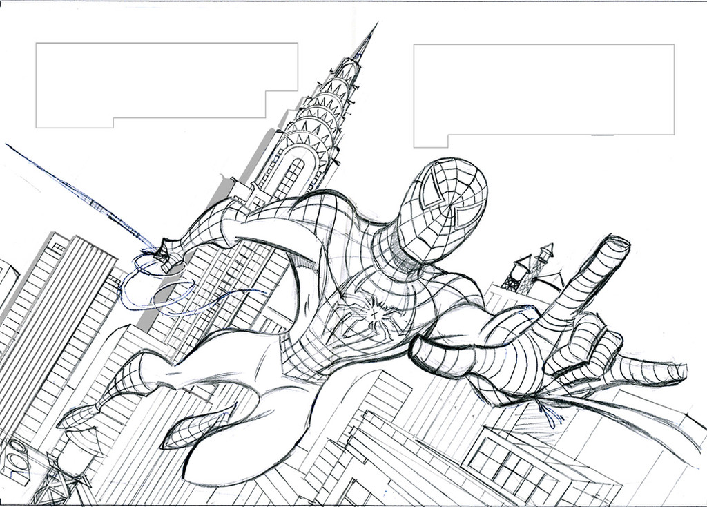
Originally, when I was illustrating the SPIDER-MAN 3 SOUND BOOK, the book had a different look. I came up with an animated style for ol' Web-Head that I quite liked, as did Meredith Books, the publisher. Unfortunately, Marvel Entertainment wanted a more traditional look as to not confuse their branding, so the style was changed. This was one of the double page spread layouts in the book drawn in the more animated style. I wish the book could have been drawn in this more kid-friendly approach. I quite liked the look. Hope you do too. (Smile)")
Loston
PS: Note that the boxes in the sky indicate text placement on both pages.
Related content


Comments: 7


That's a great layout. I like the Chrysler Building in the BG, too -- great reference!
👍: 0 ⏩: 0

