HOME | DD
 lrguyart — What is this?

Published: 2012-09-06 20:48:56 +0000 UTC; Views: 9292; Favourites: 3928; Downloads: 76
Redirect to original
Description
who knew that colouring was so much effort. D;anyways, i thought i'd try my neeww army of colouring stuff and this is what happened.

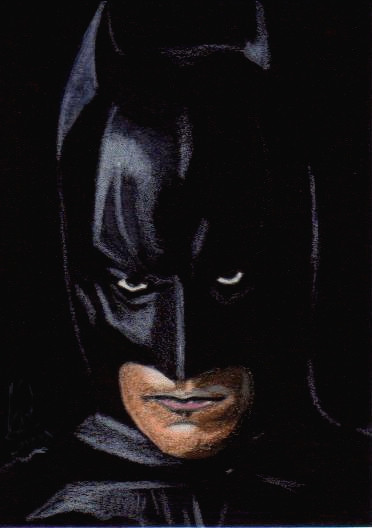
it was kind of a toss up between batman and spiderman, but spidey was more colourful. xD so there ~ lol.
i pretty proud of this one, colouring is never my strong point & i'm not too confident with it yet but hopefully i've proved myself wrong.
 (;
(;i know, i know. i suck at the titles.
")
done in copic markers and prismacolor pencils on smooth bristol board.
ref : [link]
spiderman is (c) to marvel.
Related content


Comments: 226

Overall

Originality
Technique

I'm not an artistic critique but I can say, this is very great. Being 'original' I say is lower, because Spiderman does have the black spider-man version. This looks very realistic and there is well lighting and shading. The detailing is magnificent, and so is the coloring. I could never do a work of art like this, and Wish I would. I love how the detailing upon the black on the upper-arm, you can see how it is overtaking him. That is my favorite part.
I am surprised on how you put the reflection of buildings in the eyes, unlike lot of artists. This work of art is just marvelous and you should be proud. All I can say down is there is a small crevice-looking part on the head side. But simply wonderful.
👍: 0 ⏩: 0

Overall
Vision
Originality
Well, this was so awesome I had to write a critique. This is my first critique, actually, so sorry if it sucks. e.deviantart.net/emoticons/x/x… " width="15" height="15" alt="

ANYWAY. Umm, yeah... I'll just go through the things one by one. Though I'm not sure what all of them mean. e.deviantart.net/emoticons/x/x… " width="15" height="15" alt="
Vision is great. On a first glance, everything is perfect. The picture's full of details, you clearly spent a lot of time on this, and you even made Spidey's eyes reflect the buildings. The shading and lighting is lovely and smooth and the colours match well together. I also love how detailed the spider on his suit it. e.deviantart.net/emoticons/s/s… " width="15" height="15" alt="
 (Smile)")
But, after a while, you notice small mistakes in it. I guess I've got a few reasons for only giving it 4 stars for vision. Firstly, those buildings are a bit scrambled. I'd recommend using three-point perspective for them. Some of them are a bit slanted, like they've half-sunken into the ground. Otherwise, great work on the details (windows and such) on the buildings. And you also made the further-most buildings lighter, which gives it an extra amount of realism. e.deviantart.net/emoticons/b/b… " width="15" height="15" alt="
Now, one thing is his hand. Or the fingers, specifically. His thumb looks okay, but the rest of them... Well, they're a bit short and that index finger looks weird. I don't know why. It looks like it's in an unnatural position or something. But I like the cross-hatching and shading on the hand. e.deviantart.net/emoticons/s/s… " width="15" height="15" alt="
And then the sky. I absolutely adore the colours, but those don't look a lot like clouds. Or whatever those light things are supposed to be. I don't know a lot of skies myself, so I don't really know how you could improve that... Just look at pictures. A lot.
As for originality, a lot of people have probably drawn Spidey in mid-air with a city behind him. I guess the venom stuff adds a tad of originality, so it's not just Spidey in mid-air. It's Spidey in mid air staring at some venom stuff on his hand.
...yeah. Still not very original. :/ But it's kind of a portrait-ish piece, and those are hardly ever very original.
I think I accidentally said a lot about technique in the vision thing. Uh... Well, you certainly seem like you know what you're doing with all the shading and lighting and stuff, even though you said you're not still that good with colouring. Sure, we can see some of the individual lines... but does it really matter? It still looks very realistic. Stop saying you're not good with colouring, there are people who aren't half as good and don't say anything about it. Okay, I'm several years younger, but... it's gonna take a whole lot of years of practice before I reach your skill level.
And yeah, I guess those scrambled buildings have to do with technique. Three-point perspective is a technique. Use it. Or a ruler, at least. I know those buildings are probably very small and hard to fir details into, but for example that building on the bottom-right corner doesn't look rectangle-shaped from above. Which it supposedly is supposed to be?
Um, okay, what the heck is impact supposed to mean? Uh, I checked the faq about critiques. Yes, it truly does blow my mind. Yes, it does evoke strong feelings in me. My fave part about this is still Spidey's eyes, which are awesome. Truly. Very. I guess they're the first thing that caught my eye. And the buildings in them look perfect. e.deviantart.net/emoticons/s/s… " width="15" height="15" alt="
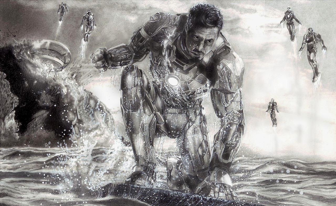
And now I noticed that this is two years old. Oops. But you don't really have any similar newer work (except the iron man), so I can't really tell how you've improved.
Sorry for the incredible length of this critique. e.deviantart.net/emoticons/a/a… " width="19" height="19" alt="

e.deviantart.net/emoticons/l/l… " width="19" height="19" alt="

👍: 0 ⏩: 0

Originality
Great work! One thing I would like to say is, did you straight draw it or just shade it in? Anyways, besides that the originality is okay but everyone knows spiderman! Maybe you could make up your own fancy character eh? The technique is amazing! I would just ask you to make the background a little more detailed e.deviantart.net/emoticons/s/s… " width="15" height="15" alt="
👍: 0 ⏩: 0

Originality
Even though I'm not such a fan of Spiderman, I must say this is quite an amazing piece.
The coloring is top-notch. All the light and shading is where it's supposed to be, and all the attention to intricate details from the reflection of the city in the eyes to the black venom things (I forgot what they're called e.deviantart.net/emoticons/x/x… " width="15" height="15" alt="
The only problem I have is the fact that the top of the highest building seems to "blend" in with the background, and almost all the buildings in the background look really crooked and unaligned.
I hate to sound like I'm asskissing by pointing out so very few flaws in this drawing but most of it is drawn so well I have very little negativity to say about it. e.deviantart.net/emoticons/s/s… " width="15" height="15" alt="
👍: 0 ⏩: 0

Brilliant work here! I love the lighting and the shading... it looks very realistic. And the detail... Woah! So super detailed!!! You made everything stand out the way it should... and I really like the way you did the reflection on Spider Man's eyes. I also like how you drew the venom thingy, you know. e.deviantart.net/emoticons/b/b… " width="15" height="15" alt="
e.deviantart.net/emoticons/b/b… " width="15" height="15" alt="
👍: 0 ⏩: 0

Originality
e.deviantart.net/emoticons/b/b… " width="10" height="10" alt="

I can tell there was a lot of effort put into it, and that's great.e.deviantart.net/emoticons/b/b… " width="10" height="10" alt="
e.deviantart.net/emoticons/b/b… " width="10" height="10" alt="
I think you chose a great medium to do this picture in, pencil crayons are great for detail and they are quite versatile.e.deviantart.net/emoticons/b/b… " width="10" height="10" alt="
Anyway, nice work! I looked at some of your other things and you have really awesome portraits. Keep up the great work!
👍: 0 ⏩: 0


thank you very much!
👍: 0 ⏩: 0

")

exactly.
👍: 0 ⏩: 0


👍: 0 ⏩: 1
thanks so much, i'm glad you like it.
👍: 0 ⏩: 1
👍: 0 ⏩: 0

great spiderman drawing, it looks LIKE the actual thing, wow!
i really really like your work, the shading/lighting is sublime, and the coloruing/details are very good, and this means that you are a great artist.
keep making stuff like this, sir.
👍: 0 ⏩: 0

I simply enjoy so much to those details on his eyes!
very good job!
👍: 0 ⏩: 0

This is awesome i love it
Also did you know for all Marvel Fans in Earth 15 Spider Man gets the carnage symbiote
👍: 0 ⏩: 0


The details are amazing
👍: 0 ⏩: 0

Definitely showing this to my nephew! (He's a huge Spider-Man fan
👍: 0 ⏩: 0


This is so good! Spidey is my favorite. You used the markers so well!
👍: 0 ⏩: 0

I love how the city is reflected in his eye patches, wow!
👍: 0 ⏩: 0


ABSOLUTELY AMAZING OH MY GOD YOU'VE PUT MY STUFF TO SHAME CONGRATULATIONS PLEASE FOR THE LOVE OF GOD KEEP DOING WHAT YOU'RE DOING!!!
👍: 0 ⏩: 0


i didn't even notice this was traditional art until i zoomed in! wow! this must've took a LOOONG time!
👍: 0 ⏩: 0


I can't believe this is a drawing, it is so amazingly well done. From the angle, to the colors, to the background, I thought it was a screenshot or something. Amazing, mind-blown...I have no idea what other words I can say to describe this. 
👍: 0 ⏩: 0


How the hell does this have not a DD yet, it's amazing art.

👍: 0 ⏩: 0

I couldn't even tell this was a drawing at first! Well, I can also say the same for just about everything else in your gallery. You also drew the skyscrapers in the background really well, although it looks like some of them are facing different directions than others. Is this intentional? At any rate, great work!
👍: 0 ⏩: 0

That's amazing!
It seems to be an official film artwork. Every detail (from Empire State Building to Spiderman's eyes) is perfect.
I'm sure you have spent time and attention on this work.
You've choosen a particular moment too. And you've caught all the dramatic atmosphere.
Very good.
👍: 0 ⏩: 0

this is so awsome..the shading, the background, the coloring, spiderman himself...everything is just perfect..thumbs up
👍: 0 ⏩: 0
| Next =>