HOME | DD
 LtCommanderData — For Katie

Published: 2007-03-23 03:54:26 +0000 UTC; Views: 277; Favourites: 5; Downloads: 22
Redirect to original
Description
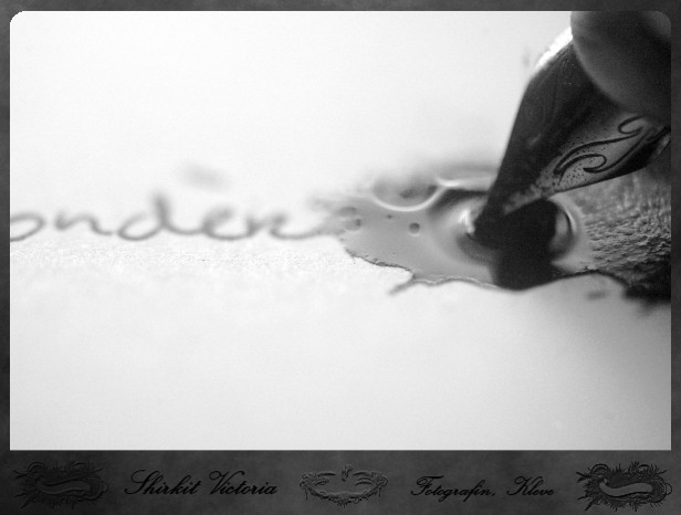
This is for an art trade with Katie ( ~bberry06 ) and I hope she likes it. This is my first attempt at still life and I do hope there are more to come with this one.That is a picture of my ink pen and ink well.
Related content


Comments: 13

Beautiful! I'll have to favourite this as well. You have an awesome eye for the microcosmic. This is just fabulous work!
👍: 0 ⏩: 1

Thank you again! I love your compliments...
")
👍: 0 ⏩: 0

Beautiful!
I think it deserve a 
Btw, try to put out the typography it'll look more better, in my opinion of course, no offense but typography sometimes doesn't need
👍: 0 ⏩: 2
Oh! My name... I see! I just always use it so I think I will continue using it but thanks for the advice! I apreciate it!
And thanks for the favorite!
👍: 0 ⏩: 1
No worries!
If you want to use it, just use a smaller text and not so bold, check it, i think it'll be great then
👍: 0 ⏩: 1
Maybe I will do that... thanks!
👍: 0 ⏩: 1
Sorry but what is typography?
👍: 0 ⏩: 1
the letters in the frame
👍: 0 ⏩: 0

Wow. It's so...bberry06 already said what i wanted to say about it...
I love it!
👍: 0 ⏩: 1

Whoo! Awesome  (Smile)")

👍: 0 ⏩: 1