HOME | DD
 LukeOram —
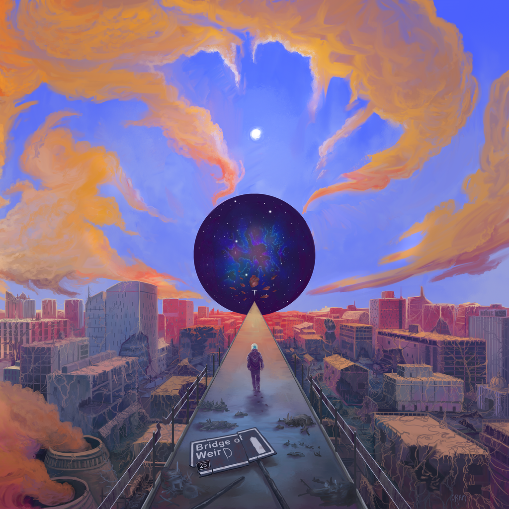
The Cosmic Causeway

#bridge #city #decay #fasterthanlight #future #industrial #portal #scifi #space #timetravel #timetraveler #urban #wormhole
Published: 2018-07-22 11:25:37 +0000 UTC; Views: 7951; Favourites: 451; Downloads: 0
Redirect to original
Description
Front cover for psych/prog band DEAD OTTER's forthcoming LPRelated content
Comments: 37

speechless! now this would make an awesome wallpaper
Love the cloudy look and the use of lightning is just awesome!
Well done and congrats on the DD
👍: 0 ⏩: 1

Thanks very much, I appreciate the positive feedback
👍: 0 ⏩: 1

Your draw is Magnificent!! Congratulation I love it!!
👍: 0 ⏩: 1

Congratulations on your well deserved DD! 
👍: 0 ⏩: 1

No matter how hard I look, cannot seem to find the otters, live or dead.
👍: 0 ⏩: 1

It could not be the heaps on the road, could it?
Admittedly I have little knowledge of what an otter looks like after sufficient putrefaction.
👍: 0 ⏩: 1

Hahaha no.
'Dead Otter' is the name of the band who were the clients for this image. Their mascot is an otter-like creature in a space suit, and the small white figure floating inside the 'worm hole' is a depiction of that. I also painted the back of the LP cover, which is the reverse image: lukeoram.com/the-nebular-grave… the skull is an otter's skull.
The whole concept is very psychadelic, which fit's the band's music.
👍: 0 ⏩: 1

Ah! That is more like it.
Was guessing the prominent character might be a tailless otter in the style of Budgie's mascot, but that makes more sense.
👍: 0 ⏩: 1

The overall style was certainly informed by the period that produced Budgie, so that's a spot-on observation.
I'm really not sure what the traveller looks like as it's back is to us- maybe it represents the listener about to throw the album on? I was working to very solid designs by the band so they have the final answer...
👍: 0 ⏩: 0

Stunning work. The colors and all the details are really inspiring. Keep it up!
👍: 0 ⏩: 1

Thanks, I appreciate that! - I certainly will keep working, lots more coming.
👍: 0 ⏩: 1


