HOME | DD
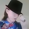 Lunix17 — Elf

Published: 2011-05-07 21:40:39 +0000 UTC; Views: 518; Favourites: 6; Downloads: 0
Redirect to original
Description
I had a lot of fun making this one, it took a looooong time, but it was totally worth it.Watch on Live Stream
Made with deviantART muro
EDIT: HE'S A DUDE!
Related content


Comments: 26


Vision
Originality
Technique
Impact

There are a few things I do like about this drawing. The hair for example took a very long time to do I imagine. Unfortunately, due to the skin colour, it does blend in too much with the hair. May I suggest throwing in a bit of shading? That way the hair and skin would be in greater contrast.
I'm not really sure what to make of the eyes, despite their simplicity and crude nature they're drawn in, there does seem to be quite a bit of emotion behind them, sadness or curiosity.
The nose I think needs to be more clearly definied. Like the hair, it does kindda blend in as does the detail in the ears.
I am not a fan of that background. So much can be done with the scattering effect in photoshop but it does just look like you've run the mouse around a back layer and thought, 'That'll do'.
What I would recommend? Since it did take time to make this piece, I would recommend drawing a lot more on paper before working on a computer. You need a certain level of skill to get away with drawing art on the computer with a mouse but even still, I highly recommend against it. Get yourself some pens, pencils, rubbers, pencil sharpeners and sketch pads and start doodling there. Draw from real life, not imagination. If you practice enough, then without knowing it you'll be drawing stuff that looks eeriely realistic.
Feel free to have a browse at dA's stock photos and sketch a couple of the models, anything that catches your eye.
If I can give one bit of advice, it's that you can be a great artist, but not while you're using a mouse. Get those pencils out and start making a mess!
I'll be keeping an eye out on your progress 


")
👍: 0 ⏩: 0

Vision
Originality
Technique
Impact
First of all, the contrast of the head overall just isn't there. Try to darken either the hair or skin, or add "dark highlights" to the hair and facial details. Think about how you did the eyes: there're the lights and darks.
The background struck me as interesting; however, maybe you can add not only detail, but hidden images. With a background like that, you can probably add even more interest and depth to the piece if you, say, hide pictures of maybe what the person's thinking--this would enhance the atmosphere of your art.
Also, the right eye is a little too high; lower it a little.
And thas' all folks--signing off = )
👍: 0 ⏩: 0

Vision
Originality
Technique
Impact
This picture is very 'meh' it suffers from floating head syndrome, with no shoulders or background indicating anything about the portrait. The facial proportions are very off, the way the eyes are aligned indicate her head is tilted down, but how the head is oriented make it look like he is facing straight on. the eyelashes for this character stand our jarringly compared to everything else in the picture, which has a more serene and calm look to it. Simply changing the color of the eyelashes should fix that.
Shading is another thing, the planes of the face indicate that there should be more shadows along the cheek, side of the nose, and around the eyes, without those shadows, the face looks extremely flat, it would also help to have more values in the skin, highlights and darker shadows would help greatly. more values would help this image 'pop' more, espeically in the hair that looks mostly the same when it comes to colors.
[link] <- this has good info on values and why they are important!
It seemed like you were trying to go for a calmer look with this, judging by the character's face, the background should do somting to support that. The hard edges of the circle distract from that image.
👍: 0 ⏩: 1

if you look closely at it you can actually see his shoulders, and the background was meant to have that airy bubbly-ness about it. I was working on the shadows, but the more i worked the worse it seemed and so I pulled back to this. I was trying to make the eyes stand out, but I didn't really get to play with it well enough.
The background is kinda meant to distract you from him actually... its kinda the way he comes off... he's a strange character...
Thanks for the critique.
👍: 0 ⏩: 0

It's a little bit hard to see the nose but the rest is nice.
👍: 0 ⏩: 1
you have to have the right color setting.... it doesn't show up on most computers... I have an HD screen and the color change is subtle enough that you can't really tell as well as you can on my computer.
👍: 0 ⏩: 1
its kinda upsetting...
👍: 0 ⏩: 1

I'm glad that you liked watching it.
👍: 0 ⏩: 0

You are so right about it being worth it. You went all out on this one! The colours and shading are perfect, the detail is top notch and the eyes are outstanding. great background for it to ... gives its a magical aura.
Well done on making a fine piece of art and a great looking elf  (Smile)")
👍: 0 ⏩: 1
I feel like I really did well with this one, I actually amazed myself at how good it turned out.
👍: 0 ⏩: 1
Agreed, watching it being coloured by you in was fun, I am happy for you that it turned out so well
👍: 0 ⏩: 1
some people aren't seeing the colors well enough it seems.
👍: 0 ⏩: 1
Hmm, people can see things diffrently sometimes.
👍: 0 ⏩: 1
its sometimes the color balance on the computer though...
👍: 0 ⏩: 1
True, but still you did splended ^^.
👍: 0 ⏩: 1
Anytime  (Wink)")

👍: 0 ⏩: 0

Done with dA muro, Hm, I think you drew rather Nicely, I like the different shades of yellow for the hair, and the shading of the ear was done very good. I really like this piece. And it was worth it for the amount of time you put into it.
👍: 0 ⏩: 1
Apparently dAmuro is evil, but I think it worked out quite nicely, I did the shading in a harder color and actually lowered the oppacity on it. It took a few hours, and you can watch a replay of the shading on [link]
👍: 0 ⏩: 1
I did take a look, and still I think you did a wonderful job. Your art skills improve with every picture.
👍: 0 ⏩: 1