HOME | DD
 lyc — a deepness in the sky
Published: 2006-11-18 15:20:35 +0000 UTC; Views: 9060; Favourites: 87; Downloads: 511
Redirect to original
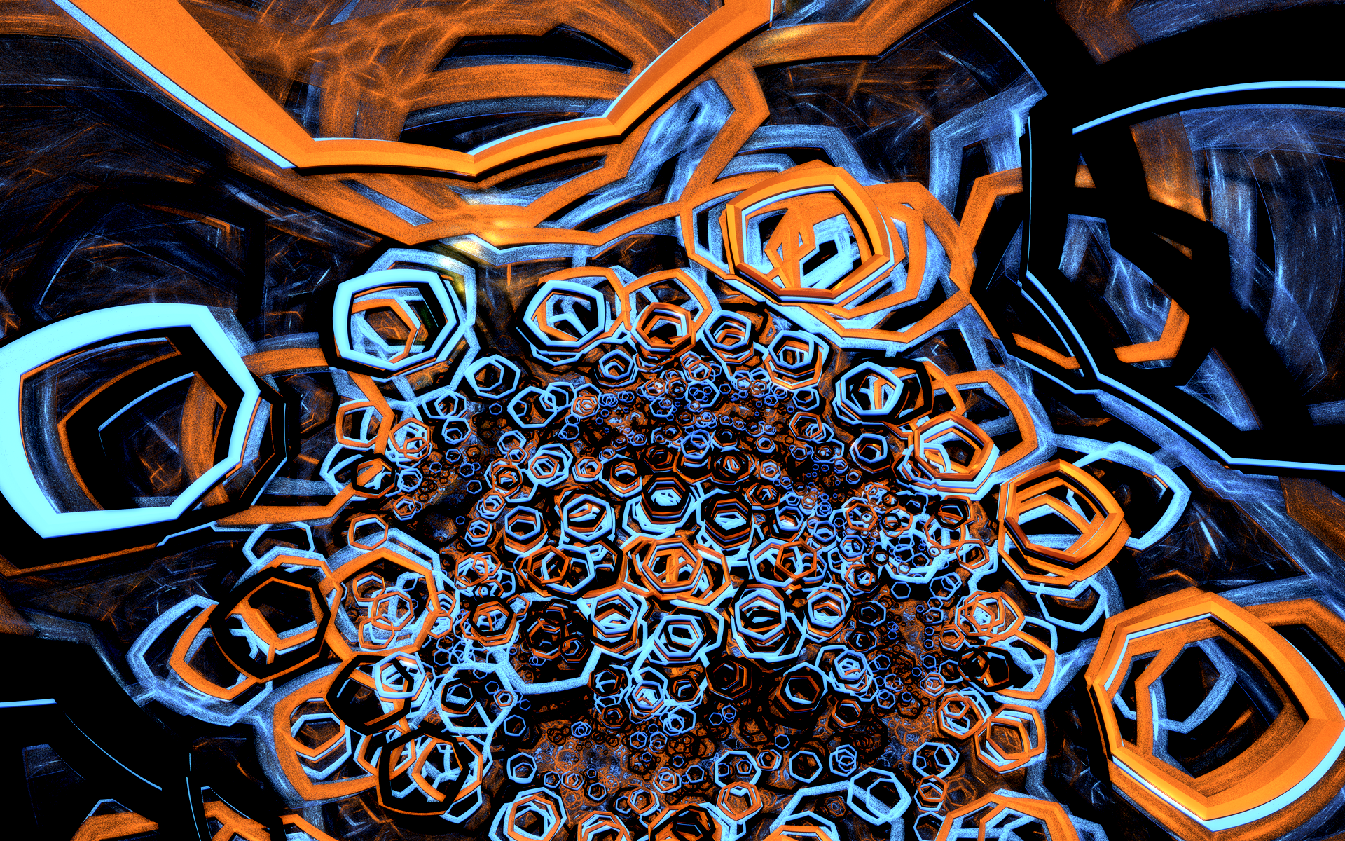
Description
vinge [link] / mfx [link]smooth version: [link]
Related content


Comments: 62


Nice. I like the way the surfaces change. I thought, its much smaller than usual for you. But then I clicked download and it was huge!
")
👍: 0 ⏩: 1

yeah this new submission procedure sucks actually ")
anyhow, glad you like it
👍: 0 ⏩: 1
The submission process requires you to have Flash? 
👍: 0 ⏩: 1
aye i've confirmed that it doesn't in fact use flash... the loading looked kinda flashy and was on another machine (not mine) that had flash, so i made the erroneous assumption...
👍: 0 ⏩: 1
I've also noticed that on the new submit, you have to set the full view to original size or it makes it smaller. 600X800 or something.
👍: 0 ⏩: 0

Wooow. This is quite different in feel from most of your other ones. *stares closer and gets dizzy*
👍: 0 ⏩: 1
thanks  (Smile)")

btw since you mentioned it, i'd be interested to hear how you'd describe the "feel" of my other works
 (Wink)")
👍: 0 ⏩: 1
I dunno. It just seems like the rest of them feel more... organic and flowy. This one is more... geometric. I dunno how to exactly describe it. And a lot of times you use a very... monochromatic look or other matching colors and this one is using complimentary colors.
Hopefully that explains it.
👍: 0 ⏩: 1
it does indeed explain it
anyway thanks for the "outsider analysis", i'm always considering how my work will be seen by others but of course i'm limited to my own thoughts there and it's great to hear another perspective
👍: 0 ⏩: 0
<= Prev |