HOME | DD
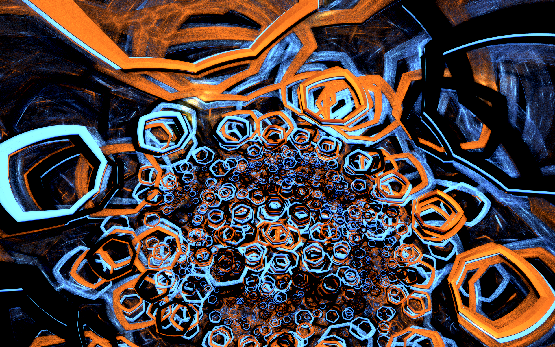
 lyc — a deepness in the sky
Published: 2006-11-18 15:20:35 +0000 UTC; Views: 9059; Favourites: 87; Downloads: 511
Redirect to original
Description
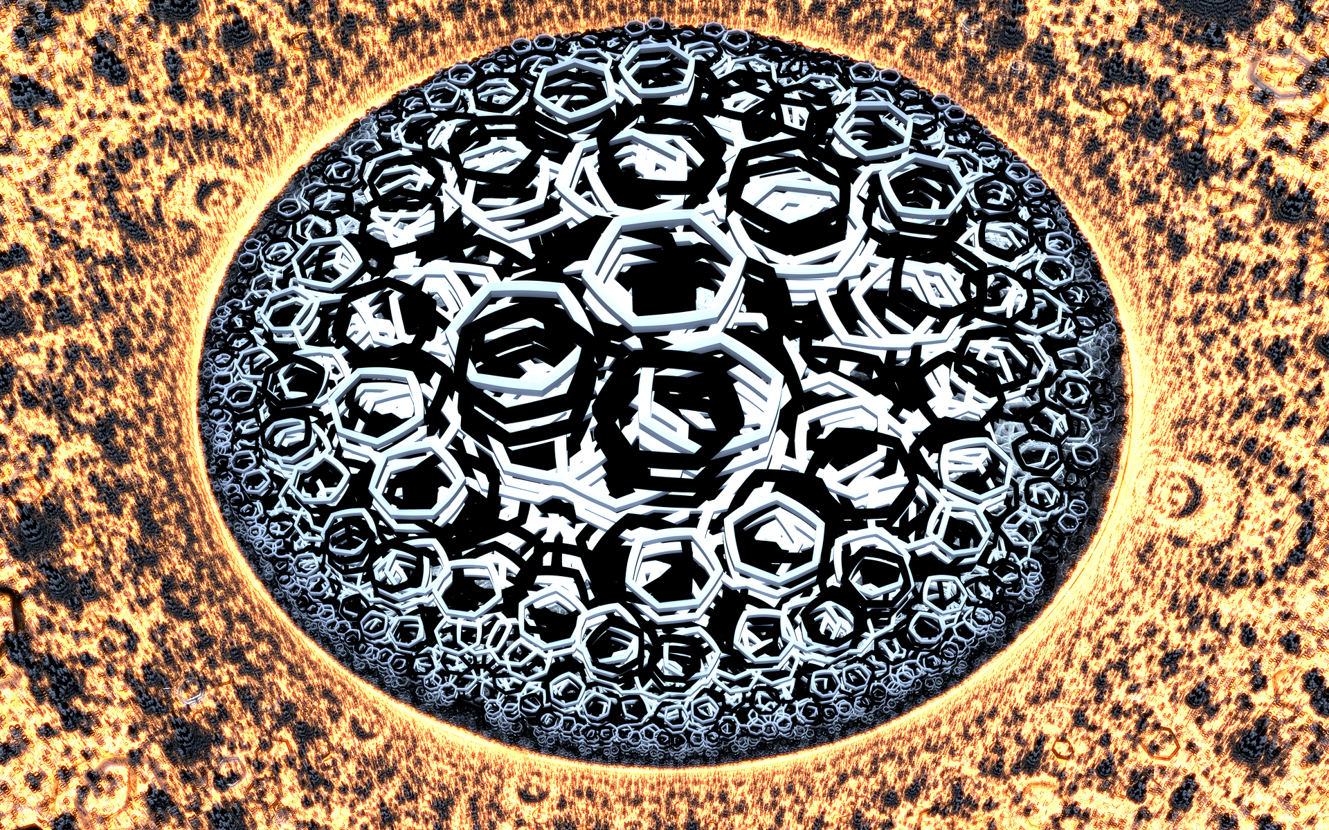
vinge [link] / mfx [link]smooth version: [link]
Related content


Comments: 62

WOWOWOW Awesome and wonderful.....Very cool!!! Love the colours.
👍: 0 ⏩: 0

Another masterpiece. Stunning. Ok, you deserve to be watched.
👍: 0 ⏩: 1

it's definitely one of my better works... sadly i don't seem to do stuff like this anymore
cheers for the watch anyhow

👍: 0 ⏩: 0

a.w.e.s.o.m.e!
the noise looks a bit like MLT patterns
👍: 0 ⏩: 1
sharp eyes
glad you like it mate, it's a favourite!
👍: 0 ⏩: 0


This may be my fav in yr gallery.
Lovely pallette, good use of contrast and its packed with style (looks like its painted).
PS: you a part of the mfx demogroup?
👍: 0 ⏩: 1
ahhaha no, i wish! mfx are gods
glad you like it, this is one of my best fractals i think.

👍: 0 ⏩: 0

Wow! I love it ")

I agree with you, this version is better than the smooth one.

👍: 0 ⏩: 1
awww thanks for the kind words, i'm glad you like it  (Smile)")
👍: 0 ⏩: 1

I just found this, I had not seen it until today...
It is sooo cool, very nice shape!
Would it be alright to use as my wallpaper?
Cheers,
Marslyr
👍: 0 ⏩: 1
you don't have to ask to use it as wallpaper, that's mainly why i release these images
glad you like it
👍: 0 ⏩: 1
Be that is it may, I wanted to be safe.
And let you now that I liked it.
Cheers,
Marslyr
👍: 0 ⏩: 0

I definitely prefer this one over the smooth. I can imagine this type of thing in an exhibit massively displayed.
👍: 0 ⏩: 1
thanks
👍: 0 ⏩: 0

This is very nice, and very different from most fractals... btw (is this a fractal?)
👍: 0 ⏩: 1
yup, a 3d fractal; it's different because it's made with proprietary algorithms and software
👍: 0 ⏩: 1
all my gallery pix were made with my programs; i notice you're using a wallpaper saying something like "real artists don't make wallpapers" -- i mainly make backgrounds, but then i'm a programmer not an artist
👍: 0 ⏩: 0

Reminds me of a canvassed painting than something digital. It's the grain, makes me think of brushstrokes. Very very nice.

👍: 0 ⏩: 1
thanks, this one is a personal favourite
👍: 0 ⏩: 0

Very cool. Daring colors on black and a hand-made feel thanks to the graininess. The anti-aliased one is nice too.
👍: 0 ⏩: 1
technically it's all hand-made, as there is no user interface on my program  (Wink)")
both are very antialiased btw, the grain is added in post process via a shader; the other one just has tons more antialiasing.
👍: 0 ⏩: 0
sputnikpixel [2007-06-04 11:21:36 +0000 UTC]
Outstanding work. I love that it looks more like a painting than digital art. Mesmerizing patterns and shapes and also a very good colorscheme.
👍: 0 ⏩: 1
appreciated! for many years i've been battling the "programmer's colours" malaise (this and all my gallery works are done by my code), and it's reassuring that someone like you (with excellent colour sense
👍: 0 ⏩: 0


much appreciated
👍: 0 ⏩: 0


👍: 0 ⏩: 1
the graffiti look could be due to the extreme field of view (something like 160 degrees!) i used to widen the shapes near the edges - graff artists typically like to exaggerate perspective in their lettering.
again i'm surprised how popular the grainy look is - glad you like it, and you can expect more in the future!
👍: 0 ⏩: 0

Very original, and looks like a truckload of work to dilletante me. I also love the colour mix; it vibrates - and even more so with the graininess. I dig that.
Still, I'm with ~CelesJessa on how it looks like to me - I can appreciate the effort invested into hard-edged geometric look, but it's not what I'd hang on my wall. Us females tend to fall for "organic and flowy" stuff no matter what we say.

👍: 0 ⏩: 1
seems natural to me that curvy girls would like curvy artwork
glad you like the graininess too, the "imperfect" look is one i'll be exploring more in the future
merci beaucoup!
👍: 0 ⏩: 1
"Curvy girls would like curvy artwork"? ")

👍: 0 ⏩: 1
your curviness is well-evidenced eh, no going back on that one ")
👍: 0 ⏩: 1


Yeah, I dig this one. This is using your custom program, correct? I can appreciate the graininess towards the edges, which is something I occasionally embrace when using Apophysis.
👍: 0 ⏩: 1
yeah, it's made with my 3d fractal rendering app (the 2d one being ham+mustard).
"embrace" is exactly the right word to use btw! it's something i've come to love about monte carlo ray tracing (specifically wrt global illumination or ambient occlusison), where the technical goal is to eliminate the variance/noise. however, whenever artists get improved renderers that do a better job of reducing the noise, or equivalently accelerating the convergence, they invariably ask "put the noise back"! a very interesting phenomenon for sure, and i think it has to do with the "kind of" noise, or more spefically its spectral properties - it's not really the same kind of noise that you can just add with photoshop.
👍: 0 ⏩: 1
What name have you chosen for your 3D app? (Ham and cheese? Cheese and bacon?
I absolutely believe artists (especially digital artists) should embrace flaws, be they intentional or not. Much like some American Indian art, where they deliberately left one bead a different color from the rest to show respect to the spirits.
I've played with various noise-adding plug-ins with Photoshop, but none seemed very believable. However, Grain Surgery 2 delivers satisfactory results most of the time.
👍: 0 ⏩: 1
hey i can be good at naming things if i want to be! ham and mustard was a bit of stoner's name since well, ham and mustard is just fucking awesome, and i needed a name pronto 
i looked into grain surgery (awesome name!) and am really surprised that there are plugins to make good noise! dunno if it came out in my previous post or not, but i considered it something of a coincidence that monte carlo noise looks so much better than uniform or even gaussian noise; that it's been engineered into a specialised function is quite surprising to me, and i wonder what kind of techniques they're using. i guess you could just "paint" the spectrum of the noise you'd like and get used to how the output looks given some input (apo's many parameters are a much larger scale problem of this sort), but well, that's just an outright guess... thanks for pointing it out!
👍: 0 ⏩: 0

The 'infiniteness' of this piece is what does it for me. It's an all-around beautiful render.
👍: 0 ⏩: 1
much appreciated mate, you know i like to sex0r those pixels hard
i hope really hard that you saw the fullview (or download as it was until just now), it's full of all kinds of crazy details!
👍: 0 ⏩: 1
Yes, it's insane - especially the bottom middle where everything gets complex.
👍: 0 ⏩: 1
awesome, glad you saw it As it's Meant to be Seen
👍: 0 ⏩: 1

it's a pity that the full view doesn't allow viewing images in full anymore.. 
👍: 0 ⏩: 1
i was very concerned by this, since for 33 views and 5 comments there were only 2 downloads ")
anyhoo, glad you like the colours! i'm working on a new smoother version (all my antialiasing settings maxed, new code to do it fast etc) and i'd be interested to know whether you prefer the grainy look as i have it now (it's very intentional and difficult to pull off with increased resolution) or the smoother version. i have some other versions of this image too; perhaps i'll submit the others to my scraps and if people dig it i'll add to the normal gallery.
hmm bit of a mind dump there, sorry
👍: 0 ⏩: 0
| Next =>