HOME | DD
 LyrebirdJacki — Pastels Tutorial

Published: 2008-07-23 11:01:41 +0000 UTC; Views: 2654; Favourites: 26; Downloads: 88
Redirect to original
Description
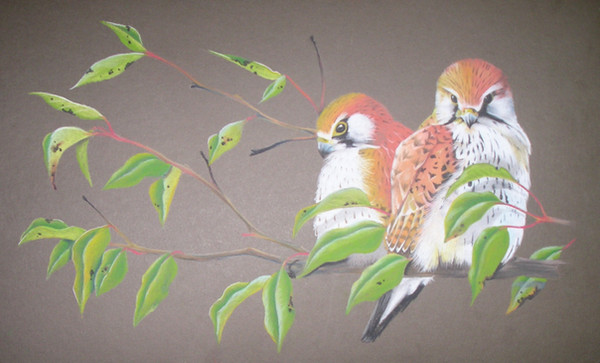
This is how i draw in pastels, its a bit different than what many people would say is right because i start with the darker colours first and go over the top with the lighter ones later. as u can see with the Tawny Frogmouth Nightjar on the left, its really dark and messy, not very pretty, also very grainy. i put all the different tones in each needed area which ends up looking really dark like that.Then i go over the top with a pale blue with the middle Tawny. This smoothens it a bit but all the textures arnt showing as much but the colour does come thru. i try using colours either than grey which is the Tawny's natural colour because it gives it its own effect. i used pale blue and purple on the middle one, the speckles or spots near the neck r done in indigo.
The third and final Tawny looks nicer, alot cleaner and not grainy like the previous two. with this i use white conte (mainly ecause my white pastle is really small) which i use to highlight and smoothen the feathers. I come back with the dark colours after that because then they have pretty much gone paler, this brings out more detail but it willl make it grainy which is in need of more layering of other colours to blend with it so it dont look so messy. it may take a while to get it right, hope this was helpfull!!!
Keep in mind, with most art, like painting and drawing/colouring in, u do light first, i just found it easier doing the darks first with light over the top cos the pastle mixes differently from pencils or paint.
The only reason this became a tutorial was because i got bored after drawing the first head (which was the far right-hand one) and when i got to the second one i got sloppy and the third i lost all motivation. how a way to do a tutorial huh!!!
Related content


Comments: 13


thats good to hear, thanks
👍: 0 ⏩: 0


")

This looks really good, despite how it's not finished. >_>
And interesting tutorial. I always love it when artists explain their tricks and tips to help others. <3
👍: 0 ⏩: 1
well as long as its helpful
👍: 0 ⏩: 0

I usually start with the darker shades fist also. Good work.
👍: 0 ⏩: 1
thats awesome!!! good to see im not the only one
👍: 0 ⏩: 1
Ya I find it easier but I should practice starting with the lighter shades
👍: 0 ⏩: 1
i do that with normal pencils tho, lighter to darker, i just find it eassier darker with lighter with pastels thats all. but yeah, i guess i should practice it too
👍: 0 ⏩: 0

this is great! :Clap: you can really notice the difference. A shame this pastels cause me allergies T_T
👍: 0 ⏩: 1
oh the dust? thats a shame, im lucky cos i have no known allergies, but i have come up in rashes only once but i dont know wat it was from. thank u tho
👍: 0 ⏩: 0