HOME | DD
 M-e-l —
Paranoid?
M-e-l —
Paranoid?
Published: 2005-12-07 13:14:06 +0000 UTC; Views: 3772; Favourites: 94; Downloads: 771
Redirect to original
Description
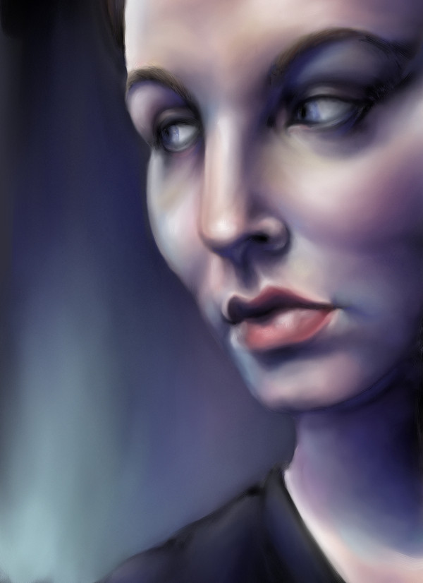
Finished. Previous versions were moved to scraps.There is something I don't really like about it, but I can't figure out what it is.
EDIT: Cropped it some.
Related content


Comments: 85

yes, of course. going back to change already finished work is slicky.
keep up with new cool stuff!
👍: 0 ⏩: 0

qwell she need a bit hair that shows.... that would really hit it of.. otherwise its GREAT
 (Smile)")
👍: 0 ⏩: 1

You actually can see a bit towards the top, but it is difficult to see because it is so dark. I have thought of going back and adding more, but I think it's better that I just start learning to live with my works, flaws and all.
👍: 0 ⏩: 1
")

very nice painting, great colors, but as you said something seem to be a tad off. i think its mainly the left cheekbone that is way too big, also the nose seem to be out of perspective and the bone above the eyes feels assymetrical, not lining up properly
👍: 0 ⏩: 1
Yeah, I agree that there are problems with the nose and eyes, but I think the cheek is okay. It looks very similar to the reference photo.
Thank you for the comment
👍: 0 ⏩: 0

Ohh, okay. I never knew what her name was!
👍: 0 ⏩: 1
 (Wink)")

I get a slightly wrong feeling about this one as well, despite the great technique - I'd say it in the left (from my perspective) eye - it's different shape from the right (corner up instead of down) and seems slightly out of perspective with the face
👍: 0 ⏩: 1
Unfortunately part of that is because my eyes are actually like that (though I do have a habit of exaggerating it in my self-portraits-a habit I am trying to break some).
Thank ye much
👍: 0 ⏩: 0

This is just too awesome. The colors are beautiful, especially with the bluish tint. Excellent job.
👍: 0 ⏩: 1

This composition has a wonderful sense of style and atmosphere. Gorgeous tones and fine form. The highlights are excellent.
👍: 0 ⏩: 1

It looks really good; the color scheme is very intriguing, esp. the shadows. If I were to comment on my opinion on what you think might look a little off in the background, I would have to say where you put the lighter colors. They are opposite of your light source according to the shadows.
Of course, I wouldn't have even noticed otherwise. Beautifully done.
👍: 0 ⏩: 2
Yeah, I was just tired of working on it, so I threw together a background in a few minutes and I wasn't really paying attention to light and such ")
Thank you much
👍: 0 ⏩: 1
Yeah, I have a few pics like that. I still have yet to fix them....
👍: 0 ⏩: 0

I agree with this one, but I didn't notice it at first. I assumed that a door had opened behind her and someone was coming into the room. Or maybe it was just a cat. ^_^ Ah, the beauty of ambiguity in art. Anyway, I also love the blue tint - It looks to me like she's in front of a computer monitor.
👍: 0 ⏩: 0

The variety of colors are just mindblowing . . . Very subtle and sophisticated. Wow.
👍: 0 ⏩: 1

The thing that's probably bothering you is her(?) right eye. It's higher than the other one, and it's also tilted a bit so that one side is higher than the other... which pretty much throws off the face from there. Everything else looks perfect.
Good job.
I love the colors, by the way. They look really nice. It's very interesting color usage. I love it.
👍: 0 ⏩: 1
Yeah, the more I look at it that definitely is one of the things that is bugging me.
Thank you
👍: 0 ⏩: 1

what i really like about this piece is choice of the colors, also i think it's brave (for a portrait) to plait in the blue color.
after i spent some time on observing i caught myself on idea that it's just me who is paranoid with kind of twisted perception and things, but then i saw the tilte and it made me smile.
maybe some hard edges and/or high contrast in places would make it look deeper, nonetheless excellent work and i really enjoy it.
👍: 0 ⏩: 1
Thank you very much
Lol, that's an interesting coincedence!
I actually don't pay much attention to what colors I use. Whatever I feel like working with at the time is what I use ")
👍: 0 ⏩: 0

well u did an awsome job anyways but maybe its the left eye..no i cant say it is but

👍: 0 ⏩: 1
Thanks!
I think the background is my biggest concern (but I have a tendency of nit-picking over every little thing wrong with my art
👍: 0 ⏩: 1
ur are a perfectionist some time its helps to be sometime i sucks to be, cause the world is full of flaws,
but ultimately its up to u to decide

👍: 0 ⏩: 1
Yeah, I'm working on not being so nit-picky
👍: 0 ⏩: 1

<= Prev |