HOME | DD
 M-e-l —
Paranoid?
M-e-l —
Paranoid?

Published: 2005-12-07 13:14:06 +0000 UTC; Views: 3824; Favourites: 94; Downloads: 771
Redirect to original
Description
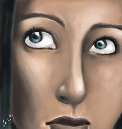
Finished. Previous versions were moved to scraps.There is something I don't really like about it, but I can't figure out what it is.
EDIT: Cropped it some.
Related content


Comments: 85

Thank you, and to answer your question it was done in Corel Painter. As for the specific brushes, I used one of the "detail oils" brushes and the "just add water" blender.
The more I look at it, the more I get used to the background.
👍: 0 ⏩: 1
GreenSprite In reply to M-e-l [2006-05-10 12:26:51 +0000 UTC]
I see... I never used Corel Painter. Great job with it.
And as for the background... hmm, it fits in just perfectly. I don't think it requires 'getting used to it' 
👍: 0 ⏩: 1
If you ever get the chance to use Painter, I suggest you try it out. It's a really nice program.
As for the background, I suppose it just depends on the person. It took me awhile to get used to it, but it seems others liked it immediately.
👍: 0 ⏩: 0

This is excellent and it looks so realistic. I can fully understand why it's a DD.

👍: 0 ⏩: 1

great expression, although i think the character looks sly and is rather like as if she's looking back and smirking at whatever is following her... -shrug-
👍: 0 ⏩: 1
That's what I love about art. It is all open to interpretation
👍: 0 ⏩: 0


you think theres something wrong? At first glance you may think that, but if you look closer it makes it a new piece in itself. Its pretty good though. maybe the other guy is right - the Shadowkitten05 guy - the right and left eye aren't on the same line you would draw a face with i guess. otherwise it looks pretty cool.
👍: 0 ⏩: 1
Yeah, but my eyes actually are somewhat like that (though it is definitely over-exaggerated). The more I look at it the more I learn to live with the flaws of it though. Thanks!
👍: 0 ⏩: 1
no prob, and good job ^^ ( 
👍: 0 ⏩: 0


")

That's really incredible. I love the way the picture speaks, the way it reflects the title - and the way the title, in turn, reflects it! Beautiful work.
👍: 0 ⏩: 1


The image is simple, but im lovin it, the colouring is great, very ispirational, great work
👍: 0 ⏩: 1


I like it
I dunno
LOVE:Kristen Price

👍: 0 ⏩: 1

The left(from our point of view) eye's eyelid is pointing the wrong way--straight at the viewer and not towards the side... But I have no idea how to go about fixing this
")
👍: 0 ⏩: 1
Yeah, you are right. I'll be more aware about that next time I do a painting. Thanks!
👍: 0 ⏩: 0

This is beautiful! It may be the nose. The bridge seems kind of broad to me...? Did you mirror the image?
👍: 0 ⏩: 1
No, I didn't mirror it. Now that you point it out, I agree. Towards the top it should come in more. Thanks!
👍: 0 ⏩: 0


strange but striking, i think if more hair was visible it wouldn't look so wierd, but is a very well done
👍: 0 ⏩: 1


Wow!! I love the softness to this. Very nice airbrushing indeed
👍: 0 ⏩: 1
Thank you, but there was no airbrushing done on it. It was one in Corel Painter using one of the "Detail Oils" brushes and the "Just Add Water" blender.
👍: 0 ⏩: 1
")


oh wow... the tonal rendering and colours... they are so realistic!!!
fantastically done
👍: 0 ⏩: 1


it would have been more expresive or, say, with more depth, if the
bottom left corner was dark.
eyes are ok.
anyways, you could look into any eye on any preson and eventually you'll end up thinking
there is something wrong with it.
i would go with working up the backround, because the picture is worth it.
👍: 0 ⏩: 1
Thank you  (Smile)")
👍: 0 ⏩: 1
| Next =>