HOME | DD
 magicwingsforever — Fly Free with Me

Published: 2012-12-03 21:17:14 +0000 UTC; Views: 2208; Favourites: 83; Downloads: 7
Redirect to original
Description
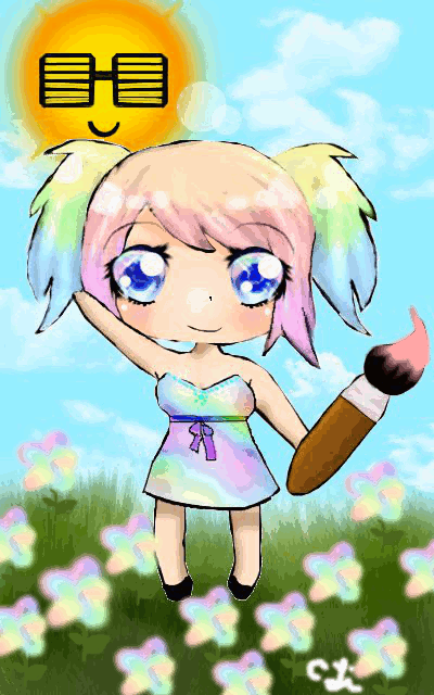
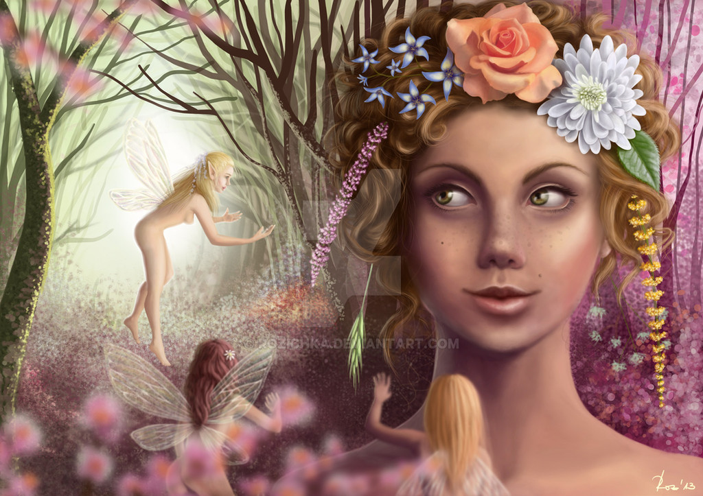
For =Hyo-san-desu 's steampunk contest [link]finallydone. ohmygosh.
I've worked on this piece for about 10-15 hours on and off in December and I thinkk I like the results. the bird is supposed to be flying out of the girl's hand.
Mouse, GIMP, 70+ layers.
I also entered this into www.celebratingart.com 's artbook contest and won!!! The art will be published as an artbook!!!
Also entered this into "A Singular Creation" website's The sky is the limit contest!
Ref: *sakimichan's Miku WIP c:
Related content


Comments: 30

Overall

Originality
Technique
Impact
The technique of coloring everything was very good; the skin looks really good and the shading is so even. However, her legs seem too small and really awkward. There is no shading on her legs under the skirt but the light seems to be coming from above.
The pose idea is okay, but her shoulders are too level. Her face looks kind of weird. Her whole body could be tilted towards the viewer more, because her hand is reaching as far as it can go but her body seems to stay upright.
Overall, with the girl, I think you should really make sure you have a great pose first, and maybe even make a complete lineart before putting in all the work of coloring and shading. I like her outfit but the skirt seems weird... I don't think the train worked, and it needs to be the same length all around. Her hair and a lot of her clothing has no movement at all while her necklace is in the air.
The bird and clouds look really weird -- I think it would have been better to use a reference for the bird, and a lot of deviantarters have tutorials on how to draw realistic clouds.
Overall, it's very good and I can tell you've worked very hard on it, but try to spend more time really getting the pose perfect before putting so much work into the shading, etc.
👍: 0 ⏩: 0


Originality
A great piece of work by you, everything about the image is to adore.
I'll begin with the background first as it is one of the most significant part of an image. The cloudy background adds a charismatic effect to the image and makes it more appealing to the eye. However, a few strands of the pale teal lines look too irregular and rough. Other than that, the background is a perfect match for the character.
The character [The girl] itself has been drawn to near perfection is looking very good. The Sky blue hair with that flabbergasted smile looks astounding with the color scheme and the outfit. The only thing I found somewhat disturbing was the fact that the hand coming forth was too big. It could have been drawn to more perfection, but overall a good job.
The bird, has a decent posture and the happy and innocent look is to adore, especially with those azure eyes and the golden look gives it that majestic feeling.
Overall a job well done, and I hope to see more of such works in the future.
👍: 0 ⏩: 0

Woah, this is amazing *____*
All the steampunk details are mindboggling, and I really like the colour scheme!
👍: 0 ⏩: 0

 (Smile)")


Great Job. I love the colors. You did this with a mouse? amazing. thank you so much for your entry!
👍: 0 ⏩: 1

Yes I did it with a mouse, and it took forever. 
👍: 0 ⏩: 0


Wow.. I can't.. think of anything that describes this beautiful peice of art..
👍: 0 ⏩: 0

Wow so cute and lovely!! Its like the one in the games 8D I amazingly (LOL not a word) love the golden bird 8D
👍: 0 ⏩: 0

Congrats, you got cute badge for this work in group.
This is badge for most cutest art in our group.
You can find your art in Badge-CUTE folder in our group.
This is your 1st cute badge. Collect 10 of this kind and your avatar will be in Cute-Badges folder forever.

👍: 0 ⏩: 0


That bird is really cool ^^and her hand is amazing, I just can't help noticing how well you shaded it.
👍: 0 ⏩: 0

")


I think the bird in the drawing is adorable, and overall it looks really really nice XD
👍: 0 ⏩: 0

I love the way you did her skin! Makes it pop out. >o<
Hope you win the contest!
👍: 0 ⏩: 0
This is the feedback frenzy contest 2
This piece has a magical feel to it and has really nothing wrong with it, except for the shading around the need and other body part like that, but it just really good overall.
👍: 0 ⏩: 0

Hi! This is a critique from a Feedback Frenzy participant.
First off, the two things that I really love about this piece is the details included in the design of the character, and the facial features. Her eyes are extremely lively, and the placement ratio between eyes, nose and mouth is perfect. I especially love her smile. The details in the design is also quite praiseworthy. The gears are a very subtle way of expressing a consistent theme that adds a very tasteful touch to the design while not making the picture look busy. I also really like the swirls on the skirt and the texture on the bow. Though speaking of gears and swirls, you could make them even better by blending them in a bit more with the flow of the fabric. For example, despite the gears being perfectly circular, with the folds of the skirt, they should appear more oval than circular when at an angle. This same principle goes with the swirls. It's really nice that you have blended them in according to the light distribution, but it would be a step up if the change in shape according to depth of field is tweaked at as well. It's a small thing, but it really adds to the 3-dimensional feel of the picture.
Your anatomy is done very precisely. Since hands are very difficult to draw, I'd like to point out that you have done her hand very accurately. The shading on her skin is also very accurate, though perhaps the areas of her thigh right beneath the skirt could be darker. Also, given the width of her bust and shoulders, it also seems that her thighs and legs could be a bit thicker.
Since the description indicates that this is WIP, I suppose that the ruffles behind her will be tweaked at in the future, so I won't comment on that. It's a really awesome concept though, I really like it.
Finally, I love the colour of her hair. It stands out from the rest of the picture so nicely. The floral design and the curls of her hair are especially lovely. A few things to watch for though. The combination of the thickness and colour of some of the locks make them look somewhat stiff and plastic-like. This is most apparently on the loose locks on the curls that hang from the sides. Perhaps try using smaller brushes for loose strands, and maybe also a more subtle transition of colour. Also, you should consider drawing a few more locks/strands over the top of her hand to conceal the fact that the two big patches of hair to the left of the floral design is duplicated. I don't have anything against using duplication, but it would be better if some alteration or addition is done to conceal it a bit better.
All in all, this is a very well done piece. Her facial features is the bright point of it. Keep up the good work, and I'd love to see this in its final form!
")
👍: 0 ⏩: 0


This is really well done! I like that lace-like pattern in her dress and her hair! Good job!
👍: 0 ⏩: 1
Heavily inspired XD
She looks really cute! I hope you win.
👍: 0 ⏩: 1
You're welcome

👍: 0 ⏩: 0
