HOME | DD
 mallaard — AVGN vs. NC II: Slow Fall

Published: 2008-11-13 06:50:49 +0000 UTC; Views: 6148; Favourites: 160; Downloads: 222
Redirect to original
Description
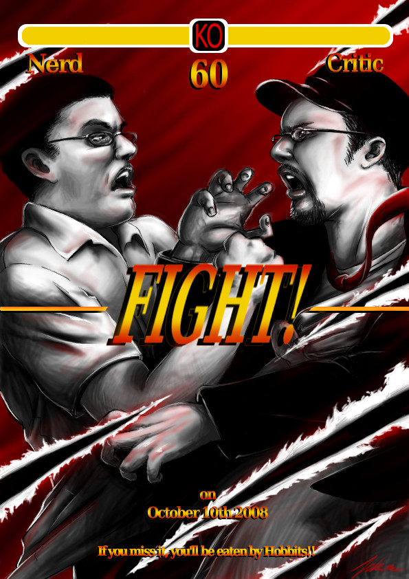
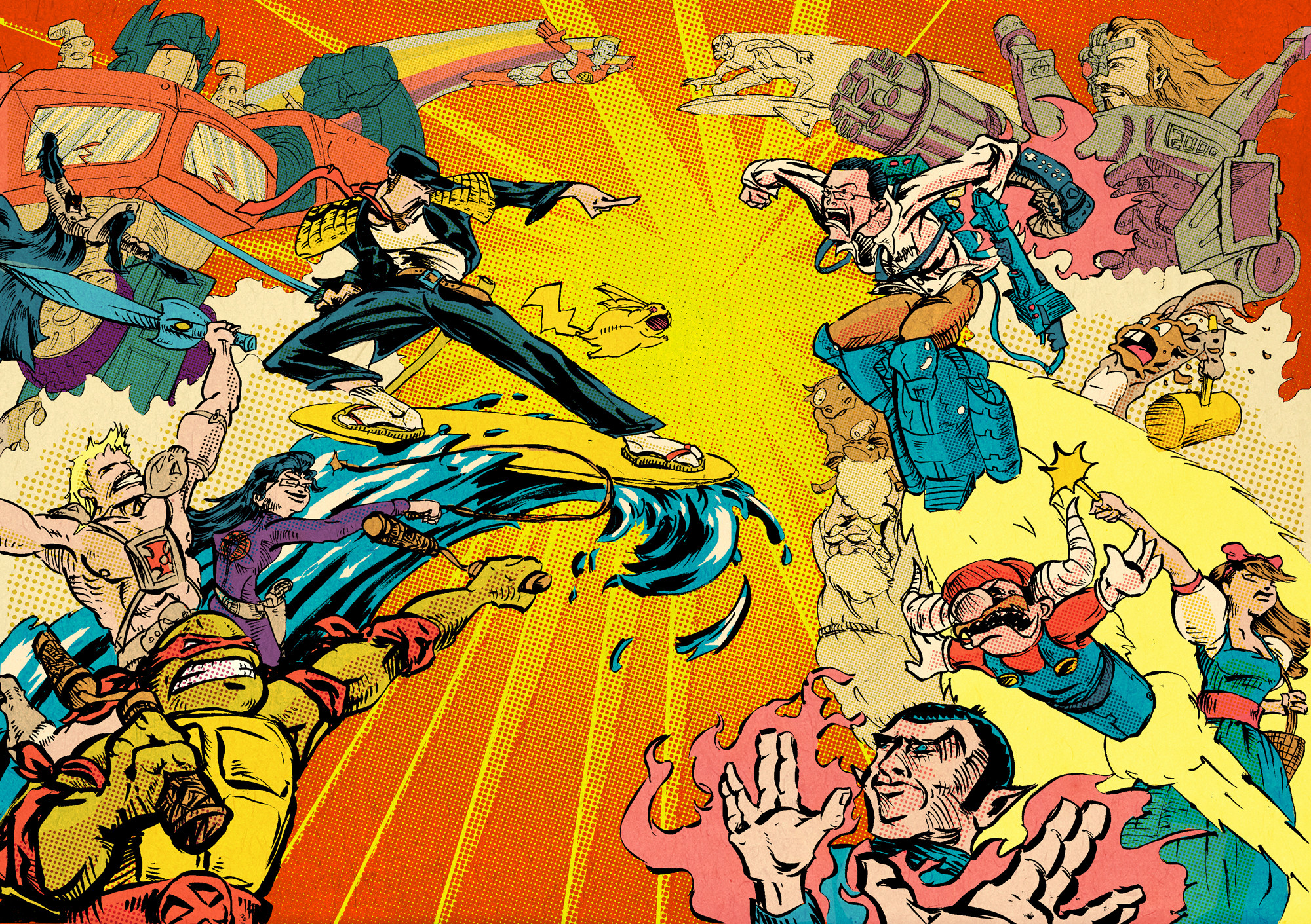
I thought I'd take another shot at a Nostalgia Critic vs. Angry Video Game Nerd piece. I never was entirely happy with the first one. Photo realism is neat but it doesn't quite feel like me, so I made another piece that felt more like me.This is based off the NC's concept of the "Slowest Fall in the History of Slowest Falls" from his review of the Masters of the Universe movie, in which Skeletor falls into a pit for like, forever. That's why the Critic is the one coming out on top in this one, although I don't have a real bias one way or another. I watch both of them pretty religiously.
Even though I didn't delve too heavily into likenesses or even great caricaturing here, I still needed reference material, most of which I pulled from here:
[link]
Related content


Comments: 13


I love the gritty, demented style this is in! They look great! And the orange glow is perfect.
👍: 0 ⏩: 0


OH MY GOD THIS IS ONE OF THE GREATEST ARTWORK I'VE EVER SEEN IN MY ENTIRE LIFE! XDD
was this chosen as one of the winning entries? cos it does look familiar
👍: 0 ⏩: 1

I wonder if you could confirm where you may have seen it before. I've only posted it otherwise on Sheezy Art. But I am glad you like it, and I like the Chester A. Bum style comment as well.
👍: 0 ⏩: 0

The thumbs up... I dunno, just cracks me up. The perspective of it or something. The giant-hand-in-close-view perspective has an odd charm to it
")
👍: 0 ⏩: 0

I get it, like in the critic's review of [link]
👍: 0 ⏩: 0

This picture looks awesome, and the colors are great! That's funny, the Critic looks so scary...but I guess it was the point
👍: 0 ⏩: 1
Yeah, although he may be a little too scary. The cat eyes I gave him might be the cause of that.
👍: 0 ⏩: 0

Though I really liked the cheese factor of the first design, I think this one is a lot better. It better displays your unique skills. You're definitely a metal-dragon-head-drooling-out-lava type of illustrator, and I think this one really shines.
I think you did a good job of getting AVGN's personality across also.
👍: 0 ⏩: 1
I was really interested in drawing some kind of evil bottomless pit thing, though I couldn't quite decide it I wanted it to be cave-like, temple-like, or industrial, so I sorta combined all of those.
👍: 0 ⏩: 1
It seems like a good mix of them, and definitely the right kind of setting for these two guys. Thumbs up man.
👍: 0 ⏩: 0