HOME | DD
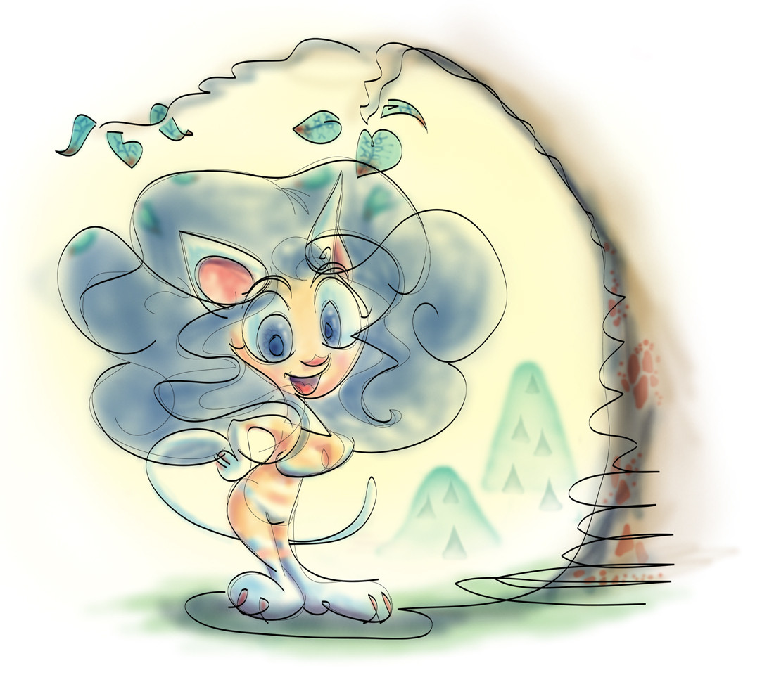
 mallaard — Felicia Under a Tree
Published: 2005-01-11 04:27:36 +0000 UTC; Views: 857; Favourites: 26; Downloads: 81
Redirect to original
Description
This was a real quick little piece I did as an experiment. The linework was done in Illustrator, which I almost never work in. I've just seen so many cool things drawn is that program that I finally decided to give it a try myself. I saved the jpeg kinda big so you can see all the busy swirly linework, which you might or might not like, although I kinda dig it. Not saying this is the grandest drawing I've ever done, but I wanted to do something quick.I'm trying to learn how to control my coloring so I can get away with a light wash look without the piece looking incomplete, something I don't think I've managed yet. I should probably study watercolors and Japanese prints and the like. So that's another thing I was working on here.
Chuck Jones once said that cartooning is the art of making as complete a character with a few lines as possible. That kind of cartooning is as much about balance and grace as wash painting, or calligraphy, the kind of balance and grace I'm trying to learn. Please let me know what you think, about how well I did that with this piece, or about how to strike good balance in general.
Related content


Comments: 24

sort reminds me of ren and stimpy spumco style!
👍: 0 ⏩: 0

One of the cutest Felicia ever! 
👍: 0 ⏩: 0

this is far beyond cute, there is so much more to this than just a pretty on-screen character!
first, i find the pic so very stylish and unique, i can't hardly think of someone else who has done something like this one.
then, i read your comment, you said something about Chuck Jones and few lines, and i agree with that and gotta say you manage to show it perfectly (also the pic did made me think of Chuck Jones a little).
final, as a huge felicia fan, gotta say this is a master piece!
👍: 0 ⏩: 1

Wow, thanks for that great comment! Although now that I think about it, I wonder what Chuck Jones would say about proper use of color in cartoons. I guess he was more of a lineart oriented guy, I don't know.
As far as the look of this one, I suppose it's the overwhelming temptation in digital coloring to go with solid colors, so this does stand out a little. I've seen some masterfully done watercolor-like digital art here and around though.
👍: 0 ⏩: 0

Just curious... did you do the linework and color in Illustrator, or just the linework? It's very stylistic, I like the swirly lines
👍: 0 ⏩: 1
I made the lines in Illustrator, then imported it into Photoshop for coloring. A lot of the swirliness came from drawing thin gestures of the form and then running thicker lines over them, though not tracing them directly. It was the loose feel I was going for, and I think it matches her bubbly personality.
Thanks for asking.
👍: 0 ⏩: 1
I thought that maybe you colored it in illustrator (somehow... using gradients). Ths soft coloring give the lineart a nice touch )
👍: 0 ⏩: 1
Thanks for that. I'm not sure one could color like this in Illustrator, but maybe someone knows something I don't. In fact, I know that they do, but whatever. There are many dimensions to Illustrator I'm not familiar with, and with Photoshop too. I might try and learn, but the books for doing that cost a lot of money, so I'm left to learn from folks online. I'm still learning how to use my dusty old Photoshop 5.5.
👍: 0 ⏩: 1
I think you can color similarly in illustrator by using gradient maps... but it's much more difficult ^_^' and painful... and the look won't be exact either
ah! I'm blabbing! *runs away*
👍: 0 ⏩: 0


 (Wink)")

wow that's a different way of using illutrator. It looks really interesting. Not your usual Falicia look and pose but cute non the less. Very nice.
👍: 0 ⏩: 0

wow, I find this really impressive  (Smile)")
the rather soft and pale colours are quite interesting too, and yes, I find the piece balanced, with a good focus on the character though
dan *waves*

👍: 0 ⏩: 0
wow, I find this really impressive
the rather soft and pale colours are quite interesting too, and yes, I find the piece balanced, with a good focus on the character though
dan *waves*
👍: 0 ⏩: 0

is that the felicia featured in the vampire savior capcom game?
👍: 0 ⏩: 1

ahhh,yes.
anime characters charactatured, very clever.
has an airbrush feel to it.
👍: 0 ⏩: 1
Thanks. Hopefully I'll eventually get good enough with these tools that I won't have to worry about stuff looking like bad T-shirt airbrushings from a circus. I always have the fear of that.
And why not caricaturize anime characters? I'll never out-anime the original designers, since Capcom's art staff kicks so much ass, so I'll just draw her like a happy little doodle and splash some blue on her and call it a day.
👍: 0 ⏩: 1

Well, you have that sumi-e look going for it, especially in the background with that mountain. THe lineart itself is pretty far from any sort of printwork or asian I know of, but to be honest, that just adds to the picture's appeal. You definitely got minimalistic lines. Nice how you interpreted the human form in the least possible amount of lines. I'd add more weight to the lines in some instances, but that's just my personal preference. I like lines not to be totally uniform and symetrically similar. ^_^
The colours are good too. ^_^ Kinda blurring the distinction between the nude and something scantily clad tho, eh? ")
")
👍: 0 ⏩: 1
Well, that's Felicia for ya...she's essentially naked except for some strategically placed fur. I knew I should've empasized the hairy parts more, but I was afraid of getting too involved with rendering, which I was trying to avoid. I'm sure there was more I could've done though.
You're also right about the line weights. I'll play around with Illustrator some more to learn how to do all that. I think I'll study some renowned line cartoonist like Al Hirschfield and such to get a better sense of what a bare line is capable of.
Thanks a lot for your input!
👍: 0 ⏩: 0

The pawprints on the tree are a nice touch, for one.
I like all the swirls and variations in thickness, and I think the contrast between that and the washed out color is what makes it interesting. When pieces have a lot of style it's harder for me to judge how good or bad it is. It looks balanced to me. Hmm, I'm starting to wish I was taught more about "art" in school.
👍: 0 ⏩: 1
To be honest, those little tree spots weren't meant to be pawprints, but I realized that's how they look, so I didn't change 'em. It is true that making something super-stylized makes it difficult to critique, so you're just left with whether you like it or not. I don't stylize like this very much, but it was fun to do. I'll probably try doing more of it so that I develop a more unique "me" style like you or Freakshow have.
Don't worry too much about what you think you should have learned in school, a large amount of what I know came from reading books about different artists and styles, which you can do anywhere. The learning process never ends, it just gets more or less expensive!
Thx for commenting!
👍: 0 ⏩: 0

i think it's goofy as hell. but the wahy watercolor look is a nice effect. nobody's hair should be that big.
👍: 0 ⏩: 1