HOME | DD
 mallaard — Chicky - Cryptic Writings
Published: 2006-01-18 08:50:38 +0000 UTC; Views: 1228; Favourites: 22; Downloads: 153
Redirect to original
Description
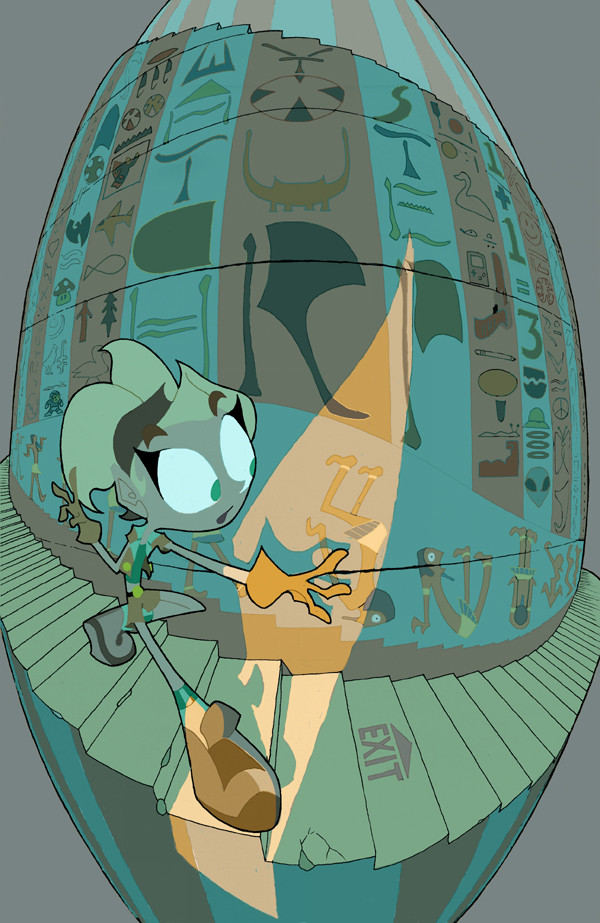
Here's a scene proposal that has Chicky descending the stairs into the inner sanctum of the Pyramid, which happens near the beginning of the toon...or would, or will, hopefully. This is probably my favorite combination of elements so far, so I'll try and stick with this look. Not her proportions, they're a little exaggerated to fit in with her surroundings, but just the way everything's outlined and colored.Related content


Comments: 35

wow love this piece. diffrent from almost everything else i see. great one. like to see more like this one!
👍: 0 ⏩: 1

Thank you! I believe the very same could be said for your work, it embodies lots of spirit.
I used this look and approach solely for this cartoon proposal which fell through, but maybe I'll be able to pick out elements to use in future work.
👍: 0 ⏩: 0

i really like this idea, and the warped perspective looks great
👍: 0 ⏩: 0

Fuck. That's nice stuff. The colours and lighting really make it pop. I only think that maybe some gradiation of surface might enhance it a bit more, but I really don't think it's necessary. Brilliant!
👍: 0 ⏩: 1
At the time I tried really hard to keep almost everything in a flat tone for a cartoon presentation, but now that you mention it, I could stand to add or recolor this badboy and give it some real depth. I'll consider it, and thanks for the comp.
👍: 0 ⏩: 1
It looks good as it is, anyway. Just a bit to complament it. It doesn't have to be a real big undertaking, but a gradient here and there. That way it doesn't compromise its cartooniness. No need to recolour. Hell, It doesn't take long to select stuff and add a transparent background/texture.
Actually, I didn't mention this, but I like the unique/extreme/cool perspective/fishbowl look to this. Kudos!
👍: 0 ⏩: 0

i love how you put the mushroom from mario bros in there XD
along other great symbols most would recognize of the modern world, (superman XD)
i love the perspective^^
cool how you have light shining in...
wonderful work
👍: 0 ⏩: 1
Thanks! A lot of these symbols that you don't recognize are either actual heiroglyphics I downloaded pictures of, or deviations of them to form into English characters.
You've got some wonderful fashion illustration on your page and I'd like to watch you now. Thanks for dropping by!
👍: 0 ⏩: 0

I agree with the description; I really like how this is going.
Why don't you learn to cel shade and all that good stuff...where's the game? The flash site? huh?!
👍: 0 ⏩: 0

the convex view looks approriate for this... makes the stairs seem like they do forever. The blue shades are also refreshing - usually when you have anything to do with pyramids, mummies and the like you get orange shades. Nice job
👍: 0 ⏩: 1
Yeah, that thought about too much orange occurred to me too, so I started trying to focus on the rest of the spectrum with these pictures. Plus, this is meant to be a really dark scene that leads up to all the glitz and glam of the Egyptian gameshow studio, so blue was the natural choice for me.
👍: 0 ⏩: 0

Captivating, wildly dynamic stuff-- gorgeously rendered!
👍: 0 ⏩: 1
I've tried this fish-eye lens thing before, but this is certainly the most convincing job I've ever done with it. I also think working solely with flat graphic shapes and figures makes these tricky little effects easier to handle, so I'm gonna try more of them.
👍: 0 ⏩: 0

hm, this goes into the direction of fisheye perspective. and I think you did pretty well at this, I like the disorted view here, and how it gets the eye to focus on your character. however, what disturbs me are the colours... I'd love to see the character pop out a bit more, instead the colours are pretty much the same like on the wall behind him. I understand that only the orange part is being directly hit by light, but even with ambient lighting you usually have some soft shadows, and I miss those especially on the left foot/leg.
other than that, well done
Daniel
 (Smile)")
👍: 0 ⏩: 1
I can see what you mean about the character's colors blending with her background, but as for more shading, I'm designing this for an animated project for television, so I'm not leaving a lot to chance as far as subtlety in shading and rendering. I'm probably already pushing my luck with this perspective stuff. If I didn't intend this to be a cartoon design, I certainly would add more shading and color complexity in the figure.
👍: 0 ⏩: 1
oh, then good luck with that animated project! 
👍: 0 ⏩: 1
Don't know, it hasn't been sent in or accepted yet, but I'll draw and color as much as they want me to if it does go through.
👍: 0 ⏩: 0

I just noticed the "Watch Your Step". Gezenius!
👍: 0 ⏩: 1
Has anyone spotted Megaman yet? Just curious
👍: 0 ⏩: 1
Haha, yeah, I found it first time I looked, I just never brought it up because it seems pretty obvious.
👍: 0 ⏩: 0

This is so manic. I feel like my eyes are shape-shifting when I look at it. the fish eye lense thing seems very appropriate, and I like the stumble heiroglyph man on the wall. That's probably the wrong way to spell heiroglyph.
And your Wutang glyph did not slip past me, nor did the one+one=three glyphs.
Your headed in a good direction.
👍: 0 ⏩: 1
I'm not entirely sure I'm spelling heiroglyph right either, but I try to stay consistent with my spelling so I'll be completely right or completely wrong. All or nothing, right?
👍: 0 ⏩: 0
Haha, I love the Pharoah in the Hyroglyphs in the background... I've never seen 'Still Slapstick' before...
👍: 0 ⏩: 1
It's like ancient comic strips all over the walls. I wish we had more stuff like this in our day and age.
👍: 0 ⏩: 1
I've never seen anything like it, it's truly incredible.
👍: 0 ⏩: 0

Ooo...that's excellent! That stretched perspective is beautiful, and that line of light accentuates the character quite nicely--a good color contrast too, between the warm of the light and the cold tones of the rest of the picture. I like the distorted proportions on Chicky, also, though as you said, only in the case of this picture.
This has got to be the best Chicky 1337 piece yet! Definitely worthy of a fav!
👍: 0 ⏩: 0


WATCH YOUR STEP. I nearly went blind myself trying to read that stuff.
I like this one a lot, except that I feel like the drawing in the character is getting a little stringy and too thin compared to your earlier drawings. You are, however, getting a good handle on this new version of Chicky despite the noodle limbs.
I would knock the tan color in the background down to one of the muted greens/blues in the staircase, maybe a little darker. That'll make the little bit of light spilling over the figure really pop out.
I'd also be careful drawing challenging things with a lot of perspective going on if somebody else is going to have to interperet it to animate it.
Other than that stuff, the illustration is really strong. I like all the craziness written all over the wall. You've done a good job making Cap'n N's gun and the Wu-Tang symbol look like Hieroglyphs.
👍: 0 ⏩: 1
I drew Chicky like spaghetti so she's fit inside the image the way I wanted her to and still give off a strong line of action, but I'll try and put a little more meat on her non-bones next time. I don't know how the animators would be able to handle this kind of scene, it's more wishful thinking on my part. Only Chicky would be moving, but it'd have to be in sharp perspective. Darkening the backdrop will be no problem, and I'm glad the heiroglyhpics are coming out as I intended them.
👍: 0 ⏩: 0

Love the forced perspective here. Perhaps toss in a bit o' bg in the background or make that cream color darker to add to the atmosphere of tombs being dark and spooky!
👍: 0 ⏩: 0

You should play with lighting in as many shots as possible! i like the way the light from the door on her pushes the depth! And because it's a different color than everything else, it really separates the space.
👍: 0 ⏩: 0

I totally love the muted colours in this! Cool perspective and format!
👍: 0 ⏩: 0