HOME | DD
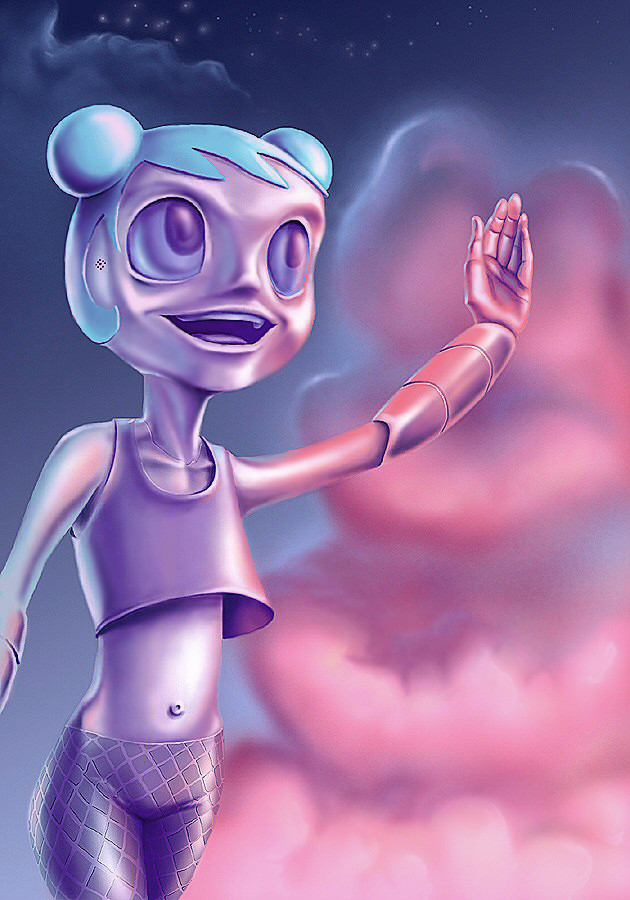
 mallaard — Teenage Robot and clouds
Published: 2005-01-26 05:43:33 +0000 UTC; Views: 5620; Favourites: 48; Downloads: 107
Redirect to original
Description
Based off My Life as a Teenage Robot, although I fooled around with the character design a lot.I tried following some of the advice my friends gave me on my last piece, and I think this turned out better because of it. Thanks for the help guys, just keep the advice coming!
Related content


Comments: 58


Not gonna lie, this is just terrible, an absolute dumpster fire, even more as I saw the show as a kid.
👍: 0 ⏩: 0

THHHHaaaaaaaaaaaaaaaaaaaaaaattttttsssssssss gonna give me nightmates.
👍: 0 ⏩: 0

its scaryer before you click on it.now...now i just dont get it at all.
👍: 0 ⏩: 0


Mi god this is scary shit.
this is not good looking no mater whic way you look at it.
👍: 0 ⏩: 0

I'm not gonna lie to you, man. I can't look directly at it, yet I can't look away. I'm afraid!
👍: 0 ⏩: 0


Well, scary's a good word. I thought it was pretty awesome when I first made it a few years ago, but I would definitely do things much differently now. Still love this show though, wish they made new episodes.
👍: 0 ⏩: 0


This is how she'd look if it was a live action movie! I've always pictured it in my head.
👍: 0 ⏩: 0

The colours are GREAT.I like the way she's making those clouds and the 'redesigned' Jenny.
👍: 0 ⏩: 0


yea... 0.0!!..
pero vale el esfuerzo.. 8DD..
👍: 0 ⏩: 0

and to this day, i still believe that cloud is a mouth gently kissing her hand :3 
👍: 0 ⏩: 1
Oh yes, I can't forget a comment like that  (Smile)")
Thanks for the fav!
👍: 0 ⏩: 0

as much as the shading rocks in this...it creates a whole new level of creepy....
👍: 0 ⏩: 1
Yeah, you can't render a cartoony character too much before it becomes genuinely freaky looking. Is there a word that combines the verbs delight with creepy? No, it always just leans toward creepy. Ah well. I hope it's at least profoundly creepy...won't have any half-assing around here.
👍: 0 ⏩: 1
oh profoundly indeed, like I said...that's a new kind of creepy right there....
👍: 0 ⏩: 0

know wut, the part of the cloud right at hr hand looks just like a mouth trying to give a kiss so its like the cloud is kissing her hand
👍: 0 ⏩: 1
That's very nice. Some people might see other, less mentionable things in clouds, but you're obviously a sweet kid. Checked out your work, you've got
mad skillz. Hope you keep it up!
👍: 0 ⏩: 1
huh? oh all my pics got accidently deleted recently! u might have mistaken my favorites for my art ^__^
👍: 0 ⏩: 1
Ah! You're right, sorry 'bout that. I don't read enuff. Well, you have a nice favorites section, yes indeedy.
👍: 0 ⏩: 1

Creeepy...
I don't know what you're watching but I humbly suggest that you stop it this very instant.
👍: 0 ⏩: 0

this is excellent, the clouds look really nice.
👍: 0 ⏩: 1
Thanks! Maybe you should take a shot at the character, your Lady Death is looking pretty sharp.
👍: 0 ⏩: 1
Funny you say that, Iscanned a pic of XJ9 I drew about 3 days ago, after I get around to cleaning it up, resizing etc. I'll be sure to send it here.
👍: 0 ⏩: 0


Ah Deric ya hudsucker. This looks great. There's some really crazy volume in some areas, and the low key pallette gives this some dreaminess. I like the airy clouds against this mettalic being. Yar!
👍: 0 ⏩: 0

hehe, again that funny style 
ther other thing is the hair... right now it looks like a hard plastic cap with a few cuts. something softer and more detailed would be very much fitting
dan *waves*
👍: 0 ⏩: 1
I didn't feel right giving her human-like hair, or trying to come up with some kind of metal hair like I did with the Transforming Car piece, so this seemed like the only valid option. There might be a better solution, but frankly I was at a loss this time.
I did go back and push some of the shading further, especially in the little crevices like under the left arm, shirt, and along the neck and head, but I never felt right pushing the shading too far. I may have pushed the backlighting a tad too far in relation to the main lighting, I was just compelled to draw out some of those edges more and perhaps went a little overboard. I'm not sure it's really that much of a problem, but I do see where you're coming from.
👍: 0 ⏩: 0

may i reiterate first off, that you are a splendid artist with quite a handful of style on every medium. anyway, to the picture. although ive never much been a fan of the lisa frank color palette ")
👍: 0 ⏩: 1
I don't know who or what she's waving at, or why. The hand may be a little awkward, granted. I'm still very happy with how well it turned out, it's probably one of my best hands ever, even if it is cocked at a strange angle. I can see your points about the sharpness issues too.
The trick with these specific colors is that they're somewhere between science-fictiony and Lisa Frank, it's all in how they're used. I think I have a combination of the two going on here. Evidently I'm all about the Lisa Frank palette, even though I'm not very big into that whole genre.
I normally screw up the mouth area of these cutesy characters tremendously, but I must have lucked out this time. I tried not to stray too far from the original look of the character, so her head is still quite round and the face looks pretty similar, just with allowance for more rendering. Certainly one of my most successful fanarts, I'd say. Appreciate the comments bro!
👍: 0 ⏩: 1
well, i think shes waving at me. anyway, i didnt mean anything against the hand, in fact it indeed is one of the finest hands ive seen for quite some while. (that could be taken sarcastically, but i meant it) i really think youve done some wonderful work with this palette. and im just amazed at how good this piece looks, the shapes and shading are just splendid. i would deffinetly place this as one of yer best fanarts, although i might be a bit partial to the kimpossible one you did a while back.
👍: 0 ⏩: 0

I don't know the show, but this picture looks very good. I don't think realism is the point of this picture (we have photos for that) so I really like the saturated colors.
 (Wink)")
👍: 0 ⏩: 1
It's true I could've added a lot more detail to push it further into realism, but that would ruin the fantasy aspect of it. Several times I had to knock down the shading on Jenny's face to soften the area up. The same tricks are used in photography, and there are a lot of photos that look more fantasy than real.
There are probably parts that could stand to be sharpened, and some that could stand to be softened. It's tricky for me to decide when to stop and when to keep going when working in this style. If I drew Jenny or a similar character once more, I'd go the battle-damaged route and cover her with dirt and cracks and stuff that would really push the realsim aspect more. Perhaps later?
Thanks for the comment.
👍: 0 ⏩: 0

It looks really really good, even though I hate the show. Awesome job!
👍: 0 ⏩: 0

Dude love the coloring. She is very matalic looking and the glow from the clouds is great. Love how her ears are just a speacker. Just love the color most of all. Great job.
👍: 0 ⏩: 1
I'm glad you like! I didn't recall Jenny having any kind of defined ear things, and I wanted to keep most of the robotic details subtle, so I opted for little speaker holes. Other artists like Bleedman opted for more anime-type earphone ears, which is cool too, so I went the opposite direction. All I remember seeing in the show is her ponytail turning into a receiver dish on occasion.
I'd been wanting to color a robot or white-skinned character to play around with all the colors that would be reflecting off of them, and Jenny was the perfect candidate. I'd considered having the clouds reflecting from her shell, but I figured she wouldn't be quite that shiny, and it would've been distracting from the facial features. She's probably about as refelctive as a white car, which might pick up some environmental detail but not a lot. I'm guessing anyway. I don't know any robots personally.
👍: 0 ⏩: 1
oh yeah the clouds are great. I jsut love how it refelcts off her so well.
👍: 0 ⏩: 0

looks amazing. The shapes of the design r slightly inhuman which i feel gives it a good touch. The colouring is superb especially the clouds.
top work!
")
👍: 0 ⏩: 1
Thanks! I figured I could get away with a lot of simplification of the form since this is a robot, after all. I was about to give her bulbous Megaman forearms before I re-checked the character design and remembered she had straight segmented ones, so I found a compromise somewhere in between.
👍: 0 ⏩: 1
lol, megaman totally rules, but yeah i dont think it would have fitted brilliantly here
no worries
👍: 0 ⏩: 0

The coloring style really works with the character this time around. The clouds in the background is competing with the character though... maybe desaturating it a bit would help emphasize the character better? It would also add some depth to the piece. Hope that helps
👍: 0 ⏩: 1
I can definitely see pushing back the little blue cloud and the stars, at least. I think I would need more elements in the composition to add more depth, like buildings and stuff. I admit I need to start making more fully-realized compositions and less portrait kind of stuff. I may try playing around with the intensity of the background to strike a better balance between her and the clouds. Thanks for the words dude.
👍: 0 ⏩: 1

you've got mad style. way to make fanart that is yourself. love the colors, very inspired, the colored lighting has done wonders.
wonderful work.
👍: 0 ⏩: 1
| Next =>