HOME | DD
 mapsal313 — What Pumpkin? (Type Collab!)
Published: 2016-05-28 09:16:17 +0000 UTC; Views: 250; Favourites: 10; Downloads: 0
Redirect to original
Description
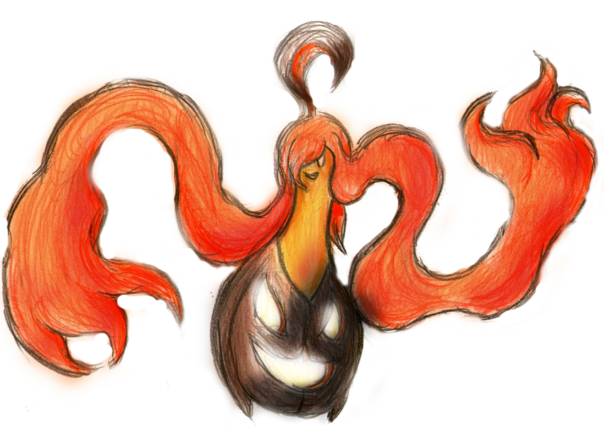
For 's Ghost collab, I drew a dancing pumpkin!I finally had some time today to scan and edit this thing.
Related content


Comments: 8

Look at this amazing hair! :'D And two faces that seem mischievously happy!
This is a very good pumpkin.

👍: 0 ⏩: 1

It's a Pokemon from the L'Oreal generation, of course it's going to have amazing hair! Glad you like it!
By the way, what do you think about the digital editing I did? Here's the unedited scanned drawing: sta.sh/0n91m0fgci6
By painting over the picture on a low opacity layer, I managed to have the colors of a digital painting while keeping the pencil texture of the traditional drawing! Sure, I need to improve this technique, but I think it has a lot of potential!

👍: 0 ⏩: 1
The L'Oreal generation omg :'D
The editing turned out very good, it made the colors really lively!
Be careful with dark colors, on page 26 of your comic there was a lot of texture lost in the dark parts. (Tho I think you noticed this already, because on page 27 it's much better.) Try this: One normal layer of painting with very low opacity, and on top of that a Multiply mode layer with painting in not-too-dark colors. It will make the image darker while preserving more of the pencil texture.
👍: 0 ⏩: 1
How else would you call the generation that brought us Mega Lucario, Mega Ampharos, Mega Absol, Mega Altaria, Furfrou, end more?
Thanks!
Fun fact: Page 26 was the last page whose colours I edited. You see, since it had the least text of all, I used it to test some fonts in order to decide which font I'll be using for the comic. So, after rounding down my choices to four fonts, I saved four versions of the page, each with a different font, and showed them to my friends, asking them which they thought looked better. Then, I did the text on the other pages, which I already had colour edited, but forgot to also edit page 26, until it was time to post it...
That sounds good, I'm going to try it when I finally get time to work on page 31! Thanks for the advice!
")
👍: 0 ⏩: 1
It's trying very hard to be my favourite generation. It might be working. : D
You chose a good font, it matches your style very well!
👍: 0 ⏩: 1
Yeah! Gen 6 was one of the best generations! Now it's Gen 7's turn to live up to the expectations! Speaking of which, have you seen the new Pokemon?
That's exactly what everyone said about this font! :-D
👍: 0 ⏩: 1
My expectations are very high but I'm also easy to please so this kinda cancels it out :'D
Yes I love the cutest bird and bug and the one that's entirely made of teeth!
👍: 0 ⏩: 1
The new generation has already given me two cute little birdies, and I'm really happy for that! And I'm sure their evolutions will be awesome!
Also, I think the bug will become some kind of beetle, since it looks more like a beetle's larva than a butterfly's larva.
👍: 0 ⏩: 0